The explicit measures podcast unpacks what does DevOps mean. It’s not a software it is a way of thinking. Matthias is the creator and inventor of our now beloved TMDL format. This conversation will blow your mind as you learn about DevOps with Microsoft Fabric.
📺 Playlist Overview
Total Videos: 4
Theme: DevOps strategies and practices in Power BI
Guest: Mathias Thierbach
Audience: Power BI professionals and teams interested in CI/CD, DataOps, and DevOps methodologies
Top Down and Bottom Up DevOps – Ep.434 Explores different approaches to implementing DevOps in Power BI environments, from leadership-driven to grassroots efforts.
Alex Powers is a staple in the Power BI community. Especially when it comes to working with Power Query. We had a super fun time unpacking all the rich features of Power Query with Alex in this series.
📋 Playlist Summary
Alex Powers joins Power BI Tips to explore advanced techniques and essential skills in Power Query, aimed at maximizing performance and deepening understanding of this data engineering tool.
Tommy and Mike had a blast discussing the state of Data Science as it relates to Fabric. Microsoft is pushing into Data Engineering and Data Science by adding easy to use experiences. Learn from MVPs where you should invest your time with Fabric as it relates to Data Science.
This 4-episode series explores how data scientists can adapt to new technologies like Microsoft Fabric, the relevance of Power BI in data science, and whether traditional BI tools are being replaced. Each episode is about an hour long and offers deep insights for professionals navigating the modern data landscape.
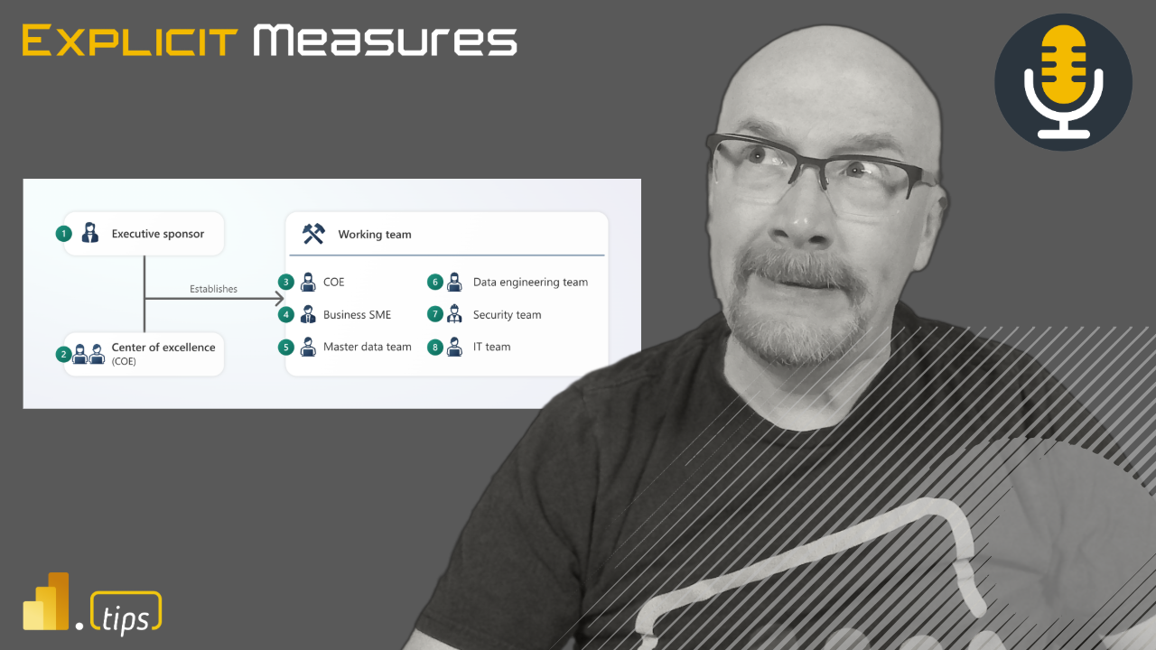
Starting a center of excellence (COE) can feel daunting. We face political challenges. This article pushes to explore the challenges of a COE and some recommendations to handle these challenges.
The Importance of Attention to Detail
Microsoft does a great job in outlining the key aspects of COE. For more details on this topic check out the Fabric adoption roadmap found here. A summary of those items are in the list below:
Pick a COE structure, does your company work more like a centralized, a unified, federated or decentralized team.
I strongly feel that documenting the result of these conversations is a huge win. The documentation can be used to show leadership that you have a solid plan. Discussing these topics pushes towards a health data culture. Lastly, when you bring documentation to leadership you show thought of aspects that drive success.
Foundational Attributes for Success
The optics of the COE matter. COE performance and leadership are crucial, as they can impact the entire organization. Don’t underestimate the value of setting clear goals. Taking time to identify pain points with your current organization structure help with planning process for the COE.
Setting clear goals
Addressing pain points that you see, plan to solve those pain points
Just start, don’t worry about making the COE perfect, plan for adjustments
Sometimes I feel that people try to over plan. Therefore, read up on the best practices provided by Microsoft’s documentation, write down your decisions then get moving! I have observed just by communicating and developing the plan really creates some momentum. Bear in mind it won’t be perfect in the first iteration. Plan on being flexible to adjust the COE to the organizations needs.
Recommendations for Overcoming Challenges
Attention to Detail: Paying attention to aspect you can control of the COE’s performance. Engage leadership so they support the development of the COE. Remember the COE is a vote in the direction of better data culture for your company.
Setting Clear Goals: Defining clear goals helps the team align towards a unified direction. Address pain points that could derail or distract from the creation of the COE. Connect the success of the COE to Objectives and Key Results (OKRs) outlined by the leadership team.
Regular Communication with Executives: Regular communication with the executive team helps remove mis-aligned expectations. When you win let leadership know, they can promote your success. Success means more buy-in from the company.
Feedback: Gathering feedback and pivot. Have empath for the process and be willing to adjust. If something is not working within the COE try something new. Ask others involved in the COE for recommendations, some of the smartest people are the ones you already work with.
For more thoughts on the COE and overcoming those challenges check out our episode on the explicit measures podcast.
Semantic link is one of the most promising technologies coming from the Microsoft Power BI and Fabric team. Semantic link has the potential to automate so many redundant tasks and tedious work. Automating and using code enables BI developers to free up time for more value-added work. Join Stephanie Bruno and Mike Carlo as they do a thorough demo of using Semantic Link.
Understanding Semantic Link
Semantic link is a powerful tool that allows direct access and manipulation of data within semantic models using code and notebooks. It offers automation, streamlined data extraction, and centralized data management within models. Throughout this workshop, we’ll delve into the diverse functionalities of semantic link and its potential benefits for data scientists, analysts, engineers, and fabric admins.
A Deep Dive into Semantic Link
This demo covers a range of topics, including:
Accessing and visualizing a Power BI report within a notebook
Exploring the list of reports in a workspace
Retrieving insights about tables and columns in a semantic model
Listing and comprehending measures within a semantic model
Visualizing and understanding table relationships
Utilizing semantic link for data access and manipulation
Live Demos and Practical Demonstrations
Our expert presenter, Stephanie Bruno, will lead live demonstrations and hands-on exercises to illustrate the practical applications of semantic link. The demos will encompass:
Creating a new notebook and connecting it to a workspace
Retrieving and visualizing reports within the notebook
Exploring tables, columns, and measures within a semantic model
Understanding and visualizing table relationships
Accessing and manipulating data using semantic link
Employing DAX magic to write and evaluate DAX expressions
The Impact of Semantic Link in Action
Throughout the workshop, we’ll showcase how semantic link empowers data scientists to access and utilize measures without the need to reconstruct complex logic. Additionally, we’ll highlight the seamless integration of semantic link with Python, facilitating efficient data manipulation and analysis.
More where that came from
If you like this type of training and content, join us over at Training.tips for 60+ hours of additional training.
In this episode of the Explicit Measures Podcast, we discuss the values of adding Python knowledge. It is well known that more organizations are moving to cloud platforms. Because of this, we should ask the following questions:
What will be the needed skills for Power BI professionals?
Is this for the Business or for a Data Engineer?
We invite you to jump in and listen to the podcast as we discuss these topics. Enjoy!
As in all our episodes we like to end with what does chat GPT say. Thus, our question for this episode is
Should I learn Python for Power BI development?
Chat GPT response
The response was quite interesting, discussing the various factors as to why Python is valuable. Overall, we gave chat GPT a better than average score of about 6.5 out of 7.
Learning Python can be beneficial for Power BI development. Python is a versatile programming language that is widely used in data analysis, data manipulation, and data visualization tasks. Power BI has its own built-in capabilities for data processing and visualization. Python can extend its functionality and provide additional flexibility.
Here are a few reasons why learning Python for Power BI development can be advantageous:
Data Manipulation
Python has a rich ecosystem of libraries such as Pandas, NumPy, and scikit-learn. These libraries are excellent for data manipulation, cleaning, and transformation. Use Python to preprocess and shape your data before loading it into Power BI.
Advanced Analytics
Python offers a range of libraries for advanced analytics and machine learning, such as TensorFlow, Keras, and PyTorch. Integrating Python code into Power BI, you can leverage these libraries to perform complex calculations. Additional features could include predictive modeling, or create custom machine learning models to enhance your data analysis capabilities.
Custom Visualizations
Power BI provides a variety of built-in visualizations. But, if you have specific visualization requirements or want to create custom charts. Python can be a powerful tool for visual development. Libraries like Matplotlib and Seaborn offer extensive options for data visualization. Enabling you to generate interactive and customized charts and graphs to present your insights effectively.
Automation and Integration
Python can help automate repetitive tasks and streamline your Power BI workflows. You can write Python scripts to extract data from different sources, transform it, and load it into Power BI automatically. Python’s integration capabilities enables connections with other tools and platforms, such as web APIs, databases, or cloud services. Python expands the scope of your data analysis.
Community Support
Python has a large and active community, with abundant resources, tutorials, and forums available. Learning Python can provide you with access to a wealth of knowledge and expertise. A Large community makes it easier to find solutions to specific challenges.
In conclusion, while it is not necessary to learn Python for Power BI development. It can certainly enhance your capabilities and offer more flexibility in data manipulation, advanced analytics, custom visualizations, and automation. Consider your specific requirements and goals for a project. Your project requirements may determine whether investing time in learning Python would be beneficial.
Chat GPT – May 12 Version
Not bad Chat GPT. I would disagree with a couple points made on how easy it is to integrate python into Power BI. Two options I am aware of today using Python in Power Query.
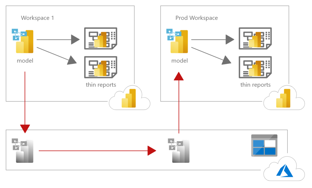
When you have really large data models loaded in powerbi.com there are challenges around quickly loading gigs of data into a data model. This is particularly challenging when working with data models in production. When changes are made which require a full load of data tables this can take hours to refresh. This means when a production change needs to be made, this should be done in low use times, evenings or over the weekend. What if we could greatly increase the load speed? but, we can!!
Below is a high level architecture and movement of the Power BI data models across the blob storage account.
The Solution
The high level solution goes something like this:
Create two workspaces, one in prod and one for pre-loading data
Connect both workspaces to premium
Turn both premium capacities to large dataset capacities
Link azure storage to both workspaces
Publish a modified data model into the pre-load workspace, this contains the changes to the data model.
kick off a full load of the data model in the pre-load workspace
Open SSMS connect to the backup the pre-load workspace XMLA endpoint
Backup the pre-loaded model to azure blob storage using SSMS
Open azure bob storage, copy and paste the .abf file into the prod workspace
Use SSMS to connect to the prod workspace XMLA endpoint
Use the restore feature from SSMS to load the .abf file back into the model in production
Instructions
Below are the step by step instructions as show throughout the experience.
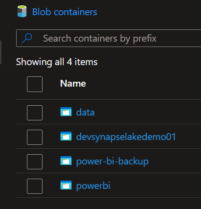
When you link your Power BI workspaces you will see inside the Blob storage a folder for powerbi and another folder for power-bi-backup. Note, it is important that both workspaces the pre-loading data workspace and the prod workspace point to the same blob storage account.
For each workspace PowerBI.com will create a single folder for each workspace. See below we have two workspaces for this demo.
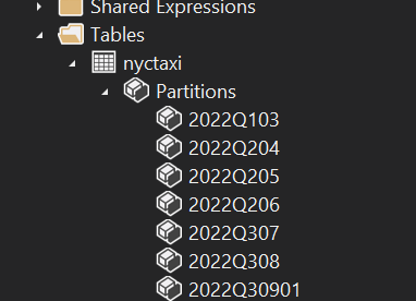
We can use the XMLA endpoint found in the workspace settings to connect and see the partitions within our data model. For this example we have a pre-loaded dataset called nyctaxi. This dataset was deployed into a workspace and fully refreshed loading all the data into all the partitions.
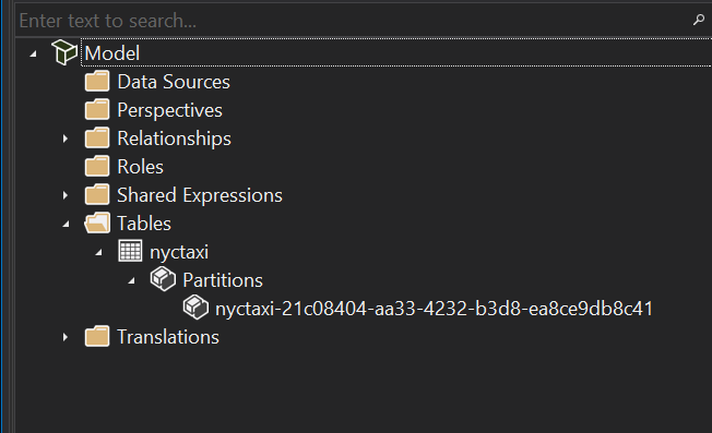
Below is a the same dataset, with the exception there are no partitions preloaded. We assume we are going to use the backup created from the above dataset and then load the partitions into the Prod model.
Note: in this example we are pushing all the partitions and all data in the partitions into production. Usually your production model will already have partitions. Thus, it is easier to show our model adding partitions for this demo. If you really want to confirm the data is correctly being restored from backups you would look at the row counts found in each partition.
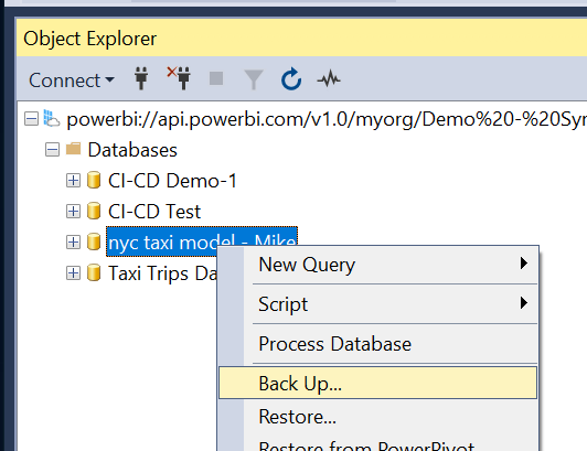
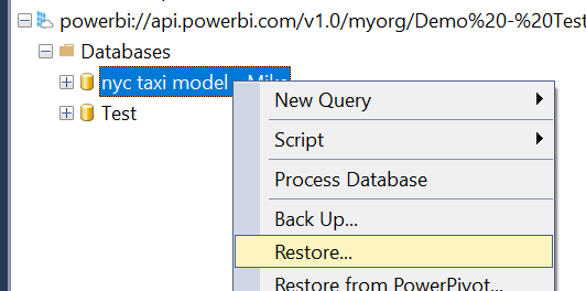
Here we log into the pre-loaded data set using SSMS.
Right Click on the data model that you are going to backup. Select the option labeled Back Up… in the drop down menu.
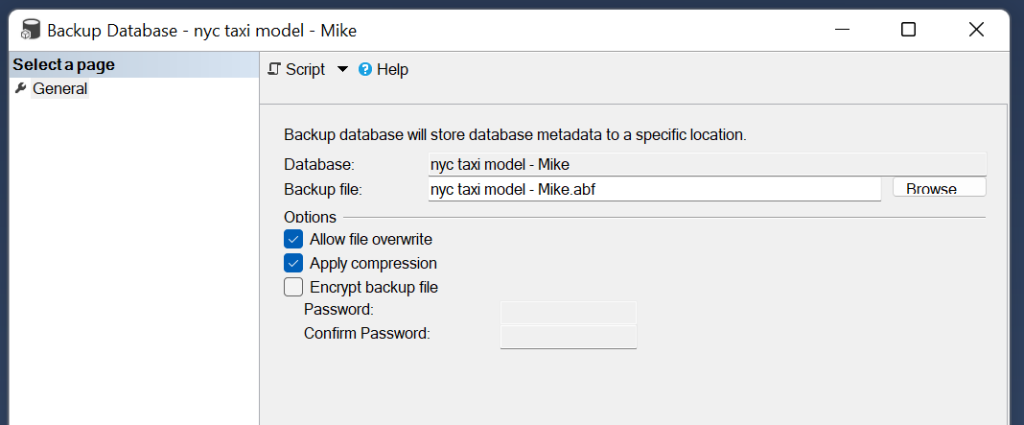
After clicking Back Up… a menu will appear letting you to name the backup file.
It is recommended to allow the file to be overwritten and to apply compression to the files. Once your settings have been configured, then you can Click the OK button at the bottom of the window to accept the changes.
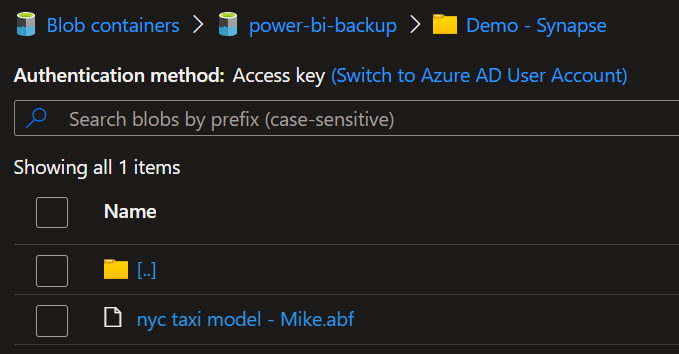
After the backup completes we will be able to see the .abf file inside the blob storage folder.
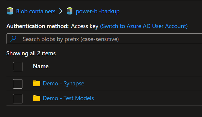
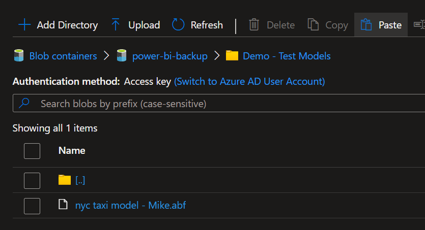
Using the copy and paste buttons form the azure portal you move the files between the workspace folders.
Below is the copied model .abf file from the demo-synapse (pre-loaded data) into the Prod workspace named (Demo – Test Models).
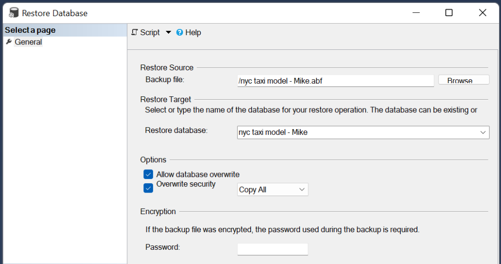
In SSMS we connect to the production workspace. Again Right click on the data model and select Restore… shown in the drop down menu.
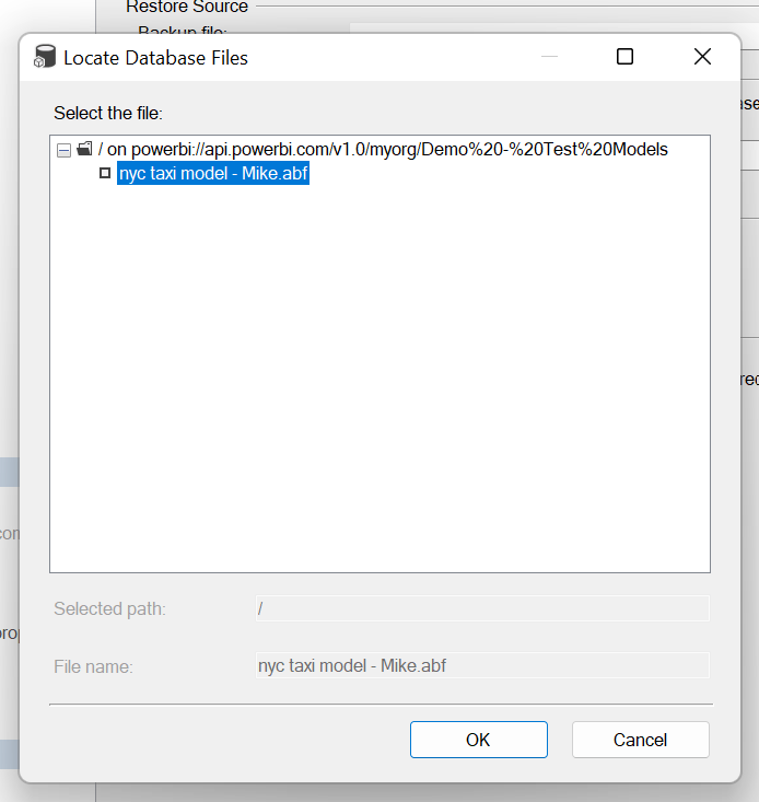
The restore menu will appear. In this menu clicking on the Browse button will bring up another window letting the user to select the data model from the storage account.
Note: on this screen you will need to select Allow database overwrite and it is optional to select if you want to Overwrite security
Below is a screen shot of the selection screen for picking the model
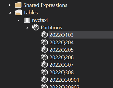
Once the restore has completed we can go back to our production model and see we now have partitions loaded.
If you like the content from PowerBI.Tips please follow us on all the social outlets. Stay up to date on all the latest features and free tutorials. Subscribe to our YouTube Channel. Or follow us on the social channels, Twitter and LinkedIn where we will post all the announcements for new tutorials and content.
Introducing our PowerBI.tips SWAG store. Check out all the fun PowerBI.tips clothing and products:
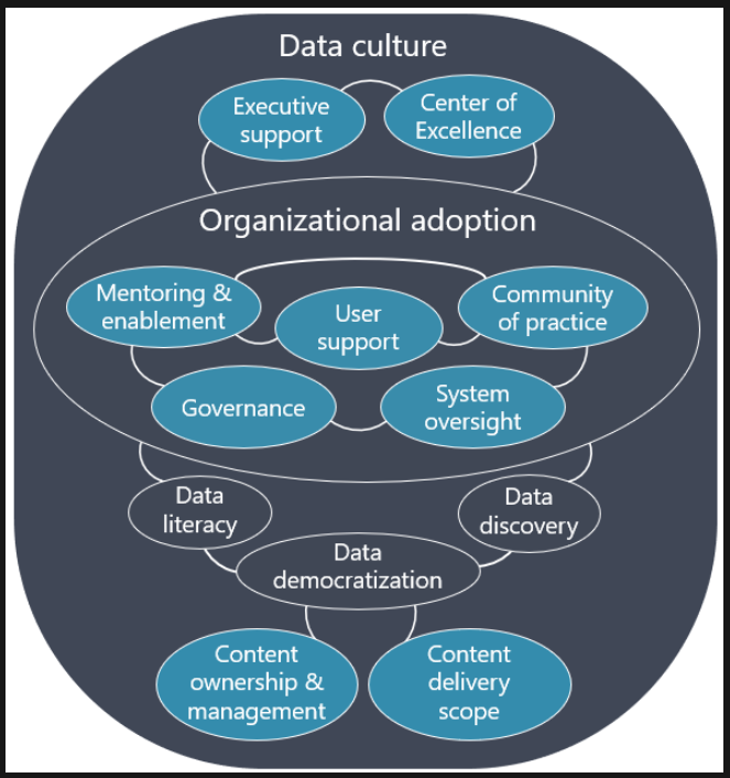
This month we partnered with the relaunch of the Des Moines user group to host Matthew Roche. This month’s topic is all about data culture. If you don’t know Matthew you should get to know him. His experience in developing enterprise data access is second to none. Along this journey of working with the largest Microsoft clients Matthew has learned a lot about their data cultures.
Obviously working with so many companies you can see what works and what does not. In this video webinar, Matthew discusses what is Data Culture. Additionally, there are aspects of what determines a successful environment.
Massive thank you to Matthew our presenter. Huge shout out to James Bartlett and Dipo Thompson for the planning. Be sure to follow our presenters on LinkedIn.
Matthew has also worked on many other impactful projects. One such project has been the Power BI Roadmap. This the best guide for individuals wanting to start their Power BI journey. On the Explicit Measures Podcast we discuss the Power BI roadmap quite often. Thus, we feel it adds a ton of value. Check it out for yourself.
If you like the content from PowerBI.Tips please follow us on all the social outlets. Stay up to date on all the latest features and free tutorials. Subscribe to our YouTube Channel. Or follow us on the social channels, Twitter and LinkedIn where we will post all the announcements for new tutorials and content.
Introducing our PowerBI.tips SWAG store. Check out all the fun PowerBI.tips clothing and products:
Where does the Power BI Mobile app fit within your report building plan? This topic is widely un-discussed within the Power BI community. Many blogs and tutorials focus mainly on developing Power BI reports for a desktop screen. More specifically, a report design that fits a wide screen monitor. However, building reports for the mobile app require additional considerations.
The Current State of Mobile
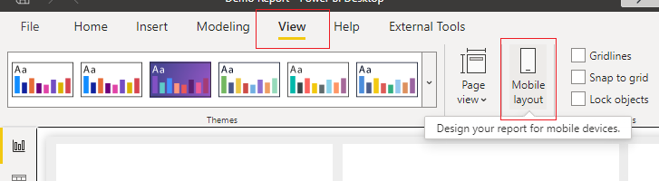
First before we get to the recommendations for mobile reporting developments, let us discuss the current status of building a mobile report. To create a mobile centric view Power BI desktop follow these steps:
Click on the View ribbon
Click on the button labeled Mobile layout
Click on the Mobile Layout
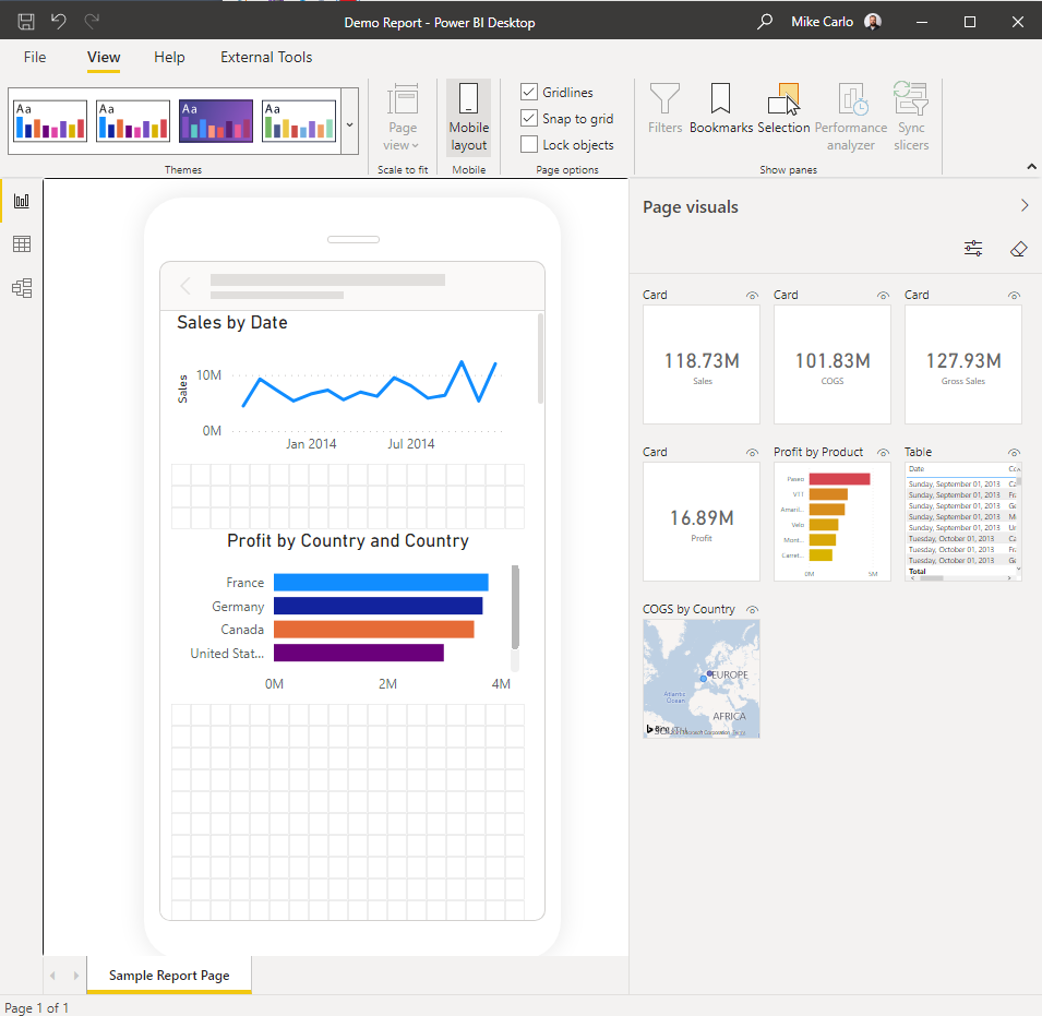
Portrait Mode Only
This takes you to a new screen where the mobile device is positioned in portrait mode. At the time of writing this article there are no options to build a mobile view in landscape. If you desire to have a mobile report that can be viewed in landscape mode you actually have to create a normal report view but with a narrower screen.
View of building reports in the mobile view.
Simplified Build Experience
The report canvas is greatly simplified. Meaning you don’t get all the advanced features of a normal report page. Stacking visuals on top of each other is not an option. Changing the color of the background is not an option on this screen. Instead, to change the mobile page background color you have to leave the mobile view. Return to desktop mode change the color and then return to the mobile view.
An Alternative Approach
Due to the limitations mentioned above. We propose that you build a report page with custom dimensions. From my experimentation a width of a page from 600 to 800 pixels meets my needs. The page length can be as long as you need it so that all the required visuals can fit on the page. Previously pages have grown to 1000 to 2000 pixels in length.
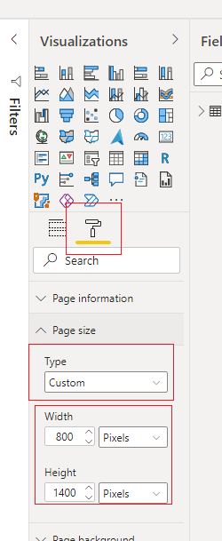
How to customize the page size?
Follow these instructions to change the page size
Click somewhere on the Report page to deselect any visuals
Open up the Visualizations Pane
Click on the Format button; the one that looks like a paint roller
Open the section named Page Size
Change the drop down menu for Type to be Custom
Type in a new Width and Height for the page
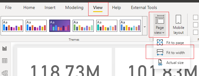
Change View of Report for scrolling
By making the page narrower but longer, the default view of the report will cause UX challenges. To fix this the report is will need to render as a scrollable object. To do this we adjust the view settings of the page
Click on the View ribbon
Click on the button named Page View
A drop down menu will appear
From this dropdown menu Click on the option named Fit to width
Fit Page to Width
Other UI / UX Considerations
As a report designer it is important to consider the UI for report consumers. In most reports I design everything that the user can see fits on a single page. Scrolling on a page is not a major issue. As we introduce scrolling on mobile we run into issues with some visuals.
Table Visuals Cause Issues
Take for example a table visual. This visual it’s self has scrolling built in. Thus, if you are scrolling a page on mobile when you touch inside the table and swipe up the mobile experience swipes the table visual. This UX can lead users to get suck inside a table when attempting to scroll the page.
Table Scrolling Solution
A solution to address users getting stuck inside a table is to provide a pixel boarder. The boarder can be either dual boarders on the left and right or just one boarder on the left or right. Inside this boarder do not place any visuals that would require scrolling, such as a table.
Adding a Scrim for added Clarity
In addition to just retaining a pixel gap on the sides I recommend also adding some color to the background. The concept of the color either in blocks or via a gradient color. See the following sample scrim for reference.
If you like the content from PowerBI.Tips please follow us on all the social outlets. Stay up to date on all the latest features and free tutorials. Subscribe to our YouTube Channel. Or follow us on the social channels, Twitter and LinkedIn where we will post all the announcements for new tutorials and content.
Introducing our PowerBI.tips SWAG store. Check out all the fun PowerBI.tips clothing and products:
Well, it’s Friday, time to take a little break and play the Dice Game! The Power BI community is creative and is always developing amazing ideas. This is another incredible example that you can play right in Power BI! The brain child of this game is Kerry Kolosko, an Analyst out of of Australia.
Play the game
Below is a sample of the game. Again, fully built in PowerBI. Check out give it a good old roll of the dice!
The Magic in the Game
There are animations moving elements all on the report canvas. Rounded buttons to click on. All sorts of neat visual elements. These creative elements are capable via a custom visual, HTML Content. The HTML Content visual is maintained by Daniel Patrick-Marsh.
Daniel’s work on custom visual development is top notch. So if you are super impressed with this report go download this visual from App Source.
If you like the content from PowerBI.Tips please follow us on all the social outlets. Stay up to date on all the latest features and free tutorials. Subscribe to our YouTube Channel. Or follow us on the social channels, Twitter and LinkedIn where we will post all the announcements for new tutorials and content.
Introducing our PowerBI.tips SWAG store. Check out all the fun PowerBI.tips clothing and products:
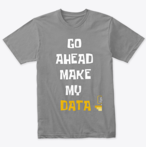
Check out the new Merch!
Hasta La Vista Data
Go Ahead Make My Data
PBIX Hat
Manage Consent
To provide the best experiences, we use technologies like cookies to store and/or access device information. Consenting to these technologies will allow us to process data such as browsing behavior or unique IDs on this site. Not consenting or withdrawing consent, may adversely affect certain features and functions.
Functional
Always active
The technical storage or access is strictly necessary for the legitimate purpose of enabling the use of a specific service explicitly requested by the subscriber or user, or for the sole purpose of carrying out the transmission of a communication over an electronic communications network.
Preferences
The technical storage or access is necessary for the legitimate purpose of storing preferences that are not requested by the subscriber or user.
Statistics
The technical storage or access that is used exclusively for statistical purposes.The technical storage or access that is used exclusively for anonymous statistical purposes. Without a subpoena, voluntary compliance on the part of your Internet Service Provider, or additional records from a third party, information stored or retrieved for this purpose alone cannot usually be used to identify you.
Marketing
The technical storage or access is required to create user profiles to send advertising, or to track the user on a website or across several websites for similar marketing purposes.