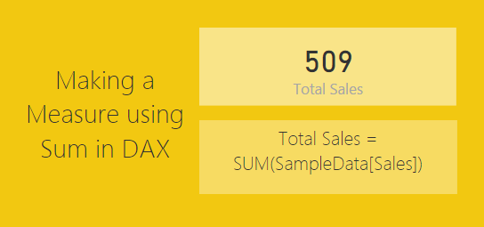
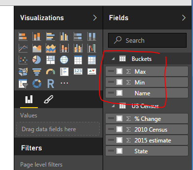
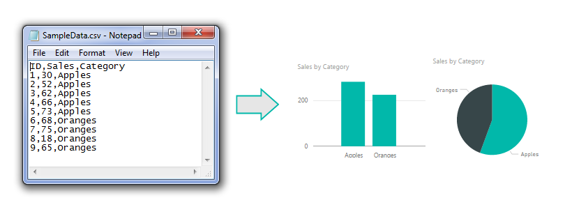
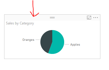
Often there are times when you will want to display a totals. Using measures to calculate a total are extremely easy to use. The power of using a measure is when you are slicing and selecting different data points on a page. As you select different data points the sum will change to reflect the selected data. See sample of what we will be building today below.
Materials for this Tutorial are:
Power BI Desktop (I’m using the April 2016 version, 2.34.4372.322) download the latest version from Microsoft Here.
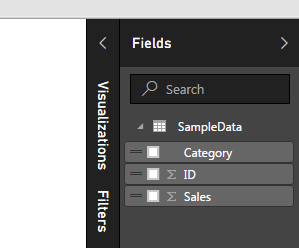
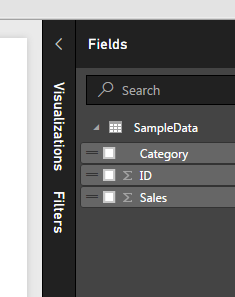
Once you’ve loaded the CSV file into Power BI Desktop your fields items should resemble the following:
Fields List
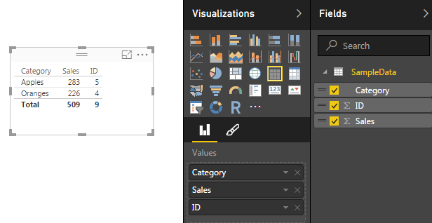
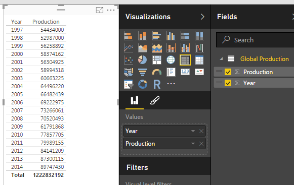
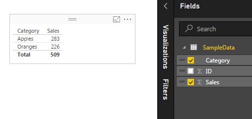
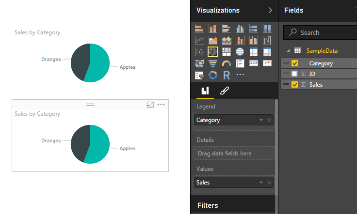
Add the Table visual from the visualizations bar into the Page area. Drag the following items into the newly created table visualization, Category, Sales, and ID. Your table should look like the following:
Table of Data
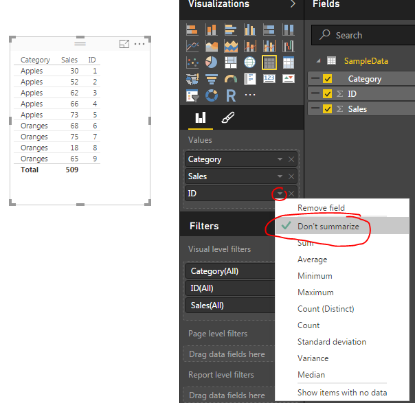
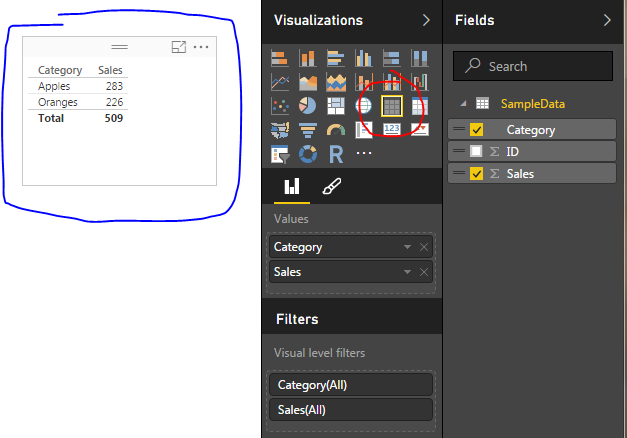
Click the Triangle next to the ID column under the Values section in the Visualization bar. A menu will appear, select the top item labeled Don’t Summarize.
Do not Summarize Data for ID
This reveal all the unique items in our table of data. Now, we will create our measures for calculating totals. On the Home ribbon click the New Measure button. Enter in the following DAX expression.
Total Sales = SUM(SampleData[Sales])
Note: In the equation above everything before the equals sign is the name of the measure. All items after the equation sign is the DAX expression. In this case we are taking a SUM of all the items in the Table SampleData from the column labeled Sales.
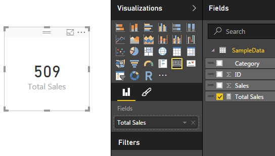
This will total all the items in the sales column. Click on the Card visual and add the Total Sales measure to the card. Your new card should look like the following.
Total Sales Measure
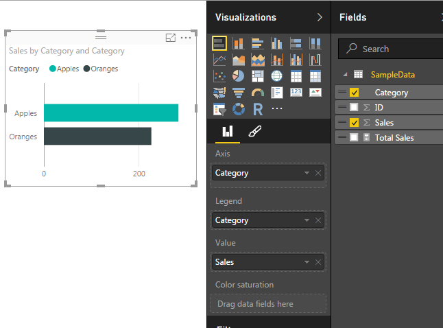
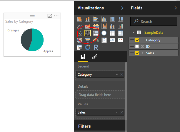
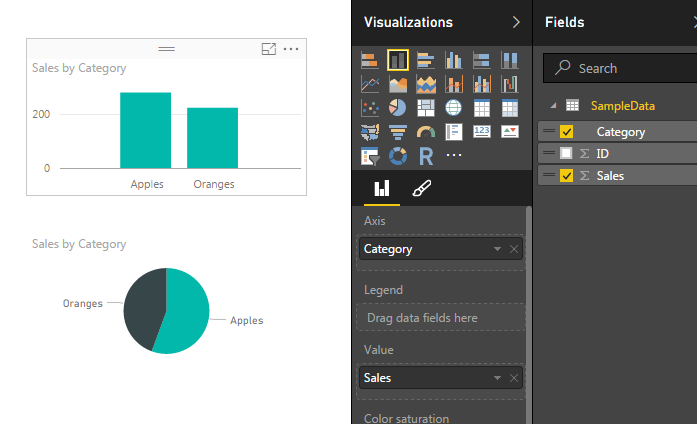
Next we will add a bar chart to show how the data changes when the user selects various items on the page to filter down to different results. Add the Stacked Bar Chart to the page. In the Axis & Legend selectors add the Category column, and add the Sales column to the Value selector. This will yield the following bar chart.
Bar Chart
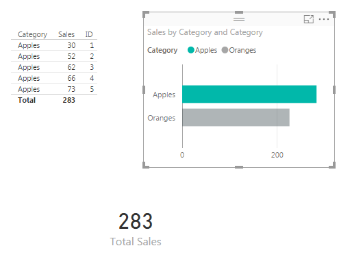
Now we can click on items in the bar chart to see how the table of data and the Total Sales changes for each selection. Clicking on the bar labeled Apples provides a total sales of 283, and clicking on the Oranges shows a total of 226.
Apples Bar Selected
Our measure is complete. Now we can select different visualizations and each time we do PowerBI is filtering the table of available data down to a smaller subset.
Pro Tip: When building different visuals and measures often it is helpful to have a table showing what data is being filtered when you interact with the different visuals. Sometimes the filters that you are applying by clicking on a visual interact in non-expected ways. The table helps you see these changes.
We have now completed a measure that is calculating a total of all the numeric values in one column.
Want to learn more about PowerBI and Using DAX. Check out this great book from Rob Collie talking the power of DAX. The book covers topics applicable for both PowerBI and Power Pivot inside excel. I’ve personally read it and Rob has a great way of interjecting some fun humor while teaching you the essentials of DAX.
In our last post we built our first measure to make calculated buckets for our data, found here. For this tutorial we will explore the power making measures using Data Analysis Expressions (DAX).
When starting out in Power BI one area where I really struggled was how to created % change calculations. This seems like a simple ask and it is if you know DAX.
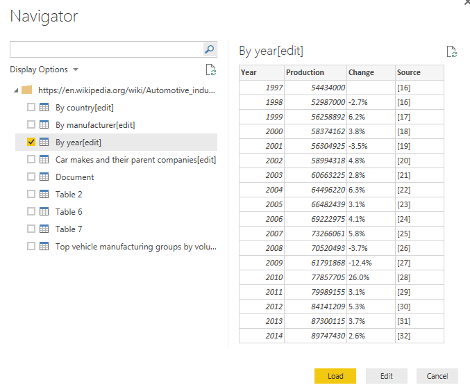
Alright lets go find some data. We are going to go grab data from Wikipedia again. I know, the data isn’t to reliable but it is fun to play with something that resembles real data. Below is the source of data:
https://en.wikipedia.org/wiki/Automotive_industry
To acquire the data from Wikipedia refer to this tutorial on the process. Use the Get Data button, click on Other on the left, select the first item, Web. Enter the webpage provided above in the URL box. Click OK to load the data from the webpage. For our analysis we will be completing a year over year percent change. Thus, select the table labeled By Year[edit]. Data should look like the following:
Global Auto Production Wikipedia
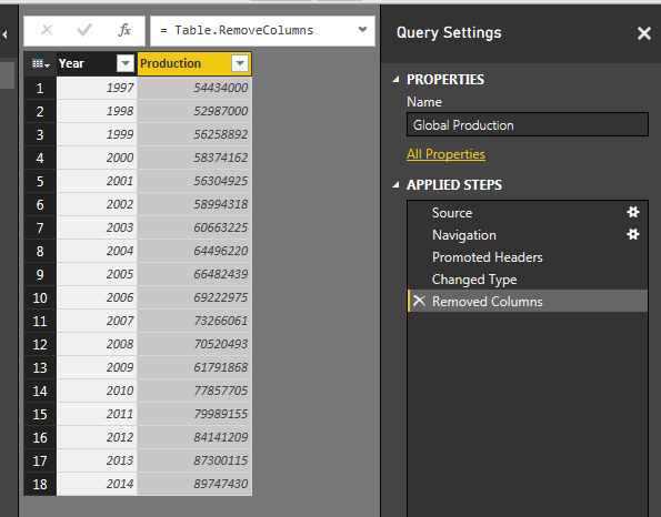
This is the total number of automotive vehicles made each year globally from 1997 to 2014. Click Edit to edit the data before it loads into the data model. While in the Query Editor remove the two columns labeled % Change and Source. Change the Name to be Global Production. Your data will look like the following:
Global Production Data
Click Close & Apply on the Home ribbon to load the data into the Data Model.
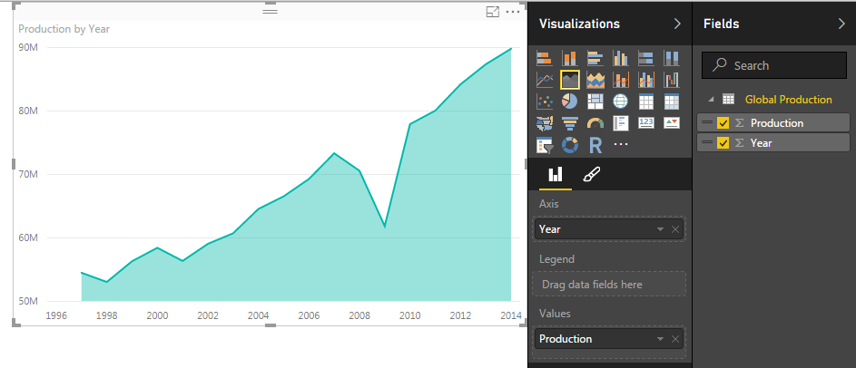
Add a quick visual to see the global production. Click the Area Chart icon, and add the following fields to the visual, Axis = Year, Values = Production. Your visual should look something like this:
Area Chart of Global Production
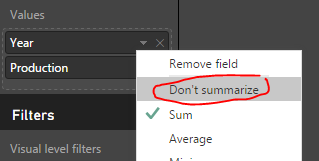
Next we will add a table to see all the individual values for each year. Click the Table visual to add a blank table to the page. Add Both Year and Production to the Values field of the visual. Notice how we have a total for both the year and production volumes. Click the triangle next to Year and change the drop down to Don’t summarize.
Change to Don’t Summarize
This will remove the totaled amount in the year column and will now show each year with the total of Global Production for each year. Your table visual should now look like the following:
Table of Global Production
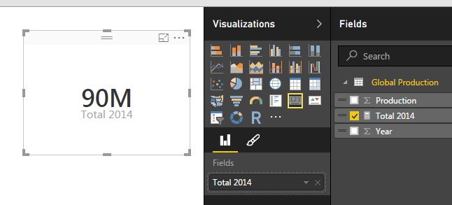
Now that we have the set up lets calculate some measures with DAX. Click on the button called New Measure on the Home ribbon. The formula bar will appear. We will first calculate the total production for 2014. We will build on this equation to create the percent change. Use the following equation to calculate the sum of all the items in the production column that have a year value of 2014.
Total 2014 = CALCULATE(sum('Global Production'[Production]),FILTER('Global Production','Global Production'[Year] = 2014))
Note: I know there is only one data point in our data but go alone with me according to the principle. In larger data sets you’ll most likely have multiple numbers for each year, thus you’ll have to make a total for a period time, a year, the month, the week, etc..
This yields a measure that is calculating only the total global production in 2014. Add a Card visual and add our new measure “Total 2014” to the Fields. This shows the visual as follows, we have 90 million vehicles produced in 2014.
2014 Production
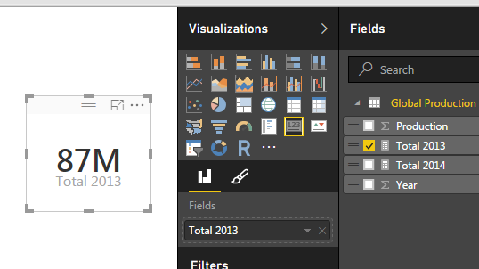
Repeat the process above instead use 2013 in the Measure as follows:
Total 2013 = CALCULATE(sum('Global Production'[Production]),FILTER('Global Production','Global Production'[Year] = 2013))
This creates another measure for all the production in 2013. Below is the Card for the 2013 Production total.
2013 Production
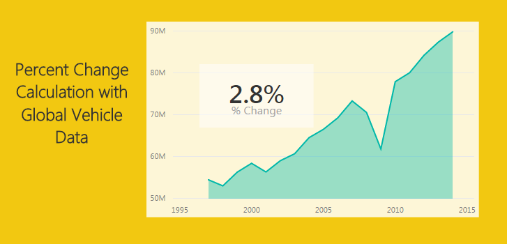
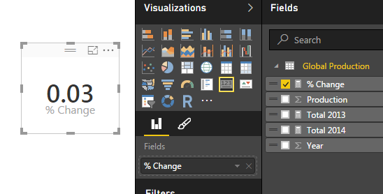
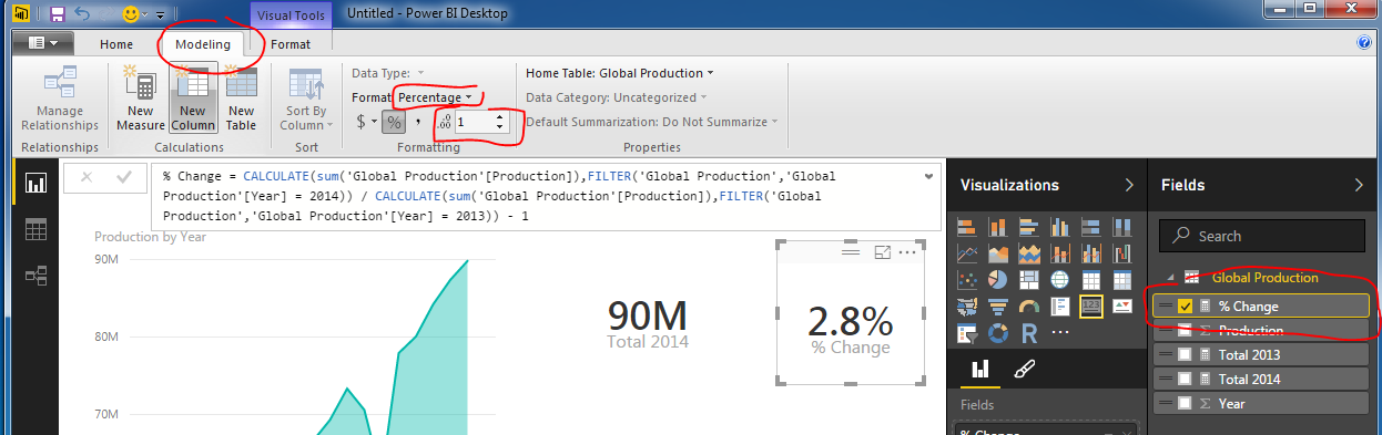
And for my final trick of the evening I’ll calculate the percent change between 2014 and 2013. To to this we will copy the portions of the two previously created measure to create the percent change calculation which follows the formula [(New Value) / (Old Value)]- 1.
This makes for a long equation but now we have calculated % change between 2013 and 2014.
Percent Change
Wait you say. That seems really small, 0.03 % change is next to nothing. Well, I applaud you for catching that. This number is formatted as a decimal number and not a percentage, even though we labeled it as % change. Click the measure labeled % Change and then Click on the Modeling ribbon. Change the formatting from General to Percentage with one decimal. Notice we now have a percentage.
Change Format to Percentage
Thanks for working along with me. Stay tuned for more on percent change. Next we will work on calculating the percent change dynamically instead of hard coding the year values into the measures.
Want to learn more about PowerBI and Using DAX. Check out this great book from Rob Collie talking the power of DAX. The book covers topics applicable for both PowerBI and Power Pivot inside excel. I’ve personally read it and Rob has a great way of interjecting some fun humor while teaching you the essentials of DAX.
Alright to start this Tutorial off right we are going to incorporate the new feature released this spring from Power BI, called publish to web. Below you can view last weeks tutorial and interact with the data. Feel free to click around to see how the visualization works (you can click the shaded states or on the state names at the bottom.
For this tutorial we will build upon the last tutorial, From Wikipedia to Colorful Map. If you want to follow along in this tutorial click on the link and complete the previous tutorial.
Materials:
Power BI Desktop (I’m using the March 2016 version, 2.33.4337.281) download the latest version from Microsoft Here.
Mapping PBIX file from last tutorial download Maps Tutorial to get a jump start.
Picking up where we left off we have data by state with data from the 2010 Census and 2015 Census.
Data from Region Maps Tutorial
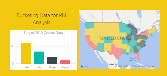
What we would like to identify is how many states are within a given population range. Say I wanted to see on the map, or in a table all the states that had 4 million or less in population in 2010.
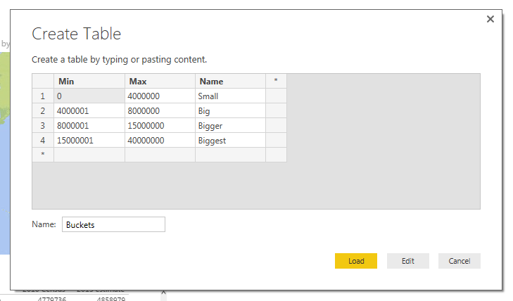
To do this we will create bins for our data. Enter custom data in this format. For the tutorial on entering custom data into Power BI Desktop check out this tutorial on Manually Enter Data. Click on the Enter Data button on the Home ribbon. Enter the data as following:
Enter Bucket Data
Note: Make sure you name the new table Buckets as shown in the image above.
Click Load to bring the data into the data model. Notice we now have a new table in the Field column on the right.
Buckets Table
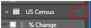
Next we will create a measure to evaluate the state level data into our newly created buckets. This will be produced using DAX (Data Analysis Expressions). DAX is an extremely powerful language which is used in SQL applications and Analysis Services. More information can be found on DAX here. Since DAX is so complex we won’t go into a full explanation here. However, we will have many more topics in the future working on and building DAX equations.
Click the Ellipsis next to the table labeled US Census. Then click the first item in the list labeled New Measure.
Note: Ellipsis is the term used for those triple dots found in newer Microsoft applications.
Example of Ellipsis
A formula bar opens up underneath the ribbons bar. Here is where we will name and type in the new measure. The equation we will need to add is the following.
Explanation of Equation: All text before the equal sign is the name of the measure. All the data behind the equal sign is the DAX expression. Essentially this equation is calculating the number of rows where we have data between the Buckets “Min” value and Buckets “Max” value. This is the magic that is DAX. In this simple expression we can compare all our data against our buckets ranges we made earlier.
Finally our new Bin measure should look like the following.
Bin Measure Created
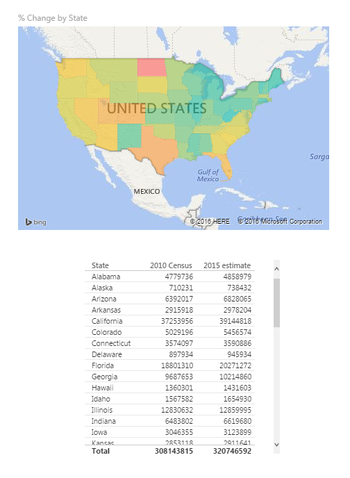
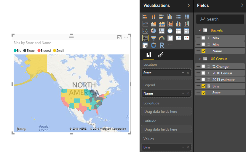
Now lets modify our visuals to incorporate the new Bins measure. Click on the existing map on the page. Remove the % Change item from the Values selection. Add the Bins Measure to the Values section. Notice the map changes color. Next, add the Name field from the table called Buckets into the Legend field. Our map should look similar to the following:
Map with Bins Added
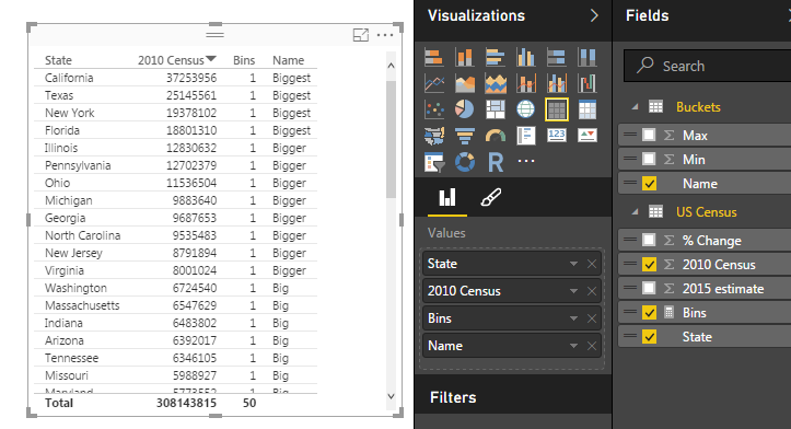
Next Click on State, 2010 Census, Bins, and Name (from Buckets table) and make a table. It should look like the following:
Table of Bins Measure
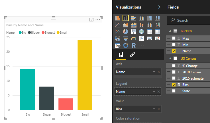
Lastly, we will build a bar chart using our Bins Measure. Click on the Stacked Column Chart Visual and add the following items to the corresponding categories: Axis = Name (from the Buckets table), Legend = Name, and Value = Bins (from US Census table). This will yield the following visual.
Bins in Bar Chart
Click on the Ellipsis of the bar chart and then click Sort By, finally click Bins. This will order the items in descending order by the count of the items found in each bin.
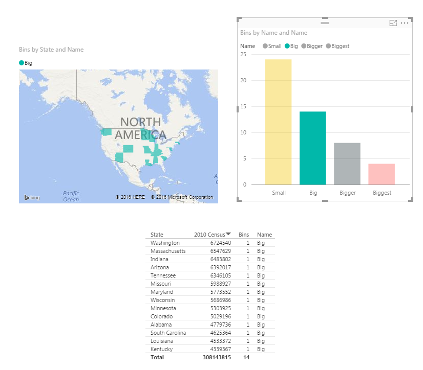
Now have fun with your new data. Click on each of the bars in the bar chart and watch your data transform between the table, and the map.
Selection Big in the Bar Chart
Here is the final product if you want to engage with the data.
I have to give credit where credit is due. Below is the page from Power Pivot Pro that I used to create binning in the tutorial chart. The binning shown on PowerPivotPro is for Power Pivot but the functionality is the same. Enjoy.
Want to learn more about PowerBI and Using DAX. Check out this great book from Rob Collie talking the power of DAX. The book covers topics applicable for both PowerBI and Power Pivot inside excel. I’ve personally read it and Rob has a great way of interjecting some fun humor while teaching you the essentials of DAX.
For this tutorial we are going to get some real data from the web. One of the easiest sources to acquire information from is Wikipedia. I will caveat this by saying, it is easy to get data from Wikipedia, but I don’t know if you can always trust the reliability. That being said, we are going to acquire the U.S. population and growth rate from 2010 to 2015 from the Wikipedia Web page.
Materials:
Power BI Desktop (I’m using the March 2016 version, 2.33.4337.281) download the latest version from Microsoft Here.
Link to the data from Wikipedia, Here. ( https://en.wikipedia.org/wiki/List_of_U.S._states_by_population_growth_rate )
Let’s begin.
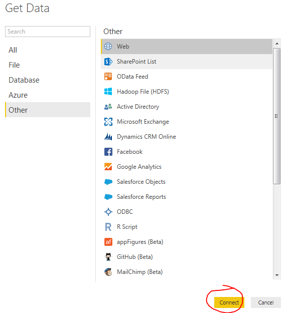
Open up Power BI Desktop. Click on the Get Data button. On the left of the Get Data menu click Other then select the first item titled Web. Click Connect to continue.
Get Data from Web
In the From Web window enter in the following web address. You can copy and paste it from below.
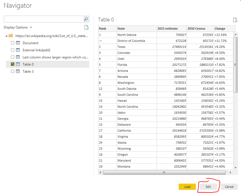
Click OK to move to the next menu. After a bit of thinking the Power BI will present the Navigator window. This is what Power BI has found at that specific web address. On the left side of the screen there is a folder. This is the web page folder location that we loaded earlier. Power BI then intelligently looks through the website code for tables it can distinguish. By clicking on each table you can see a preview of the data returned on the right side of the window.
Try clicking on the various tables such as Document, External links, or Table 0. For our example lets click on Table 0. Click on the button at the right hand corner labeled Edit. We are going to slightly modify this data before we load it to the data model.
Navigator Window
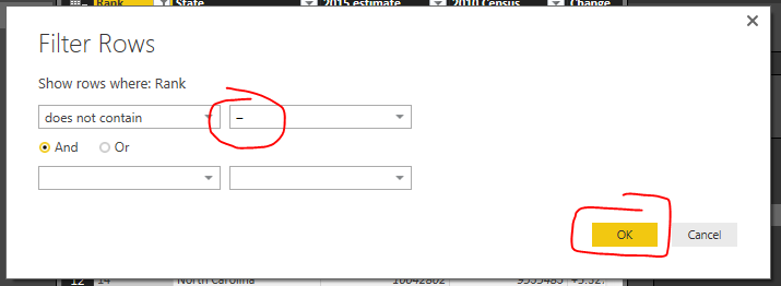
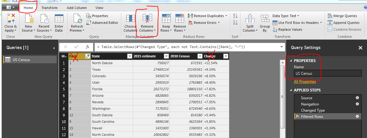
You’ll notice once we load the data there are some items we’d like to remove. In row #2 the label is District of Columbia, which technically isn’t a state. Also further down we see in row #25, the entire U.S. population is shown. Again, we don’t want these values to show, we only want the 50 states. To remove this data we will use a text filter to remove any item in the Rank column that has a “–” (which is called an em-dash, see note below for more details on how to select this text character).
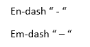
Note: There are two kinds of dashes that your computer uses. One is called the en-dash(-), the second being the em-dash(–). It is very hard to distinguish the difference between the two dashes. The image below shows a better contrast when used in Microsoft Word.
Em-Dash vs. En-Dash
The en-dash is shorter than the Em-dash. The Key for the en-dash is next to the number 0 on your keyboard. To select the em-dash you need to use a bit of Microsoft trickery. The Em-dash will be presented when you hold the Alt key and type 0151 on a keypad. This selects the specific ASCII character for the em-dash. For more information on selecting the em-dash visit here.
Click the drown down button in the column labeled Rank. Select the item labeled Text Filters, and then Click Does Not Contain…
Text Filter on Rank Column
Enter in the em-dash code by using Alt 0151 to enter in the correct dash into the Filter Rows dialog box. Click OK to proceed.
Enter EM-Dash in Filter Rows Dialog
If we entered the correct em-dash we will now be presented with a cleaned list of U.S. states with only numbered items in the Rank column.
Next we will clean up the query slightly to make it easier to deal with. Delete the column labeled Rank, and Change. Rename the query to something a little more meaning full such as US Census.
Remove Columns & Rename Query
Note: You can delete a column by pressing the Remove Columns button on the Home ribbon. A second method is to right click with your mouse on the column you want to remove and selecting Remove.
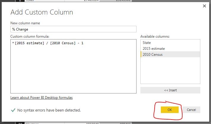
Next we will add our own calculated column which will calculate the 2010 to 2015 percent change. Click the ribbon labeled Add Column and select the first icon on the far left labeled Add Custom Column. The Add Custom Column dialog box will open. Enter the name for the new column, then by clicking on the columns in the available columns on the right you can build an equation. For this example we are using the percent change calculation which is the following:
Percent Change = [New Value / Old Value ]- 1
Using the columns we imported from Wikipedia we will have the following equation:
= [2015 estimate] / [2010 Census] - 1

Update: this formula has now changed to 2016 estimate as time has progressed since this first tutorial was posted.
The new column should have this following formula: = [2016 estimate] / [2010 Census] - 1
This inserts a new column with the calculated percent change between the 2010 census and the 2015 census. Click OK to proceed.
Add Custom Column
Finally we want to change the type of data in the % Change column so our data model will operate as expected when producing visuals. Click the Home ribbon, then click the % Change column. Change the Data Type: from Any to Decimal Number. This informs the data Model how to treat the data held the % Change column. We are finished data modeling and now click Close & Apply on the Home ribbon.
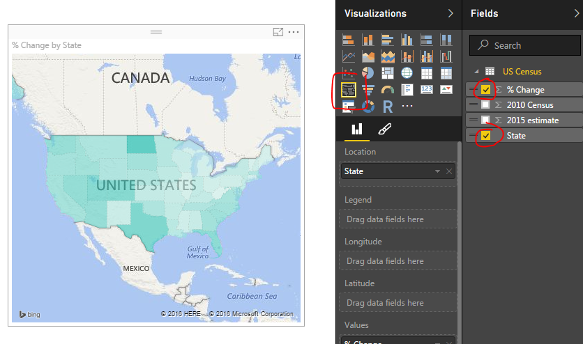
Now we have all our data loaded into the data model ready to build a map.
Click the Column labeled State and then click % Change. This yields a map with circles on it. Change the visual to a filled map by selecting a different visual, the Filled Map icon (circled in red below). Doing so produces a shaded map of the US, where each state is colored according to the % Change.
Filled Map Selection
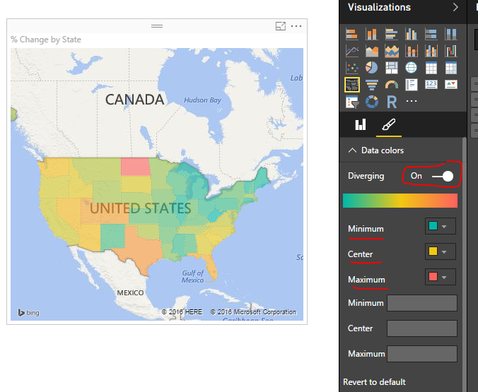
Finally lets add some color to the data. Click the visual’s Format properties (the little paint brush in the visuals window). Expand the Data Colors section by clicking on the title Data colors. Diverging is set to off. Change it to On. Change the Minimum color to Green, the Center color to Yellow, and the Maximum color to Red.
Colored Map
The states with the largest population change are in Red, while all the states with the smallest population change.
This tutorial is a real simple mapping exercise. I was talking with a colleague today about Power BI and I was challenged to map something using latitude and longitude. I had played with mapping before but not using latitude or longitude.
I’d have to say if you want to impress someone with your PowerBI skills adding a map is a good way to do so. Typically this a functionality that you can’t add into excel, well at least not with out some serious effort.
Alright, here we go..
Resources for this project are:
Power BI Desktop (I’m using the March 2016 version, 2.33.4337.281) download the latest version from Microsoft Here.
Excel file with a table in it with our location information that can be downloaded here: Locations Data Set
After downloading the Locations Data Set, Open up PowerBI and load the Excel file into Power BI. If you need to learn how to load Excel files you can follow the loading excel tutorial.
Click the Get Data on the Home ribbon. Select the first option Excel and click Connect at the bottom of the Get Data window.
Navigate to the downloaded file called Locations.xlsx and open the file by clicking Open in the bottom right hand corner.
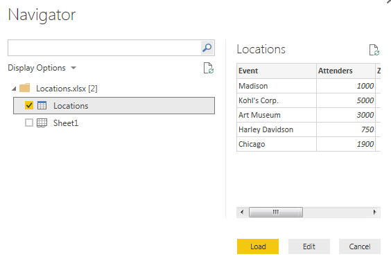
Next, the navigator window will open. Select the table (denoted with the grid with a blue top header) called Locations. Then Click Load to load the data into the data model.
Navigator Window Selection
Note: there are two different icons in the Navigator window. One is called Locations which is a Table within the Excel document. While the other is called Sheet1, which is simply the first sheet in the excel workbook. For Future references it is much easier to make tables in excel and use them to load data in to PowerBI than using just a worksheet. So whenever possible try to form your data in Excel into Tables. When loading a table the headers of the table automatically load into the column names in the PowerBI data models.
We now have loaded the data into a new Table in PowerBI called Locations.
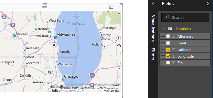
To make the map check the boxes for Latitude and Longitude. Power BI intelligently understands that latitude and Longitude are mapping functions and we are now presented with a map with tiny blue dots.
Map from our Data
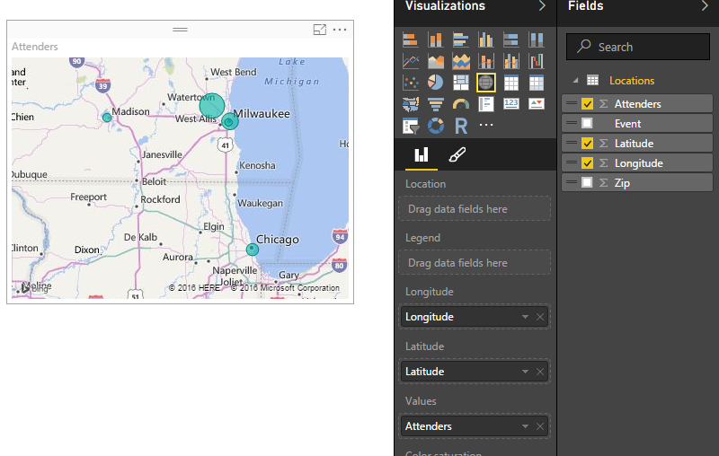
Lets add some more data to enhance the map. We can change the size of the circles at each location by dragging the column called Attenders over to the Values field for this visual.
Change Bubble Size
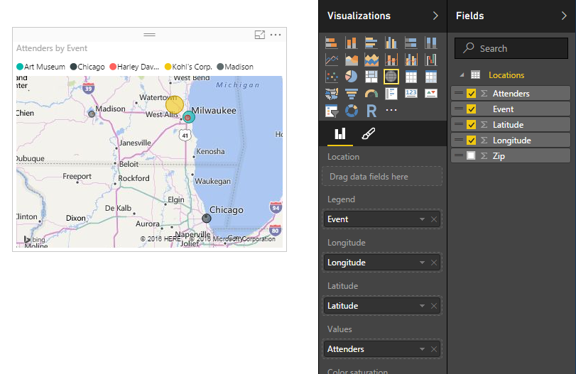
We have now changed the size of the circles relative to each other to show the number of people that we saw at each location. To add color to the map drag the column called Event to the Legend option of the visual. This yields a map that now has each circle with a different color according to the event name.
Colored Bubbles on a Map
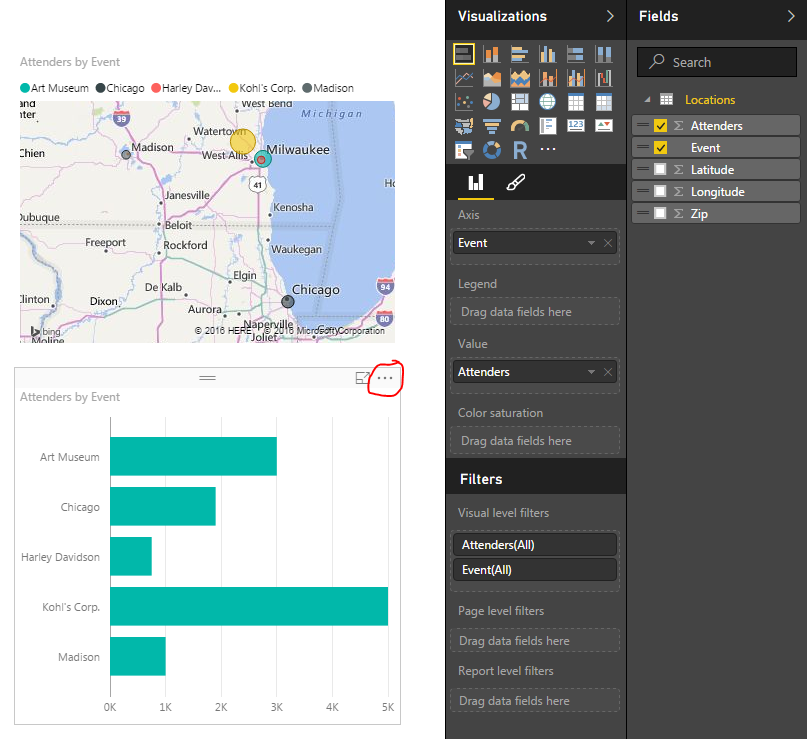
To enhance our visual further we will add a bar chart with the total count of attenders per event. To do this click any where on the visual page (this will de-select the map visual on the page). Now click the Event column and then the Attenders column. This will present you with a table list of events and the corresponding attendees. Leaving the table visual highlighted click the Stacked Bar Chart which is in the upper left hand corner of the Visualizations window.
Adding a Bar Chart
I circled the triple dots on the bar chart. Click the triple dots and a menu will appear. First click Sort By, then click Attenders. This will sort the attenders in descending order from the largest amount at Kohl’s Corp. down to Harley Davidson. Drag the column labeled Event to the visualization option called Legend. This colors the bar chart.
Colored Bar Chart
Note: The colors in the bar chart match the colors in the map we made earlier. This build uniformity in your reports and when your filtering items colors across visuals make sense.
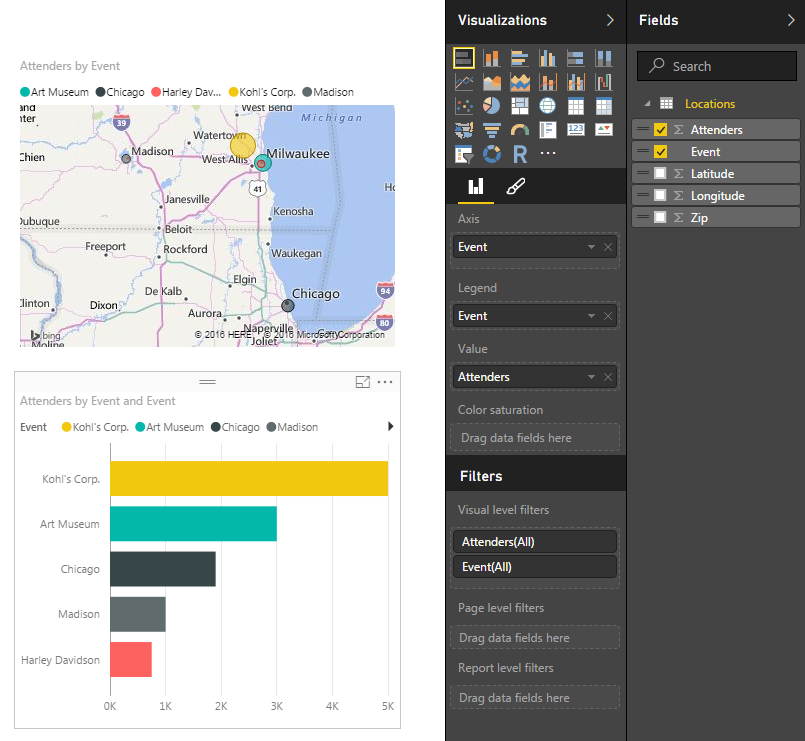
Take some time to click on each of the bars on the bar chart. Notice how the map re-draws with only the data for that selected item. To select multiple bars on the bar chart hold the CTRL button and click on the multiple bars.
Nice job. We have finished the mapping tutorial. Share if you liked it below.
There are often times when you need a small data set in order to make a visual behave exactly how you want it to. This may mean you need a small table to represent a range of numbers or text values.
Here are the Resources for this tutorial:
Power BI Desktop (I’m using the March 2016 version, 2.33.4337.281) download the latest version from Microsoft Here.
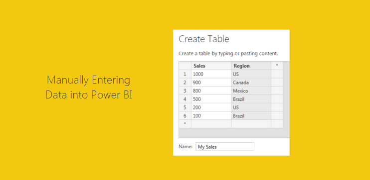
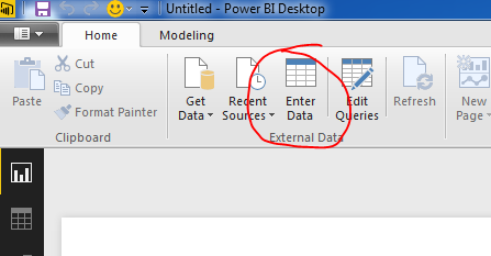
To enter your own data Click the Enter Data button on the Home ribbon.
Enter Data Button
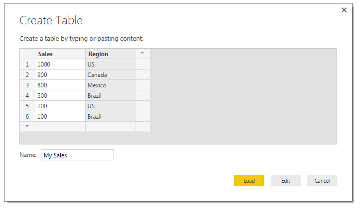
Next you are prompted with the Create Table window. In this window you are given the layout of a unfilled table. To begin entering data you can click in the first cell in Column one and start entering data. By pressing enter a new cell will populate below. You can Rename the column by double clicking the column name. To add a second column you Click on the * symbol next to your existing column. Finally to edit the table name you can type in the desired table name in the Name input box in the bottom left hand portion of the window.
Create Table Window
Finally, you can either to choose to Load the data as is or Edit the data to make additional changes (this can be useful to edit the data types of each column or to populate equations in subsequent columns). For the sake of this tutorial we will simply load the data. Click Load to load the data into the data model.
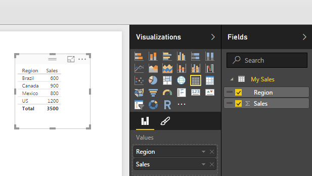
Now drag over the columns into the page view to begin generating visuals. By default PowerBI makes a table of data to show you the values you just entered.
Visual of Sales Table
Select the table visual (you know it is highlighted when it has the trim boarder as shown above) and Click the Doughnut Visual. This transforms the data into a doughnut, and who doesn’t like a nice data doughnut? Click anywhere in the page to de-select the new doughnut visual. Add a second table by dragging over he Region and Sales columns. We can now see the pretty graphic and the numbers supporting that visual.
Visuals Made with our Custom Data
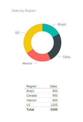
I bet you didn’t notice that something changed here. Look closely at the data we see now vs. what we entered earlier. Go ahead, scroll up, I’ll wait… Did you catch it?
We now have 5 rows of data but we entered 6 before. That is because the Sales column is a number column and can be aggregated. Look in the fields column and you see there is a little sum symbol in front of the Sales column. This means that this column has a default summarization associated. To see what is the default summarization highlight Sales by clicking on the column name in the grey area. Then Click the ribbon titled Modeling, and there it is in the properties section the Default Summarization is Sum. Every time you use the Sales column it will be summarized in the tables and visuals views. Our visual table shows Brazil with a total sales of 600, because we had two Regions labeled as Brazil 500 and 100.
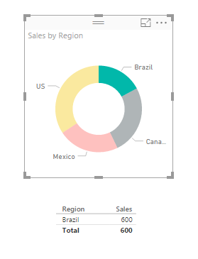
Now you can click on any of the data points in the doughnut. Notice the table automatically filters down to only show the areas you selected.
Data Filtered to only Brazil
ProTip: you can select multiple selections by holding down CTRL and selecting multiple items in the visual. You can only do this inside of one visual. As soon as you click another visual all filtering will disappear.
Again, I hope you enjoyed this quick tutorial. If you liked it make sure you share it below.
One of the most important concepts to learn within Power BI Desktop is how to build a Data Model.
Note: In simple terms the Data Model is data that is collected from the get data function. In your data model you can build multiple queries. This data is stored in the file. The data storage is very efficient as the data compressed down to approximately a 4:1 ratio. 1000 KB file will compact down to approximately 250 KB when loaded into Power BI. From my current understanding all data is loaded into the memory of the computer. Thus, if you are having performance issues it could be in part due to the RAM of your computer.
As you begin to craft more data models you will learn little tips and tricks along the way to make an efficient Data Model for your visualizations. I have found that the most challenging part of building the data model is structuring the data in a way that will make your selected visual make sense. This may mean you need to add a measure or a calculated column or a ranking to a data set. Alright lets get started.
Here are the Resources for this tutorial:
Power BI Desktop (I’m using the March 2016 version, 2.33.4337.281) download the latest version from Microsoft Here.
We are going to work through the Power BI Desktop file that we built in the Loading Excel Files Into Power BI Tutorial. You can follow the link to create the Power BI Desktop (pbix) file in the tutorial. For convenience, the completed file can be downloaded here: Import Excel Tutorial.
I’m going to start off by extracting the Import Excel Tutorial.zip file to my desktop. Once the file has been extracted we can open the containing folder. In this folder there are two files the source data in the excel file and the Power BI Desktop file.
Note: A Power BI Desktop file has a .pbix file format ending.
Open the Import Excel.pbix file. First click the Home ribbon and then click the Refresh button. Most likely there will be an error similar to the following message.
Message box when file can’t be found
This type of message occurs when you refresh a query and the file is missing or can’t be found. This is because when i originally built the Power BI Desktop tutorial the excel file that is supply the information was located on my desktop. This is a common problem when you build connections to local files stored on your computer. If you move a file into a different folder then the connection will break.
To resolve this close the message window by clicking Close. on the Home ribbon click the Edit Queries button. The Query Editor window will be presented. In a large yellow bar in the data view portion of the window (circled in red) is the error message.
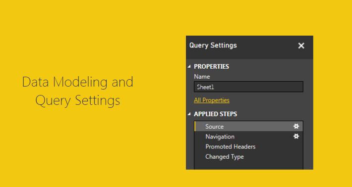
Note: Circled in blue is the Query Settings window. This window is the window for all the applied steps to transform the data. You can change the name of the query in the name box. From the view we have selected we can see that the step entitled Changed Type is currently selected (seen circled in blue).
Click the grey button labeled Go To Error which is found in the yellow error box.
Error seen inside Query Editor
Upon clicking the Go To Error button the selection in the Query Settings button to the Source Step. This is where the query has failed. More information about the failure is shown in another yellow error box. This time click Edit Settings in the error box.
Edit Settings in Error window
Now we have the Load Excel file window prompt open. In this window Click Browse, navigate to where you extracted all the files downloaded earlier in the tutorial and select the excel document entitled Book1. Click Open and the new file location will be loaded into the Load Excl Window. Click OK to complete the settings change.
New File Location
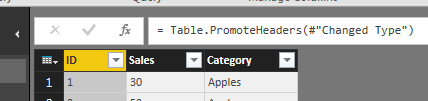
Now the data is correctly loaded into the data model. Notice we are still on the step called Source. Take some time to click through each step, Source – Navigation – Promoted Headers – Changed Type. As you click on each step you can see how the data is transforming.
To see the code that is being used to make each step click the View ribbon and check the little box entitled Formula Bar. This will make a formula bar appear. When you click on a step the formula bar will reveal the code needed to complete the selected step.
Toggling on the Formula Bar
We can now see the equation, which is similar to how you would write an equation in excel. The code in the Changed Type step is here:
= Table.TransformColumnTypes(#"Promoted Headers",{{"ID", Int64.Type}, {"Sales", Int64.Type}, {"Category", type text}})
The equation is using the M language to transform the data. More information on the usage of the M language can be found here.
Note: Couple of pointers about the data shown in the formula. The function is called Table.TranformColumnTypes. The source of the data is a variable called #”Promoted Headers”. The pound sign and the words following in quotations is how the M language passes variables that have a space contained in the language. Since the prior step has the name “Promoted (space) Headers” the program has to add the pound sign and the quotation marks. If there is no space in the naming convention such as “PromotedHeaders” then only the PromotedHeaders would be seen in the code and the pound sign and quotes will be gone. See modify coded when I remove the space from the Promoted Headers applied step.
= Table.TransformColumnTypes(PromotedHeaders,{{"ID", Int64.Type}, {"Sales", Int64.Type}, {"Category", type text}})
Notice the the pound sign and quotations are missing.
The second part of the formula is an array which has been written out in curly brackets:
{
{"ID", Int64.Type},
{"Sales", Int64.Type},
{"Category", type text}
}
I changed the code by adding line returns to make it easier to read. The coded array has beginning bracket and an ending bracket. Each parameter is contained in it’s own curly brackets and separated with a comma. The array is a 2 x 3 array, it has 3 rows and two data points on each row, just like a matrix. The first data point is the column name. In the first row the column that is being address is called ID. The data transformation parameter is called Int64.Type. This means that the data is an integer type 64 bit. This repeats for each row until all parameters have been addressed.
So there you go, we have opened up a query repaired it and learned a little about the formula bar.
As a side note, as you build queries each button press that you make on the various ribbons in the Query Editor will make a minimum of one step the in the Query Editor.
Hope you enjoyed this short tutorial about the Query Editor. Make sure you share below if you liked it.
Ok, I’ve got to be honest the first two tutorials (Loading Excel Files, Loading CSV Files) were only there to get things kicked off. Now we are getting to some of the good stuff.
When I first saw this feature in Power Query for excel I nearly had a conniption. My first thought is this is going to CHANGE EVERYTHING, and to be perfectly honest it has. My entire view of Excel and Power BI has been shaped by this simple but powerful idea; Automated Data Loading.
In all my years as an engineer I would have to constantly copy and paste data from one excel file to another. Then perform some transformations just to produce a bar chart or a line graph, uggh. This is slow and boring. I was really good at being boring, and I felt like I was able to become quite ingenious by writing macros and automating parts of my data transformations. Now I have seen the light, The simple ability of being able to load a group files from a folder is AWESOME! Had I had this feature in my engineering days I could have saved so much time. So in true homage of my engineering roots this post is for you, the all mighty data hungry engineer.
Alright, enough of be babbling, Lets get to it.
Materials for this Tutorial:
Zip file with (3) three excel files download Data Set.
Power BI Desktop (I’m using the March 2016 version, 2.33.4337.281) download the latest version from Microsoft Here.
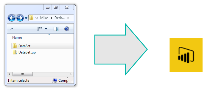
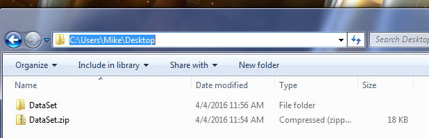
Lets start off by downloading the Data Set and unzipping the file to a folder called DataSet. For this demo I unzipped the files to my desktop folder.
Location for UnZipped Excel Files
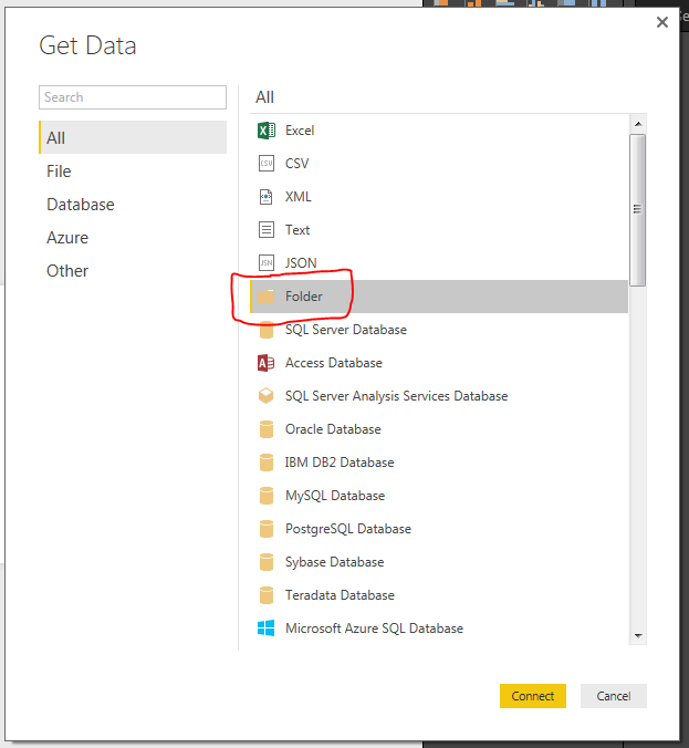
Next we will open up Power BI Desktop. On the Home ribbon select the Get Data button. The Get Data window will be presented and this time we will select the Folder icon in the menu.
Get Data Folder Icon Selection
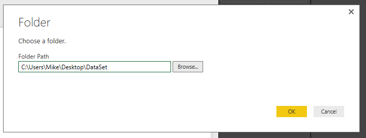
Click the Connect button at the bottom right of the screen. A folder window will display. This is where we will select the location of our data in the folder we unzipped earlier. Click OK once you’ve selected the location of the folder.
Folder Path Location
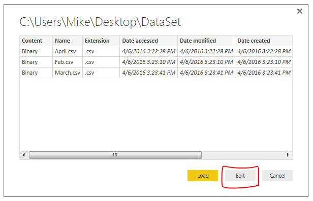
The next window to open shows the files that Power BI Desktop is able to see in the folder location. Normally we would press Load and move forward but in this case we want to further manipulate our query to load the data. Therefore, Click the Edit button to modify the query to load data.
View of Files in Selected Folder
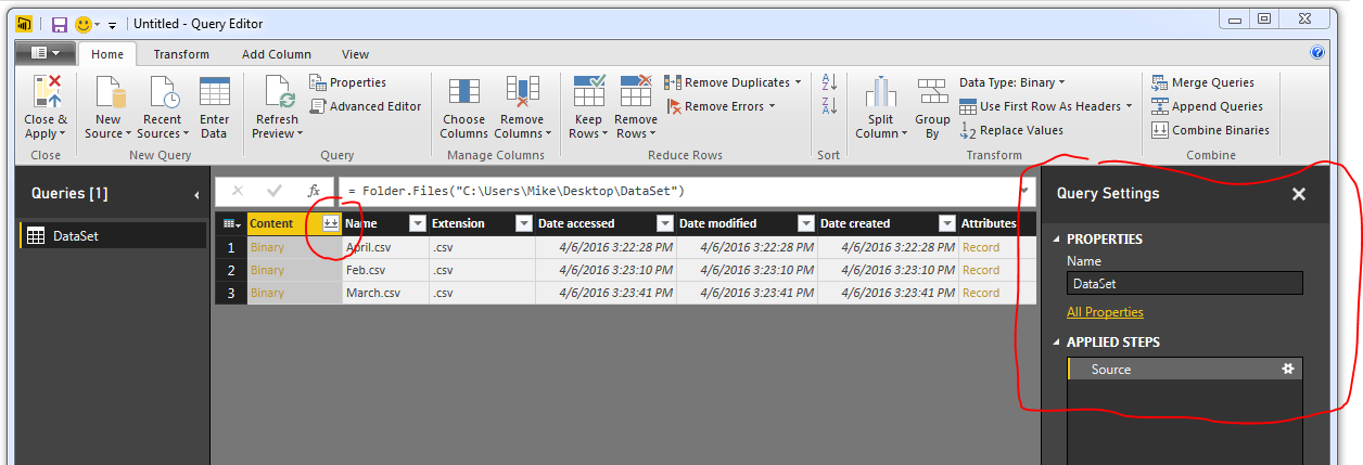
We are now in the Query Editor. This is where we can manipulate the incoming data before we visualize it.
Note: The Query Editor is a graphical representation of the M-language which is used to load data. Each button press in the Query Editor performs a transformation to your data. Each step writes a little line of code that handles the transformations. To see the code Click the View ribbon then click the button labeled Advance Editor. For more documentation on the M language look at the Microsoft documentation located here.
Here is an image of the files we loaded in from our folder location in the Query Editor.
View of Query Editor
The next step is to combine all the files into one combined data model. To do this click the Double Down Arrows that are circled in red on the left side in the column called content.
Note: I also circled the Query Settings in Red on the right. The Query Settings window will become very useful, especially when trouble shooting a query. You will notice as we make additional data transformations more steps will accumulate in the query settings.
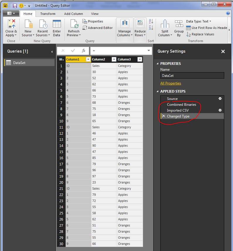
We now have a final view of all the data from each of the three CSV files.
Loaded Files into the Data model
The file needs a little clean up to remove some unwanted data rows. Notice now that we have loaded all three files. In each file we had a header row. Now in our data model we have three rows with headers. We want to use the first row as column names. To do this, Click the Use First Row as Headers button on the Home ribbon.
Use First Row as Headers
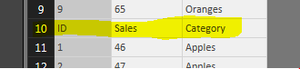
Also, notice there are rows of data that contain the initial header rows from the other two files.
Header Rows from Other Two Files
Now we will apply a filter to remove these rows. Click the Arrow in the ID row. This will present a menu. There are various transformations on this screen, you can sort a row in Ascending, or Descending order, Filter out text items, etc…
Filter for ID Row
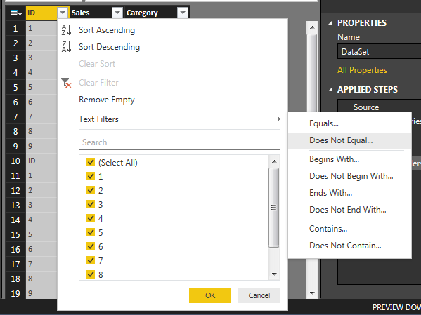
Click Text Filters and select Does Not Equal and enter ID into the filter. Click OK to proceed. This will add a step to remove any row that had ID listed in the ID column.
Filter out the Text “ID” from column
We have transformed our data and now have cleaned the data and it’s ready for use. Click Close and Apply to load the data to the data model. Now the data is ready for visualizations. Thanks for following along.
Make sure you take some time to share if you enjoyed this tutorial.
This post is going to be similar to my previous post about Getting Data. I figure we better cover some of the basics before going crazy with deeper topics.
Power BI Desktop (I’m using the March 2016 version, 2.33.4337.281)
After I read the previous version I thought it would be helpful to put the materials up at the top and what version I was using. If you didn’t know Microsoft has been very active in the development of PowerBI.com and Power BI Desktop. Right now there are weekly updates to PowerBI.com and monthly updates to Power BI Desktop.
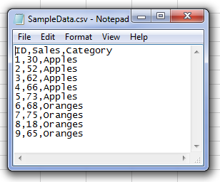
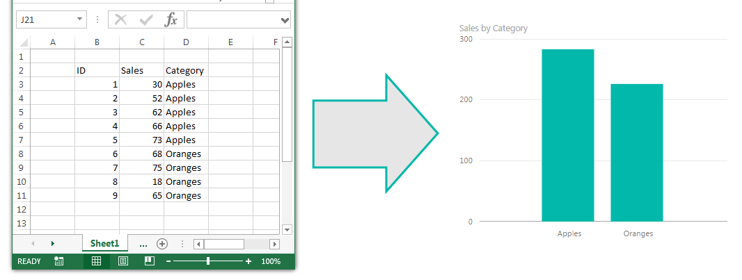
Starting off like before here is a sample of the data from the csv file. I’m showing the data in notepad to prove it is a comma separated value file (hence the CSV name).
CSV File opened in Note Pad
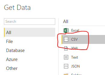
Alright, lets go get some data. Open up Power BI Desktop. Click on the Home ribbon. Select the Get Data icon.
Button for Get Data
Now the Get Data window will open. Next, select the second item labeled CSV from the top of the list on the right.
CSV selection in the Get Data screen
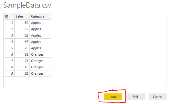
Click the Connect button at the bottom right hand of the Get Data screen to proceed to the next screen. Now the open window will let you navigate to the CSV file you would like to import. Click the Open button at the right of Open window to load the CSV file. Finally you’ll be presented with the data view of the contents contained inside your CSV file.
View of CSV Data file
Once loaded we now have our view of all the columns of data in the Fields viewing pane on the right. From here we can build our visuals.
Loaded Columns from CSV file load
Now, lets throw together a quick visual of the data.
Start by clicking the check box next to the label titled Category and then click the box next to the label titled Sales. This will automatically populate a table with the categories in the first column and the sales for each category in the second column.
Table of Data
To open up the Visualizations bar click on the word Visualizations. This will present all the information relating to the visuals. Upon opening up the visualizations pane there is a small yellow square showing you which visual is selected.
Showing the Selected Visual
Note: The blue pen highlighting shows the selected visual on the page. As you build more complex visuals there will be multiple visualizations on your page. When you select a specific visual, all the properties in the Visualizations Bar show all the properties for the selected visual. The Table visual is highlighted by the red highlight circle.
To change our selected visual to a new visual we will simply select a new icon in the Visualizations bar. Click the icon that looks like a pie chart.
Pie Chart Visualization
Cool, but what if I want more awesomeness on my page. No problem. Let’s copy our visual. You can do this by selecting the visual. To know it is selected look for the slight grey bar at the top of the visual.
Gray Bar denoting that visual is selected
Copy the visual by using Ctrl + C. Click any where on the white space on the page. This will deselect the current visual. Then paste an identical version of the visual by using Ctrl + V.
Copy and Paste of new Visual
Ta-da! Now we are really getting somewhere. Two Amazing visuals, well not quite. Two identical visuals isn’t very compelling. Lets change one of the visuals to a different visual.
Select the top visual by clicking on it. Then select the Stacked Column Chart which is the second icon from the left in the top row. Selecting this icon will change the visual.
Bar Chart Visual
And there you have it. You’ve imported a CSV file and generated two visuals. Nice job.
Hope you enjoyed this tutorial. Leave comments if you have questions or if you want to see something else in a tutorial. If you like what you see please share this post on your selected social network of choice below.
We are going to kick this blog off with a simple example of how to load data from excel into Power BI Desktop.
Note: I’m a firm believer of always understanding your data. If you are receiving data files or extracts from an automated system or from an individual, trust me it will make a difference. So, make sure you understand the source of the data and how the structure of your data may change over time. For example, you have have a column that has both text values and number values; or the data may add additional columns in the future. Thus, the data load into Power BI Desktop (PBID) will need to be flexible.
Lets start off with some simple data in excel:
Sample of Data in Excel
We have three columns of data, two have number in it and one has text values.
For now we will close out of excel and jump over to Power BI Desktop. Once the program loads we will click the Home ribbon then select the Get Data button.
Button for Get Data
After pressing the button a new menu will pop up showing us all the sources where data can be ingested from. The very first item in the list is Excel. Click the Excel then click the Connect button in the lower right hand corner.
Select Excel as Data Source
After clicking Connect a new window will pop up asking for the location of the Excel file. Navigate to our sample data called Book1.xlsx you can down load the actual file I used here: Book1 I saved my Book1.xlsx file on the desktop of my computer. Select Book1 and then Click Open.
Open Excel File Dialog Box
Next we are presented with the Navigator screen that reveals what is inside the workbook. There are two sheets. For now we are only interested in the data on Sheet1. Select Sheet1 and then click Load. This will load our data from Sheet1 into the Power BI Desktop data model.
Navigator Selection Screen
Now our data has been added to the Power BI Desktop data model. The data and the various columns we loaded can be found in the tool bar at the far right of PBI called Fields.
Location of Loaded Excel Data
Tech Tip: Power BI Desktop (PBI) opening the file and loading the relevant data into the memory of the computer. This has an approximate 4 to 1 compression ratio. In practical terms this means that a 100MB file will only consume 25MB of file size in PBI when it is saved. This is extremely useful as the data model can be quite large when loading multiple data files but the PBI file will compress down to a manageable size.
Make a Data from Column Sales and Category
Finally, the Sheet1 data table can be expanded into is respective columns by clicking the triangle next to the table icon. Finally you can drag and drop the column names into the visualization page to begin making visualizations. For this demo I used the Category Column and the Sales column to make a table.
By selecting a different visualization in the visualizations bar you can change your data table into a Bar Chart.
Data Transformed into a Bar Chart
Well that is it for the first tutorial. Share your thoughts and comments below. Let me know if you have any suggestions on what you would like to see next.
Manage Consent
To provide the best experiences, we use technologies like cookies to store and/or access device information. Consenting to these technologies will allow us to process data such as browsing behavior or unique IDs on this site. Not consenting or withdrawing consent, may adversely affect certain features and functions.
Functional
Always active
The technical storage or access is strictly necessary for the legitimate purpose of enabling the use of a specific service explicitly requested by the subscriber or user, or for the sole purpose of carrying out the transmission of a communication over an electronic communications network.
Preferences
The technical storage or access is necessary for the legitimate purpose of storing preferences that are not requested by the subscriber or user.
Statistics
The technical storage or access that is used exclusively for statistical purposes.The technical storage or access that is used exclusively for anonymous statistical purposes. Without a subpoena, voluntary compliance on the part of your Internet Service Provider, or additional records from a third party, information stored or retrieved for this purpose alone cannot usually be used to identify you.
Marketing
The technical storage or access is required to create user profiles to send advertising, or to track the user on a website or across several websites for similar marketing purposes.