This month at our Power BI User group in Milwaukee Seth and myself walk through some of the basics of Power BI. We digest how can we leverage Power BI to Act like the business, and Think like I.T. Discuss the concept of global and local measures within a data model. As well as some tips and tricks while working in the power query editor. Check out our presentation that we recorded for this month.
YouTube Video
If you like the content from PowerBI.Tips please follow us on all the social outlets. Stay up to date on all the latest features and free tutorials. Subscribe to our YouTube Channel. Or follow us on the social channels, Twitter and LinkedIn where we will post all the announcements for new tutorials and content.
Introducing our PowerBI.tips SWAG store. Check out all the fun PowerBI.tips clothing and products:
In October of 2019 Power BI released a new file type, PBIDS. The Power BI Desktop Source (PBIDS) file is a JSON object file that aids users connecting to data sources. In true PowerBI.Tips fashion we have of course, made a tool for that.
Introducing Connections
Today we release the new tool called Connections. It can be found at https://connections.powerbi.tips/ . With this tool you can use our predefined templates or customize one of your own file. To learn more about this sweet sweet JSON editing tool check out the following YouTube Video:
Technical Details
For more information on the Power BI Desktop Source file check out these links:
If you like the content from PowerBI.Tips please follow us on all the social outlets. Stay up to date on all the latest features and free tutorials. Subscribe to our YouTube Channel. Or follow us on the social channels, Twitter and LinkedIn where we will post all the announcements for new tutorials and content.
Introducing our PowerBI.tips SWAG store. Check out all the fun PowerBI.tips clothing and products:
We are starting today off with a fun chart. We will be making a filled donut chart. Typically, I don’t use donut charts but in this case I think we have a good reason, and it’s delicious…
The data being used in this visual varies from o to 100%. This could be something like a test score or a compliance number. Thus, we will be using the donut chart to represent a completion of 100% or some variant below.
Video on how to build this chart.
During this video we used a couple measures. They are the following:
Measures
Average Product Score = AVERAGE( 'Product Scores'[Score] ) / 100
Average Product Score Inverse = 1 - [Average Product Score]
Where the value of the Score comes from the Product Scores table. The Score column ranges from 0 to 100%. If you like this visual and want to download a sample file visit my GitHub page.
If you like the content from PowerBI.Tips please follow us on all the social outlets. Stay up to date on all the latest features and free tutorials. Subscribe to our YouTube Channel. Or follow us on the social channels, Twitter and LinkedIn where we will post all the announcements for new tutorials and content.
Introducing our PowerBI.tips SWAG store. Check out all the fun PowerBI.tips clothing and products:
The release of grouping visuals was an extremely welcomed
feature. As one who builds lots of reports grouping elements together is
essential to stay organized and to increase report building speed. Since I’ve
been using this great new, I found an interesting design element to style
groupings for reporting impact. The grouped visuals feature enables a new
property, background color. This can be
applied for the entire group of visuals.
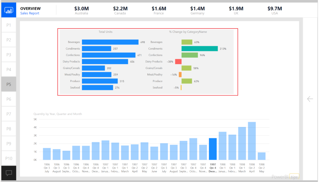
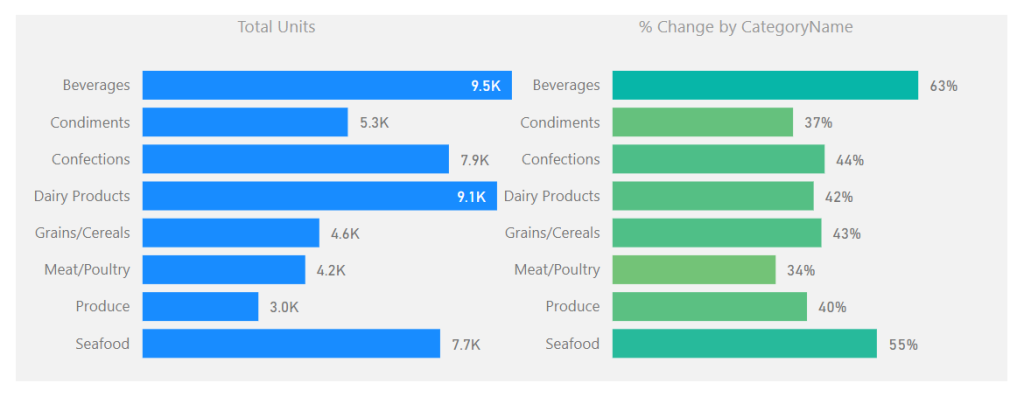
See the following example of setting a background around two
visuals.
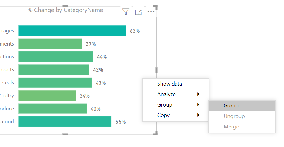
In this example the intent is to show the user that these
two visuals are related. The graph on the left shows the number of units sold
for a selected time period. The bar chart on the right shows the relative sales
over time represented as a percent change. This illustrates the principle of
position and direction. The number of units sold is what happened right now. It
is my place in time with respect to sales. However, this does not show any
context to performance. The percent change provides the directional context. Since the position and direction are an
important insight as a paired visual, we use the grouping to visually bind the
two.
For those who have done some research around design
principals inevitably you will stumble across the Gestalt
Principals of design. Grouping
visuals with a common background falls into the Law of Common Region or Law of
Proximity.
Alright let’s walk through how to use grouping with
backgrounds colors.
Once you have created the visuals which will be grouped together;
select each visual by holding CTRL and Selecting each
visual.
Right Click on one of the visuals and select the menu
item labeled Group, in the flyout menu select the option called Group.
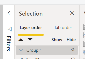
A grouped element will be created in the Selection Pane.
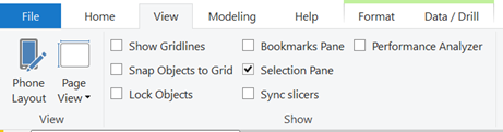
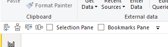
Note: If you don’t see the Selection Pane, you will need
to turn this on. The setting to turn the
Selection Pane is found in the View ribbon with the check box for Selection
Pane. See below for reference.
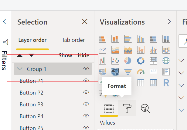
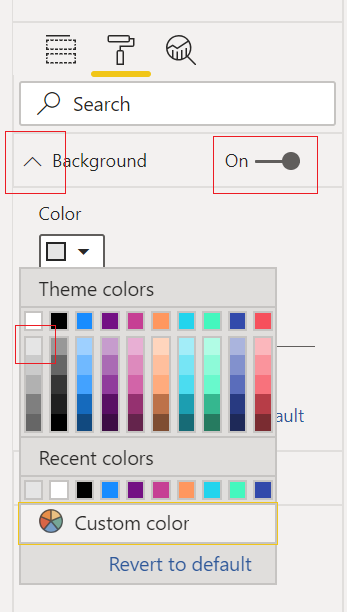
With the newly created group being selected, Click on
the Paint Roller (Format) icon in the Visualizations Pane.
Expand the property section called Background.
Toggle the background to be On and select a Color from the
drop-down menu. For this example, I
selected the very first shade of grey in the first column of colors.
The final product will be a grouped arrangement of visuals
with a shaded background.
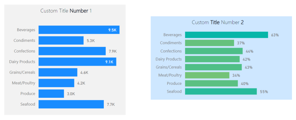
To extend this idea further we can take the same approach
when working with Text boxes and Visuals.
Often, I find I need more style for applying a Text box or header to a
visual. In these cases, I will use two
visual elements to create one visual.
See this example of two visuals with custom titles created with a
textbox.
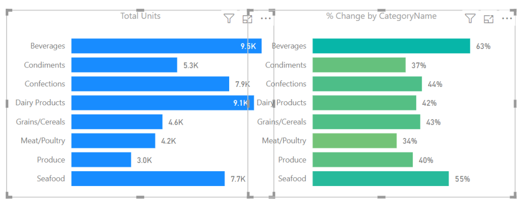
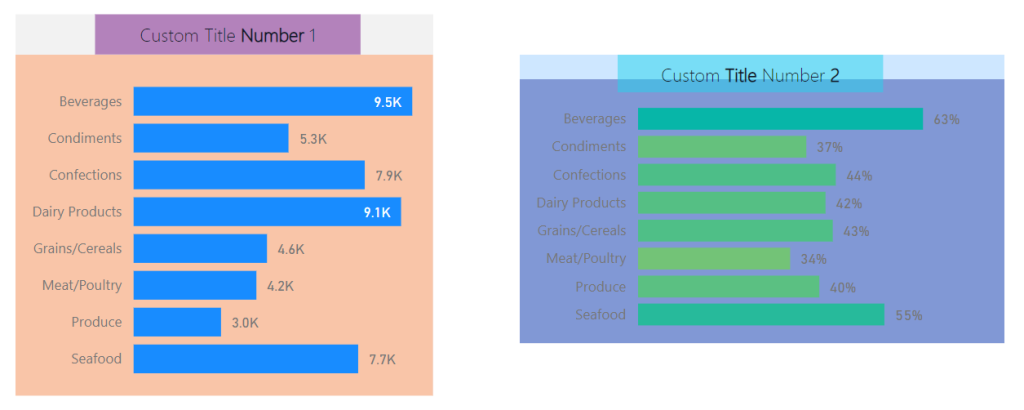
Note: Backgrounds are colored differently to illustrate
that each background for the grouped visuals is different.
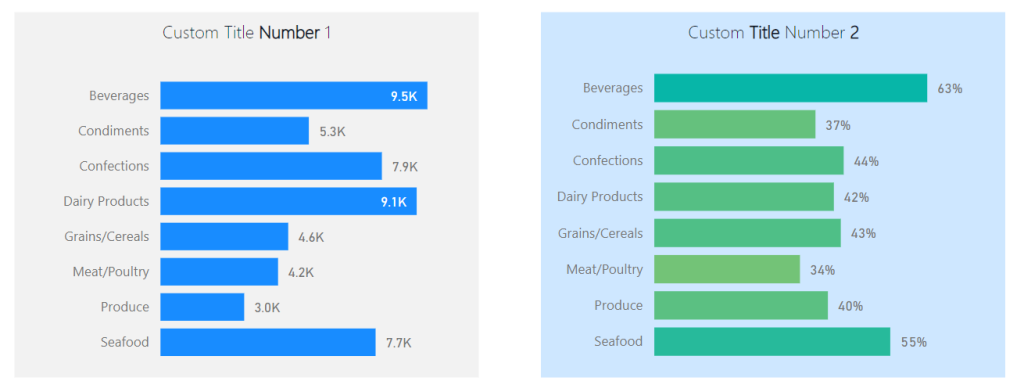
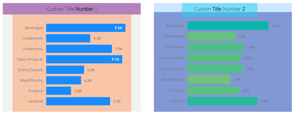
While this meets the need the boxes are not identical in
size. This violates yet another Gestalt
Principle, symmetry. The bounding
regions of the elements inside the grouping define the outer perimeter of the
background shading. Knowing this we can
modify the visuals within the groups to provide a symmetrical background shape.
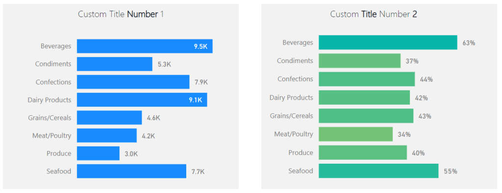
Here are the same before and after images with each visual
object colored to see the adjustments in size for each visual type. This creates the proper background
sizes.
Before:
After:
The visual on the left required an increase of the text box
at the top to get the desired width of the background shape. By contrast the visual on the right required
an extension of the bar chart in length to acquire the desired length of the
background. The result provides a
symmetric view of both visual groups.
If you like the content from PowerBI.Tips please follow us on all the social outlets. Stay up to date on all the latest features and free tutorials. Subscribe to our YouTube Channel. Or follow us on the social channels, Twitter and LinkedIn where we will post all the announcements for new tutorials and content.
Introducing our PowerBI.tips SWAG store. Check out all the fun PowerBI.tips clothing and products:
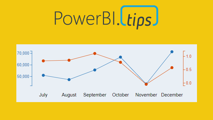
Ever need two different scales on the Y-Axis of a line chart? If so, then this tutorial is for you. While creating a dual y-axis line chart is pretty common in excel, it is not as easy in power BI. The only standard chart that comes with Power BI Desktop that enables dual y-axis is the Column and line combo chart types.
For this particular visual I needed to show correlation between two time series with different Y-axis scales. The Y-axis on the left of the chart had data elements in the thousands, but the right side needed percentages. The tutorial below illustrates how to accomplish by building a custom visual using the Charts.PowerBI.Tips tool.
Video Tutorial
note: there are a bunch of really good custom visuals that can be downloaded from the Microsoft App Source store. However, this article will not review all third party visuals that are able to produce a dual Y-axis line chart.
Source files
All files used to create this visual are located here on GitHub.
Layout file
The file used in this tutorial was a derivation of the Sunset layout from PowerBI.Tips. If you like this file, you can download it here:
If you like the content from PowerBI.Tips please follow us on all the social outlets. Stay up to date on all the latest features and free tutorials. Subscribe to our YouTube Channel. Or follow us on the social channels, Twitter and LinkedIn where we will post all the announcements for new tutorials and content.
Introducing our PowerBI.tips SWAG store. Check out all the fun PowerBI.tips clothing and products:
I am just bursting with excitement!! This month the amazing Power BI team has yet again come out with a great new feature, Icon sets. In addition to this you can enhance these icon sets by adding your own custom icons to your Power BI reports. Woo Hoo….
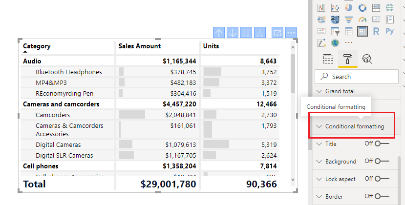
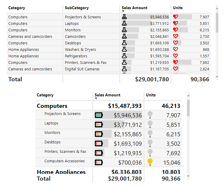
So what does this mean? Well, now you have a new Conditional Formatting box found in the settings of the Table and the Matrix properties. To use a built in Icon from Power BI. Create either a table or a Matrix visual with some data.
Select the visual and adjust it’s properties by clicking on the Paint Roller and opening the Conditional Formatting window.
Scroll down until you see the toggle button for Icons. Turn the Icons On.
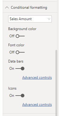
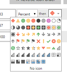
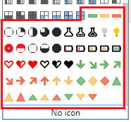
Click on the Advanced Controls to set the properties of the icons based on the data properties. This type of dialog box should look familiar as it is similar to the previous boxes for conditional formatting. Opening this window shows Icons for each Rule in the list. To adjust an icon Click on the Drop DownArrow next to the icon you wish to change. There are multiple icons to choose from.
There are limited selections by default, but you can enhance this by adding your own icons with the custom Json theme files. At PowerBI.tips we love our theme files. They make using standard settings so much easier.
Loading the Custom Icons
For starters we have already done the hard work of creating an additional 50 icons for you to use in your reports. Download the Icon Theme File Here
Update: Special thanks to Reid Havens from Havens Consulting for contributing extra icons to this Icon Set.
Unzip the downloaded file to find the PowerBITips Icons v1.json file
Navigate to the Home ribbon in Power BI Desktop
Click on the Switch Theme button
Select the list item Import Theme from the drop down menu
The open file dialog box will open. Select the PowerBITips Icons v1.json file that you downloaded earlier.
Boom, and just like that you have loaded your new icons. Now you can return to the icons for your table or matrix and adjust until your heart is content.
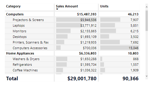
Here is a sample of a table and a matrix with some custom icons applied:
Update 2019/08/06: When publishing the Power BI file to the PowerBI.com service, the fill colors for the shapes need to have a %23 instead of a # (HASH) infront of the HEX codes. Thus, the format should look like fill=’%23FF0000′ instead of fill=’#FF0000′
If you like the content from PowerBI.Tips please follow us on all the social outlets. Stay up to date on all the latest features and free tutorials. Subscribe to our YouTube Channel. Or follow us on the social channels, Twitter and LinkedIn where we will post all the announcements for new tutorials and content.
Introducing our PowerBI.tips SWAG store. Check out all the fun PowerBI.tips clothing and products:
I’m a lazy engineer. Let me qualify my statement. In lazy I mean I like to find the path of least resistance, the shortest distance between two points. Everyday I challenge myself to be lazy, or efficient how ever you want to view it. As I have built many reports in Power BI over the years here is a fantastic trick, I use almost every day, Customizing the Quick Access Toolbar.
Here are a couple reasons why I think this will speed up
your report writing.
There are only a few shortcuts that I am aware
of for Power BI Desktop, thus making your own shortcuts with Hotkeys is faster
for repetitive tasks.
To achieve a simple task, you might have to jump
between ribbons, again adding time.
When you set up Hotkeys you don’t have to remove
your hand from the keyboard and wiggle your mouse around then come back to the
keyboard. Again, wasting time.
Enough reasons, if you are still reading this then clearly
you are lazy like me. Let’s just get to
the good stuff…
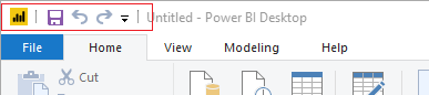
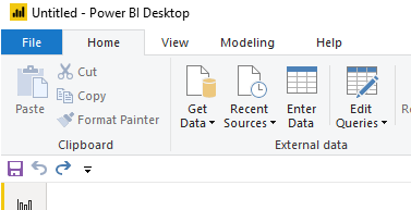
By default, you get the following Quick Access Toolbar:
The icons are Save, Undo, and Redo.
While these icons are good, YOU DON’T NEED THEM… lol
You can automatically save by using Ctrl + S
Undo is simply Ctrl + Z
And Redo… lets be honest no one uses this one.
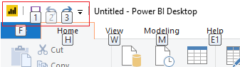
Another aspect of the Quick Access Toolbar is when you hit
the Alt key you can reveal numbers on the toolbar:
Pressing the number or letter triggers the next button
press.
Example:
Alt + 1 will automatically save the file
To take this further you can string together multiple key
presses to dig even deeper into the menus
Example:
Alt + H + ii
brings up the import image dialog box
Alt + G + D
opens the menu to get data
Alt + W + C
Opens the Selection Pane,
Repeating this command closes the Selection Pane
The downside with multiple commands it takes more time to
learn the key strokes to be fast. As a
personal preference I like to use one-step key press options (Ctrl + s or Ctrl
+ z). It is easier for my simple mind to
remember and commit to memory. If you
use Adobe products for images or video, you will be familiar with this
technique. From my opinion Adobe has
some of the best most useful shortcuts that enhance productivity.
Make it Custom
Let’s begin customizing our menu.
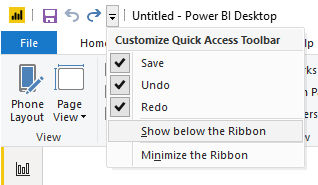
First Click the Down Arrow at the far right of the
toolbar.
Click on the item
in the dropdown menu called Show below
the Ribbon. This will move the
toolbar to the bottom of the ribbon.
For each item in the dropdown list Uncheck each item, Save,
Undo, and Redo. This will remove all the items from the
toolbar.
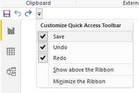
The Quick Access Toolbar will now look like the following
image:
In our next step we need a hidden toolbar to appear, the
Format ribbon. This Ribbon only appears
when multiple elements are on the page.
Thus, we will need to add some generic shapes to the page to reveal the
toolbar.
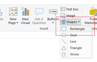
Add three Shapes (Squares) to the report
page. Click on the Home ribbon
and select the Shapes icon listed in
the Insert section of the ribbon. Then Select the item in the drop-down list
labeled Rectangle.
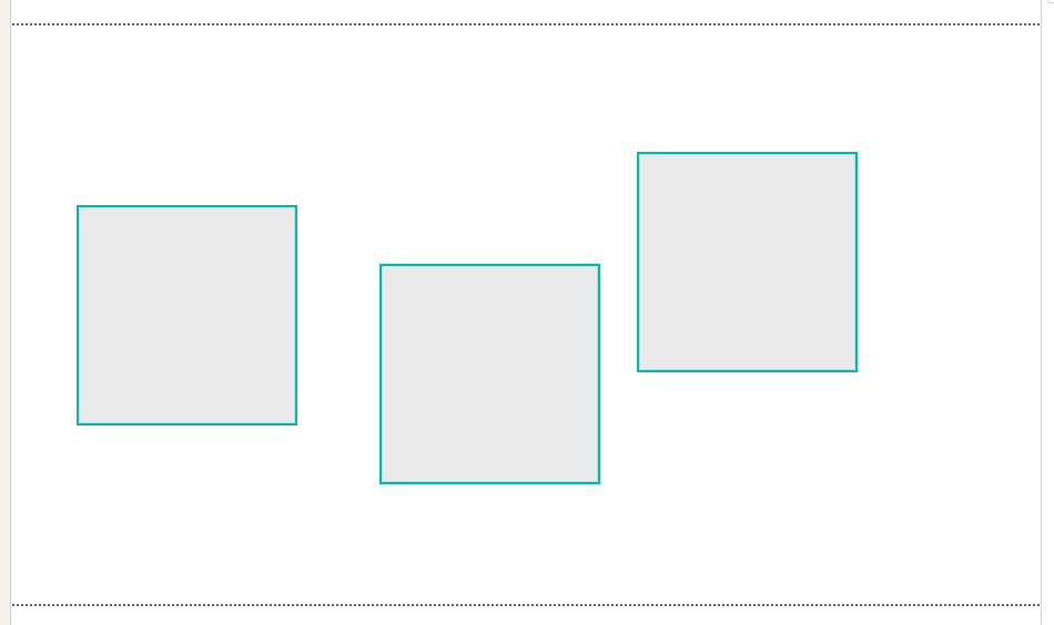
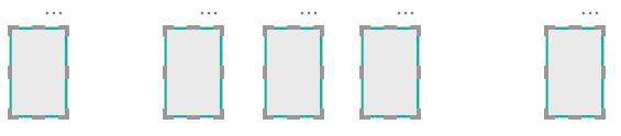
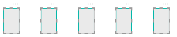
After adding one rectangle select the rectangle with your cursor. Use Ctrl + C to copy the shape. Then, use Ctrl + V to past Two more rectangles on the page. Use your cursor and move the shapes across the report page. The order of the shapes does not matter, they just need to be distributed across the page. See below for reference.
Use Ctrl + A to
select everything on the page.
Notice a new ribbon appears, the Format ribbon. This is called a context aware ribbon. This has been a long standard best practice
in office products. Only show the
ribbons that are needed. Thus, the
format ribbon and the Data / Drill ribbons are not exposed until you have
visuals selected on the page.
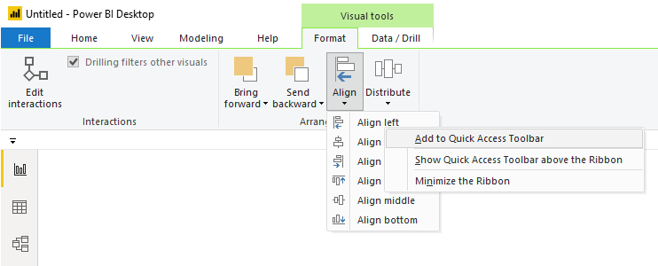
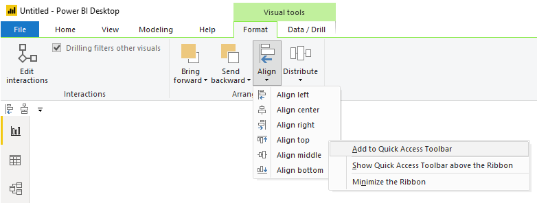
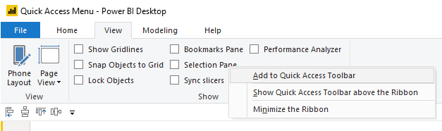
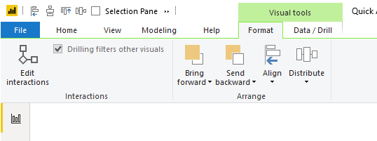
Click on the Format ribbon. Click the
button called Align in the Arrange section of the Format ribbon. Then Right
click on the first item in the align menu called Align left. Upon doing this,
a menu will appear. Select the first item in the list called Add to Quick Access Toolbar.
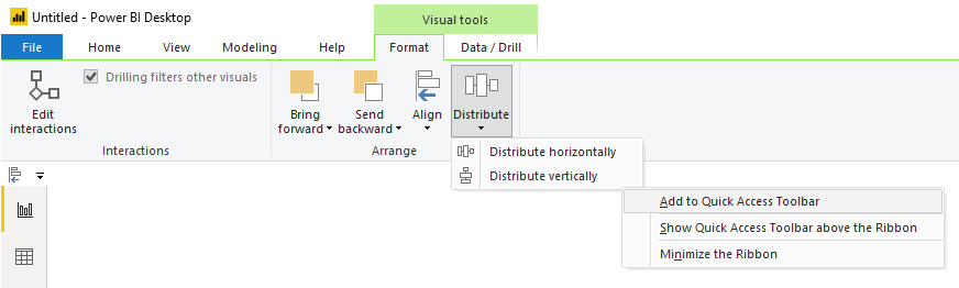
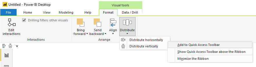
Repeat the same process by adding the Distribute Vertically action from the Distribute button on the Format
ribbon.
Next, Add the Align top action from the Align button on the Format ribbon.
Finally, Add the Distribute horizontally action from the
Distribute button on the Format ribbon.
Using the combination of Aligning an Edge / Distribution is
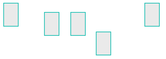
just so much faster then moving one object at a time.
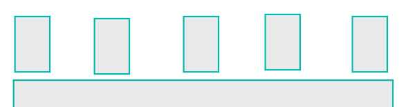
For example, here is a random arrangement of 5 shapes on a
page.
Using our newly created shortcuts I select the Items I want
to move.
Then using our new key combo, Alt + 3, Boom all the top
edges are aligned.
Then the magic, press Alt + 4 and all the items are evenly
distributed
Superfast and efficient, aka lazy..
Side Note:
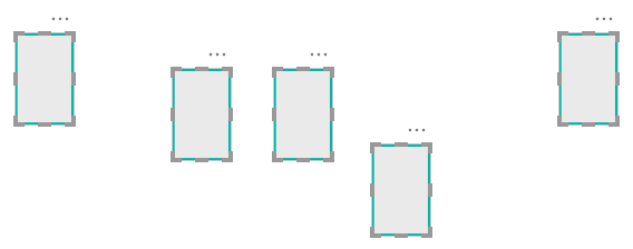
When I am training new users in building Power BI reports, I like to point out the following, it is important to align your elements on the page. This follows along with one of the Gestalt principles, symmetry. Your eye can perceive slight differences in objects that are misaligned. I can’t tell you the number of reports has something like the following:
The change is subtle but your eye picks it up. When these out of alignment objects are near
another visual with a straight edge it is even more apparent.
(Steps off the Soap Box) Ok, enough diversions. Let’s finish with adding two more items that
I use every time I build a report, Selection Pane, and Bookmarks Pane. We can add these items to the menu as
well.
Navigate to the View ribbon (or hit Alt + W if you want to be fancy).
Right Click on
the item called Selection Pane. Select the item in the dropdown Add to Quick Access Toolbar.
Do the same for the Bookmarks
Pane. When you are finished your
Quick Access Toolbar should look like the following:
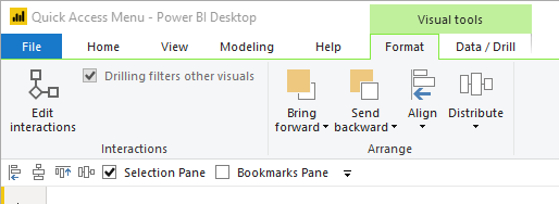
You may be asking yourself… So why did we move the menu to
the bottom of the ribbon? We could have
just left it on the top of the screen.
You would be right. But, I do
want to point out one odd behavior when the Quick Access Toolbar is at the top
of the ribbon.
When I have multiple visuals selected on the page the
contextual menu appears. See below image
with the Quick Access Toolbar at the top:
When this happens any items to the right might get chopped
off, and you must access them using the double sideways arrow. The Alt + # keys will still work even though
the items are hidden, but I don’t like the experience of having some of my menu
items hidden. If you had many icons distributed
across the Quick Access Toolbar, say 9 of them, you would have to remember its
position in the alt keys. This is the
reason why I prefer to show the Quick Access Toolbar below the ribbon. When the context aware menus appear the Quick
Access Toolbar is not covered.
Thanks for reading along.
Have a great day and I hope this tip / trick makes you a little bit more
productive!
If you like the content from PowerBI.Tips please follow us on all the social outlets. Stay up to date on all the latest features and free tutorials. Subscribe to our YouTube Channel. Or follow us on the social channels, Twitter and LinkedIn where we will post all the announcements for new tutorials and content.
Introducing our PowerBI.tips SWAG store. Check out all the fun PowerBI.tips clothing and products:
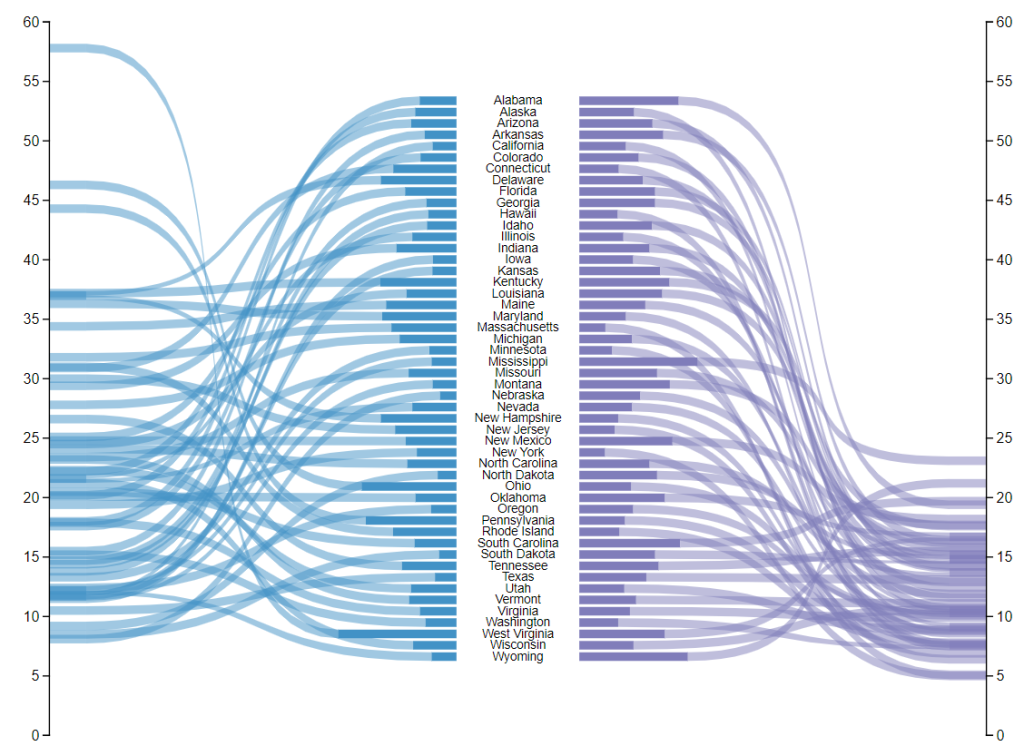
Welcome to another installment of building custom visuals with the Charts tool from PowerBI.Tips. In this edition we make the following custom visual.
Custom Ribbon Chart
This chart comes to us from the sharp mind of Nick Snapp, Check out is work on Charts.PowerBI.Tips within our custom visual gallery. This chart combines the ability to see both the relative size of values between states as well as distributions of data with adjacent number lines. Pretty cool don’t you think?
Below is the walk through video on how to build this custom chart.
If you like the content from PowerBI.Tips please follow us on all the social outlets. Stay up to date on all the latest features and free tutorials. Subscribe to our YouTube Channel. Or follow us on the social channels, Twitter and LinkedIn where we will post all the announcements for new tutorials and content.
Introducing our PowerBI.tips SWAG store. Check out all the fun PowerBI.tips clothing and products:
With the release of the custom visuals building tool Charts.PowerBI.Tips we received a number of comments requesting tutorials on how to build visuals. Ask and you shall receive! Below is a basic tutorial on how to create a Bar chart. Within this tutorial we review a couple of the features of the chart tool and how to use them.
Video Tutorial on Building a Basic Bar Chart Custom Visual
Comment below on other topics you would like to see.
Be sure to follow:
If you like the content from PowerBI.Tips please follow us on all the social outlets to stay up to date on all the latest features and free tutorials. Subscribe on YouTube. Or follow us on the social channels, Twitter and LinkedIn where we will post all the announcements for new tutorials and content.
In the September 2018 blog post the Microsoft team released a new layout. This layout has a number of really nice design elements. However, upon reviewing the file used for this demo found here. Upon downloading we noticed that the new style of the layout was only one page deep. As an enhancement to this file we added all the pages, renamed all the elements and created a full PowerBI.Tips layout from this page. We’d love to share our work with you and hope you enjoy this new layout from PowerBI.tips.
If you like the content generated from PowerBI.Tips please follow me on all the social outlets to stay up to date on all the latest features and free tutorials. Subscribe to me on YouTube. Or follow me on the social channels, Twitter and LinkedIn where I will post all the announcements for new tutorials and content.
Manage Consent
To provide the best experiences, we use technologies like cookies to store and/or access device information. Consenting to these technologies will allow us to process data such as browsing behavior or unique IDs on this site. Not consenting or withdrawing consent, may adversely affect certain features and functions.
Functional
Always active
The technical storage or access is strictly necessary for the legitimate purpose of enabling the use of a specific service explicitly requested by the subscriber or user, or for the sole purpose of carrying out the transmission of a communication over an electronic communications network.
Preferences
The technical storage or access is necessary for the legitimate purpose of storing preferences that are not requested by the subscriber or user.
Statistics
The technical storage or access that is used exclusively for statistical purposes.The technical storage or access that is used exclusively for anonymous statistical purposes. Without a subpoena, voluntary compliance on the part of your Internet Service Provider, or additional records from a third party, information stored or retrieved for this purpose alone cannot usually be used to identify you.
Marketing
The technical storage or access is required to create user profiles to send advertising, or to track the user on a website or across several websites for similar marketing purposes.