Category: Building Reports

  • Use Multiple Connections Between Tables

    Use Multiple Connections Between Tables

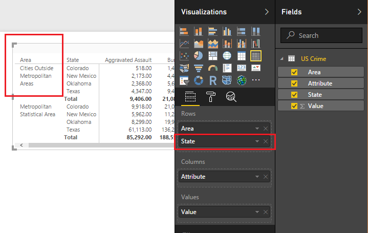
    For those of you who work in supply chain management this tutorial will be right up your alley.  In my previous job position I had a lot of interaction with our shipping department.  We would look at when orders were placed from the customer, and conduct a comparison to what orders were actually shipped or cancelled prior to shipment.  Our analytics team would produce reports and metrics to our customers about orders and shipment information.

    In an ideal world, every product ordered on the purchase order would be shipped and some point in the future.  But, as we know, in the real world this isn’t always the case.  Orders get cancelled, products get re-ordered, challenges happen, and therefore we would need to track all these changes.  In our shipping analytics group, the team would pull data from our shipping system with columns similar to the following:

    Order Date, Ship date, Product type, and Shipped QTY

    Sometimes you want to sum the data by the order date, and in other cases you want a total by the shipped date.

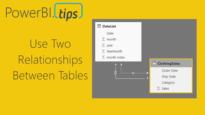
    In this example, we will walk through making a measure that uses the DAX formula USERELATIONSHIP.  To learn more about this function from the Microsoft documentation follow this link.

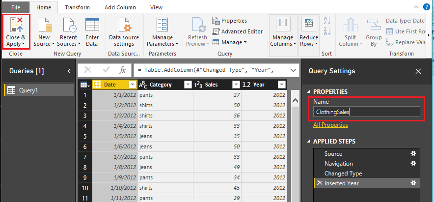
    Open PowerBI Desktop, click the Get Data button on the Home ribbon and select Blank Query.  Click Connect to open the Query Editor.  On the View ribbon click the Advanced Editor button.  While in the Advanced Editor paste the following code into the editor window, click Done to complete the data load.

    Note: If you need some more help loading the data follow this tutorial about loading data using the Advanced Query Editor.  This tutorial teaches you how to copy and paste M code into the Advanced Editor.

    let
        Source = Excel.Workbook(Web.Contents("https://powerbitips03.blob.core.windows.net/blobpowerbitips03/wp-content/uploads/2017/06/Clothing-Sales-Ship-Order-Dates.xlsx"), null, true),
        ClothingSales_Table = Source{[Item="ClothingSales",Kind="Table"]}[Data],
        #"Changed Type" = Table.TransformColumnTypes(ClothingSales_Table,{{"Order Date", type date}, {"Ship Date", type date}, {"Category", type text}, {"Sales", Int64.Type}})
    in
        #"Changed Type"
    

    Your loaded data should look like the following:

    Sales Data Load
    Sales Data Load

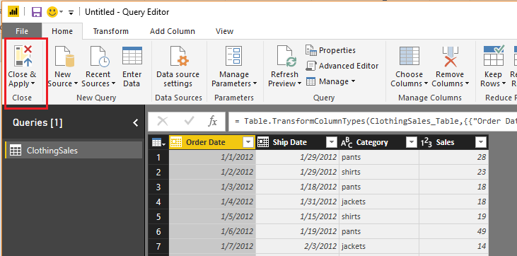
    Click Close & Apply on the Home ribbon to load the data into the data model.

    We will want to create two measures, one that performs a calculation on the Order Date column, and one on the Ship Date.  To do this we need a date table to populate all the dates needed for this data set.

    We can do this by creating a DAX date table.

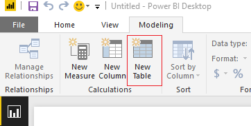
    On the Modeling ribbon click New Table.

    New DAX Table
    New DAX Table

    In the formula bar enter the following.

    DateList =
       GENERATE (
          CALENDAR ( DATE ( 2012, 1, 1 ), DATE ( 2017, 12, 31 ) ),
          VAR currentDay = [Date]
          VAR startYear = 2012 // we know this by looking at our data
          VAR month =  MONTH ( currentDay )
          VAR year =  YEAR ( currentDay )
       RETURN   ROW (
          “month”, month,
          “year”, year,
          “month index”, INT ( ( year – startYear ) * 12 + month ),
          “YearMonth”, year * 100 + month  )
     )

    Note: This DAX formula is building a date table, for each row we are building the columns, Month, Year, Month Index, and an integer for YearMonth index.  This is a simple way to repeatedly create a date calendar based on your data. 

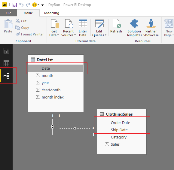
    Great, we have completed the data loading.  Now, we need to link the date table to the Clothing Sales data.  To do this click on the Relationships button on the black navigation bar located on the left side of the screen.  Then Click & Drag the Date column from the DateList table to the Order Date column of the ClothingSales table.  This will create a one to one relationship link between the two tables.  Note that the relationship is illustrated in a solid white line.  This means it is an active relationship.

    Next, drag the Date column from the DateList table to the Ship Date column of the ClothingSales table.  We have made our second connection.  Note that this connection has dotted white line.  This means this connection is not active.  Also, we can observe that the relationship between the two tables, DateList and ClothingSales is a one to many relationship.  This is denoted by the * on the ClothingSales table, and the (1) one on the DateList table.  The * means there are duplicate values found in the ClothingSales table.  The (1) on the DateList table means in the Date column we only have unique values, no duplicates.

    Note: You can edit the connections between tables by double clicking the connecting wires.  This brings up the Edit Relationship dialog box which allows you to edit things like, the Cardinality, Cross Filter Direction and activating / deactivating the connection.

    Once you’re done your relationships should look like the following:

    Linked Tables
    Linked Tables

    By default, Power BI will only allow one active connection between tables.  Therefore, we have one connection active and the other has been inactivated by default.  Return to the report view by clicking the Report icon on the left black navigation bar.

    Report View
    Report View

    Now that we have completed the data modeling let’s make some visuals.  We will start by making a simple table to see what the data is doing.  Add the columns from the two tables, ClothingSales and DateList to a Table Visual.

    Create Table Visualization
    Create Table Visualization

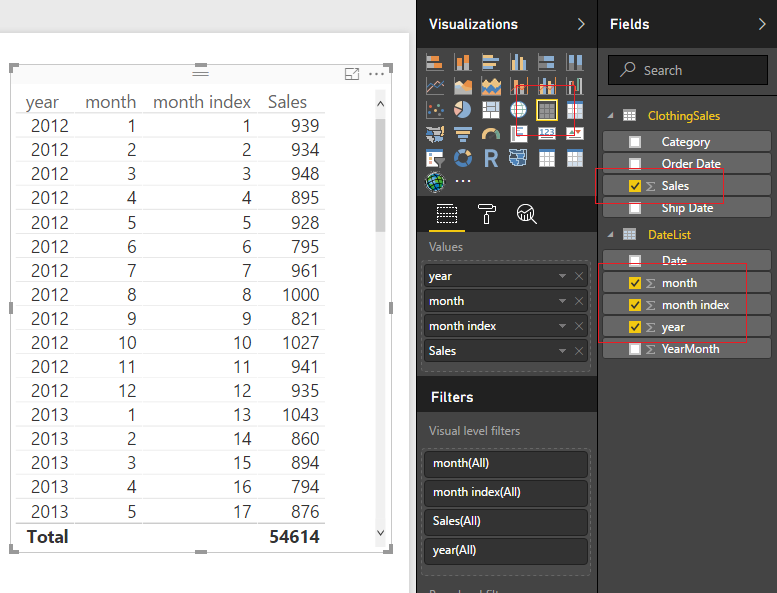
    Great!  Now we have the total number of sales based on the order date.  We know this because it is the primary connection that we established earlier when we linked our two tables together.  But, what if I wanted to know the sales that were shipped based on the Ship Date.  Earlier we made this connection but it is inactive.

    Here is the awesomeness!  We can create a measure that calculates different results between a user specified relationship.

    First, we will re-calculate the sales number that we already have in our table.  On the Home ribbon click the New Measure and enter the following in the DAX formula bar:

    Order Date Sales =
       CALCULATE (
       SUM ( ClothingSales[Sales] ),
       USERELATIONSHIP ( ‘DateList ‘[Date], ClothingSales[Order Date] )
       )

    Note: In this DAX formula we are creating a explicit measure, meaning we are specifically telling Power BI to sum a column.  An implicit calculation is what we did earlier when we added the sales column to the table.

    The USERELATIONSHIP filter within the calculation forces Power BI to calculate the sum based on the dates listed in the Order Date column.  To see another demo on UseRelationship you can watch this video from Curbal.

    Create another measure with the following DAX formula:

    Ship Date Sales =
       CALCULATE (
       SUM ( ClothingSales[Sales] ),
       USERELATIONSHIP ( ‘DateList ‘[Date], ClothingSales[Ship Date] )
       )

    This time we are forcing Power BI to use the inactive relationship to calculate the sum of the sales by shipped date.  Add the two new measures to our table and we now can see how the calculations differ.

    Sales By Order & Ship Date
    Sales By Order & Ship Date

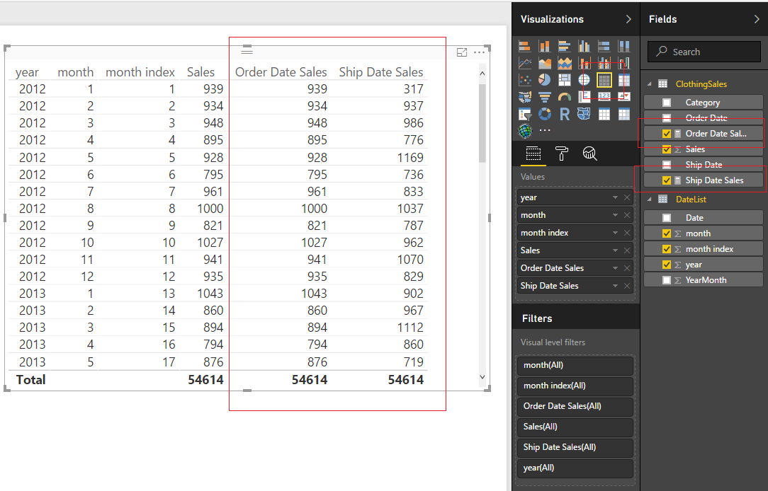
    The calculated sales for the order dates match our earlier column.  This is expected, and we can confirm that this calculation is working properly.  The shipped date sales are now calculating a different number.  In some cases, the Shipped Date Sales is lower than the orders, because in that month you took in more orders than you shipped.  In other months, the Shipped Date Sales is higher than the Order Date Sales, because there were likely large shipments ordered in the prior month and shipped in a different month.

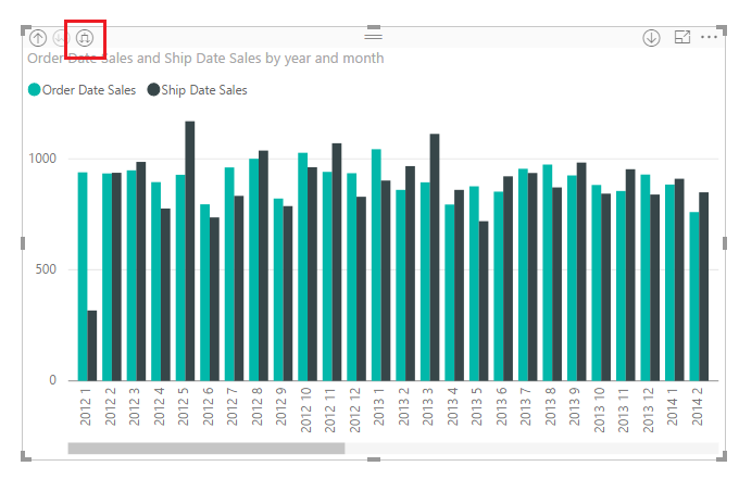
    By adding a Bar Chart from the Visualizations pane, we can now see sales by order date and ship date.

    Bar Chart by Year
    Bar Chart by Year

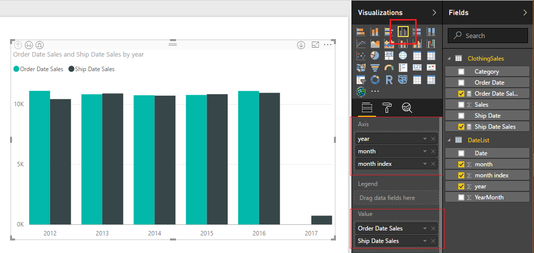
    We can even dig deeper into the data.  Click the Expand button to see the data by Year and Month.

    Expand Button
    Expand Button

    Well that is about it.  I hope you enjoyed this tutorial about using two relationships between data tables.  If you want more information about DAX check out these books that I have found extremely helpful.

    This specific example was based of the article from Marco Russo at SQLBI on UserRelationship in Calculated Columns.  Follow Marco at http://www.sqlbi.com/articles/

  • UseRelationship DAX Tutorial – Curbal

    UseRelationship DAX Tutorial – Curbal

    Here is another great tutorial from Curbal.  This tutorial teaches you how to use the DAX function UserRelationship.  This is important when your dealing with a tables in your data model that have multiple relationships.  Power BI by design can only handle one relationship between two different tables.  This will also be an important function to use when you have source tables that contain multiple date columns.  This is a pretty slick function when handling supply chain type data sets.

    For the full documentation from Microsoft visit this page.

    The Highlights:

    Full video below:

    Curbal has been generating a lot of great content.  To learn about for more information you can visit the website found here, or visit the YouTube Channel.

    For more great videos about Power BI click the image below:

    PBI Videos


  • Using Variables within DAX

    Using Variables within DAX

    Every so often you find a hidden gem, something so valuable, just hiding there in plain sight.  Recently, I found out that I LOVE the using Variables with in a DAX expression.  Ok, brief introduction, I was trying to calculate sales changes between different years.  The data looked similar to the following table:

    Year Month Sales
    2013 1 20
    2013 2 25
    2014 1 22
    2014 2 23
    2015 1 21
    2015 2 31

    I wanted to sum the sales for each year and compare the percent change between each year.  If you have followed my blog for a while, I have a ton of tutorials about percent change.  ( See list of other tutorials dealing with percent change )

    Now, for the twist making this calculation more difficult.  I want to calculate percent change even when a filter is applied by clicking on a visual.  By using variables we can apply some data modeling voodoo magic to get the desired results.  See a sample of the measures working in the Power BI Embedded sample below:

    Let’s dive in!

    Open up PowerBI Desktop, Click the Get Data button on the Home ribbon and select Blank Query.  Click Connect to open the Query Editor.  On the View ribbon click the Advanced Editor button.  While in the Advanced Editor paste the following code into the editor window, click Done to complete the data load.

    Note: If you need some more help loading the data follow this tutorial about loading data using the Advanced Query Editor.  This tutorial teaches you how to copy and paste M code into the Advanced Editor.

    let
     Source = Excel.Workbook(Web.Contents("https://powerbitips03.blob.core.windows.net/blobpowerbitips03/wp-content/uploads/2017/05/Clothing-Sales.xlsx"), null, true),
     ClothingSales_Table = Source{[Item="ClothingSales",Kind="Table"]}[Data],
     #"Changed Type" = Table.TransformColumnTypes(ClothingSales_Table,{{"Date", type date}, {"Category", type text}, {"Sales", Int64.Type}}),
     #"Inserted Year" = Table.AddColumn(#"Changed Type", "Year", each Date.Year([Date]), type number)
    in
     #"Inserted Year"

    Your loaded data should look like the following:

    Load ClothingSales Data
    Load ClothingSales Data

    Rename the Query to ClothingSales, and click Close & Apply to load the data into the data model.

    It is a good practice to review the data columns and verify that the formatting is set up correctly.  To do this click on the the column Date in the Fields pane, then click on the Modeling ribbon.  In the Formatting section change the format to Date Time and select M/d/yyyy format.  Repeat this for the following columns:

    • Format Sales to Currency then select $ English (United States)
    • Format Year to Whole Number

    With our data properly formatted we are ready to build a simple bar chart.  See the image below for the bar chart set up:

    Create Bar Chart
    Create Bar Chart

    To start we will create a explicit calculation for the total selected sales.  On the Home ribbon click the New Measure button and enter the following code:

    Total Selected Sales = SUM(ClothingSales[Sales])

    Pro Tip: To learn more about explicit vs implicit calculations within Power BI Click the following link.

    Add a Card visual and add our new measure.

    Add Card Visual
    Add Card Visual

    Let’s change the formatting measure so we can see the full number.  With the Card still selected click the Paint Roller expand the section labeled Data label and change the units from Auto to None.  This allows us to see the entire sales number.

    Remove Number Formatting from Card
    Remove Number Formatting from Card

    Let’s enhance this card visual further by adding dollars formatting.  Make sure you have the Total Selected Sales measure selected by Clicking on the words of the measure.  Then, click on the Modeling ribbon click and change the Format to Currency, then select $ English (United States). The final format of the card visual should look like the image below:

    Final Card Format
    Final Card Format

    For the next step we will repeat the previous steps for our new measures.

    1. Create the measure
    2. Change the formatting of the card
    3. Change the formatting of the measure

    The next measure will calculate the prior year total sales, but only calculate this value when a filter context from a different visual is applied.  Take note this is the magic I was talking about!!

    Prior Year Sales = 
    VAR 
    selectedYear = if( HASONEVALUE(ClothingSales[Year]), 
        FIRSTNONBLANK(ClothingSales[Year],ClothingSales[Year]),
        BLANK() )-1
    Return 
        CALCULATE(
            SUM(ClothingSales[Sales]),
            ALL(ClothingSales),
            ClothingSales[Year] = selectedYear)

    I am going to pause a second here and explain what is going on in this measure as we have multiple things going on.  First, we are creating a variable with the VAR.  In the below image I show you that the variable that we are defining is called selectedYear.  SelectedYear returns a value of blank if multiple years are selected.  This is accomplished by using the if statement and the HASONEVALUE() DAX formula.  The Return in then allows us to output a value.  In this case we are using the CALCULATE() to sum all the sales.  The next part is crucial to making this work.  Within the Calculate we are applying two filters.  The first filter selects the entire table with the All() then we apply the filter from the earlier defined variable with the name of selectedYear.

    Prior Year Sales in Color
    Prior Year Sales in Color

    Apply the same formatting steps 2, and 3 mentioned earlier.  Now, we can select one of the years within our bar chart.  Doing so populates the two measures we created.  The selected year total sales, and the prior year of sales. I selected the year of 2014, which has sales of $11k.  Hover your mouse over the bar for year 2013 and the tool tip will appear showing a total sales of $10K.

    Selected Bar
    Selected Bar

    Now we will make our percent change measure.  Enter the following as a new measure:

    Percent Change = DIVIDE([Total Selected Sales],[Prior Year Sales],1)-1

    Pro Tip: Use the DAX function DIVIDE when dividing two numbers, this protects against odd cases where the denominator is zero.

    Click on the Modeling ribbon and change the formatting of the measure to Percentage.  Add a final measure that calculates the difference.  See measure below:

    Prior Year Delta = [Total Selected Sales] - if( [Prior Year Sales] = BLANK(), [Total Selected Sales],[Prior Year Sales])

    This measure calculates the total changes in sales between the two selected years.  The if statement at the end of the equation handles a special case that if you don’t have any individual year selected the prior year delta defaults to zero.

    Thanks for following along an learning about variables.  Trust me, these are super helpful.  Make sure you spend some learning how to leverage variables in your DAX equations.

    This Tutorial was inspired by the following article I found from SQLBI authored by the master of DAX Alberto Ferrari.  I mean, come on, Ferrari, how baller is that last name!  I guess that is why he is the master.  Kudos to you Alberto!

    Still need more reading about DAX, check out the following books:

  • SUM & SUMX Tutorial – Curbal

    SUM & SUMX Tutorial – Curbal

    Learn how to use SUM() and SUMX() with this great video from Curbal. As you become more familiar with PowerBI you will increase your understanding of DAX (Database Analysis Expressions). Microsoft has an extensive list of all the expressions you can use found here.  One of the more common expressions you will use is SUM and SUMX.

    Example of SUM, SUMX and Calculate from PowerPivotPro

    Microsoft Documentation of SUM

    Microsoft Documentation of SUMX

    Using the SUMX and SUM expressions:

    To learn more about DAX I have read both of these book and found them extremely helpful.  They both cover the basics and then quickly get you understand how to make complex calculations which you will need to make the right visual work.

    Curbal has been generating a lot of great content.  To learn about for more information you can visit the website found here, or visit the YouTube Channel.

    For more great videos about Power BI click the image below:

    PBI Videos

  • Dynamic Filters in PowerBI

    Dynamic Filters in PowerBI

    This video talks about how to create custom links that apply report level filters.  This is super cool and provides a ton of wide flexibility when building drill down reports.  In this example Patrick talks to filtering a report based on a Sales Person (Lilly Code).  Great technique for drilling down into subsets of data within a report.  If implemented in correctly this will enhance the user experience.

    Dynamic filtering with PowerBI:

    In the above video Patrick has referred to a previous video done by Adam talking about report filters within the URL query string.  For convience I have linked the referred video below, so you can watch it all in one place.

    If you haven’t already make sure you go check out Adam’s site and YouTube Blog for more great information.

    For more great videos about Power BI click the image below:

    PBI Videos

  • Using Parameters to Enable Sharing

    Using Parameters to Enable Sharing

    This week I had a number of team members tell me how difficult it was to share a PBIX file and the corresponding data between team members.  The department hasn’t committed 100% to the idea of using PowerBI.com, and thus wanted to share the actual report.  I pointed my team mates to my earlier tutorial about using variables for file locations.  After reading the tutorial the team came back with a bunch of griping about how they didn’t want to go into the query editor, people name variables different things, and thus it’s hard to understand what another team member was doing, blah, blah, blah…

    So, in order to make peace I took another look at trying to make the sharing of a PBIX file easier.  This time I decided to use the Parameters feature within PowerBI.  This feature within the Query Editor was released all the way back in April of 2016.  I read about it, thought it was interesting but couldn’t find a really good use case.  In my current predicament, the parameters feature is the perfect solution.

    By using a parameter to store a folder and or file location you enhance the user experience by making it easier for a user to change the Query.

    To modify a parameter after it has already been built click on the bottom half  of the Edit Queries button, found on the Home ribbon.  A menu will pop up and you can select Edit Parameters.

    Edit Queries
    Edit Queries

    The Enter Parameters screen will pop up.  This is where you would change the parameters for a query.  In our example this is where we will enter a new folder location for our data.

    Enter Parameters Screen
    Enter Parameters Screen

    Let’s begin the tutorial.  To start we will need to work with some data.  In my earlier tutorial, I used the Olympic Medals Count.  We will reuse this dataset.  Start by downloading the zipped folder Olympic Metal Count files from the following location.  Once you have downloaded the sample data, extract the folder and subsequent files from the zipped file.  In windows 10, which I am using, you can right click on the downloaded file and select Extract All..

    Extract All from Zipped Folder
    Extract All from Zipped Folder

    A pop-up window will appear to complete the extraction process. By leaving the default settings the folder will be extracted into the same location as the downloaded file. Click Extract to complete the extraction.

    Complete Extraction
    Complete Extraction

    We now have a folder with all our data.

    Extracted Folder
    Extracted Folder

    With the data prepared we can now make the parameters within PowerBI.  Open PowerBI and click the top half of the Edit Queries button.  The Query Editor will open.  Click the Mange Parameters found on the Home ribbon.  The Parameters screen will open.  Click the blue New button at the top left.  Enter the name Folder, and include a brief description of this parameter.  Since the folder parameter is essential to the query we must leave the Required box checked.  Change the Type to Text, and leave the Suggested Values to Any value.  Finally enter the Folder Location where our Medal-Count file is located into the Current Value.  Click OK to complete the parameter.

    Make Parameter
    Make Parameter

    Next, we will create the actual query to load the folder containing our Metal Counts.  Click on the New Source button.  This will open the Get Data window.  Select the Folder option located in the list on the right.  Click Connect to complete the Get Data.

    Connect to Folder
    Connect to Folder

    The Get Data window will close, then a new window asking for the folder location will open.  This is where the parameter implementation is slick.  Click the ABC button to the far right of the Folder Path bar.  Change the selection to Parameter and select our newly created parameter labeled Folder.  Click OK to load the Folder.

    Change to Parameter
    Change to Parameter


    Select Folder
    Select Folder

    Next the folder prompt opens allowing us to accept or edit the query.  Click Combine & Edit to proceed.  The Combine Files window will open.  Here we can interrogate each file to inspect what is in each file.  Clicking the drop-down menu next to Example File: allows us to see the list of all files.  Select the 2004 Medals.xlsx file.

    Select Drop Down
    Select Drop Down


    Click the Sheet1 item on the left side of the window.  This exposes the data that is contained within this 2004 particular file.  Click OK to proceed.

    Select Sheet1
    Select Sheet1

    Note: For users that have been working with PowerBI for a while, this Combine Files screen flow is a newer feature.  I feel that this greatly simplifies the process and makes it easier to detect issues when loading data. 

    PowerBI now loads the files into the Query Editor.  The Query that we want to use is labeled Query2, change the Query2 name to Metal Count.

    Metal Count
    Metal Count

    What you’ll also notice is there is a lot more queries on the left side of the screen under Queries.  These queries were auto generated when we navigated through the menu screens. Click Close & Apply to complete the data load.

    Build the following Stacked Column Chart:

    Stacked Column Chart
    Stacked Column Chart

    Click the Ellipsis on the upper right hand corner of the chart and select Sort By Total to sort all the items in the bar chart according to how many metals each country won.

    Sort by Total
    Sort by Total

    Great we have made a parameter, loaded multiple excel files, and then made a visual of our data.  Let’s test it out. Save your work and close the PowerBI desktop.  (don’t forget to save your PBIX)

    Next we rename the folder where all the excel files are contained.  Change the name to Olympic Medals.

    Rename File Folder
    Rename File Folder

    Reopen your PBIX file, on the Home ribbon click the Refresh button.  Ooops, since we renamed the folder we now have an error.

    Error Screen
    Error Screen

    To fix this click the bottom half of the Edit Queries button on the home ribbon, and select Edit Parameters.  Then modify the Folder field to include the new name of the other folder Olympic Medals. Click OK to proceed.

    Edit Folder Location
    Edit Folder Location

    A message bar will appear under the Home ribbon.  Click Apply Changes to complete the data load.  PowerBI will reload all your data using the context of the new folder.

    Now this is an elegant solution for sharing PBIX files and their corresponding data files with coworkers.  This is just a simple example of how you would use parameters.  There are a multitude of other really good use cases for using parameters within your queries.  Thanks for reading along, be sure to share if you like this tutorial.

  • Import Color Theme & Color Theme Generator

    Import Color Theme & Color Theme Generator

    March is an exciting month, and with this release of Power BI we have been given some long asked for features. One such feature is the ability to import a color theme. The color theme defines the starting colors for your visuals. Before the ability to import a theme one would have to first define each color that they want to use in a Power BI report by changing each visual to have the correct color scheme. Color themes are useful when trying to make a dashboard and you want to use colors that resemble a company’s product or logo. Alright, let’s get started and make and add our own color theme to a report.

    Begin by opening up Power BI Desktop. Make sure you have the latest version of Power BI Desktop, you can download the latest version here. The import color theme feature is available in the March 2017 release.

    On the Home ribbon click the Enter Data button.  Enter the following table of data and name the table Data.

      Product    Value
    Item120
    Item225
    Item315
    Item440

    The Create Table should look similar to the following.  Click the Load button to proceed.

    Load Data Table
    Load Data Table

    Power BI will load the data to memory and the Fields pane will reveal our newly created columns. Add the Stacked Column Chart on the report page and appropriate fields shown in the image below.  You will notice that the default colors are automatically overlaid onto our visual when we add the Product to the Legend visual field.

    Add Stacked Column Chart
    Add Stacked Column Chart

    Next, let’s take a peek at the standard colors that are offered by default from Power BI.  Click on the Paint Roller found in the Visualizationpane.  Then expand the data field labeled Data colors.  Under Item1 click the little triangle.  This will expose the current color scheme that is loaded.

    Default Color Scheme
    Default Color Scheme

    Now we will load the new color theme.  But before we can load the color theme we have to generate the color theme first.  The color theme has some requirements.  First the color theme must be written as a JSON file and must adhere to the JSON format.  For developers this will be a very simple google search to accomplish this.  However, I know there are some out there that do not enjoy doing development work.  So, in a PowerBI.Tips first, I have developed a custom tool to make the color theme generation super simple.

    Introducing the PowerBI.Tips Color Theme Generator (CTG) to help Power BI users create quick and easy JSON code files to input into Power BI for the color themes. Not everyone has a coding background, and though there will be tutorials and examples of how to set up the JSON, if you aren’t familiar with the language a small typo could have you spending precious time troubleshooting the issue.

    update 3/15/17: The Advanced Theme Generator has been released.  Find the tool here.

    Click the following link to open up the PowerBI.Tips Color Theme Generator in a different Browser window.  Once the browser loads the Color Theme Generator follow the instructions listed at the top of the page to select your colors.  The only required fields are the Name, and at least one color.  For this tutorial I selected a number of nice pastel colors.  Click the Download Color Theme button to download the JSON file that we will use in Power BI.

    Note: The Generator was tested on Google Chrome.  Also, clicking the Download button will download the JSON file to your browser’s default location.  You will need to know this file location to load the file into Power BI Desktop. 

    PowerBI.Tips Color Theme Generator
    PowerBI.Tips Color Theme Generator

    Head back over to Power BI Desktop.  On the Home ribbon click the button labeled Switch Theme.  Then click Import Theme.

    Import Theme Button
    Import Theme Button

    Note: If you want to remove your custom theme you will click on the Switch Theme, then click on the Default Theme.  The normal power BI colors will be restored.

    Navigate to where your browser downloaded the file.  Select the file labeled PowerBI-Tips Color Theme.  Click Open to load the theme.

    Load Color Theme
    Load Color Theme

    PowerBI will prompt a message letting you know everything loaded correctly. Click Close to see the new theme applied to our visual.

    Theme Load Successful
    Theme Load Successful

    We can now see our custom theme by clicking on the Paint Roller found in the Visualizations pane.  Then expand the data field labeled Data colors.  Under Item1 click the little triangle.

    Tada, now we have a custom color scheme that we create and loaded.  Also, now that we the JSON file you can modify the file and keep it for future projects.

    Loaded Custom Color Theme
    Loaded Custom Color Theme

    Thanks for following along.  If you liked this tutorial please be sure to share.  Also if you want to know more about me you can visit my About page and follow me on twitter or Linkedin for updates.

  • Power BI Embedded Dashboard

    Power BI Embedded Dashboard

    For a while now I have been longing to spend more time learning all the ins and out of Power BI embedded.  From the line of work that I do, I can see a number of different development applications where an embedded solution would be perfect.  Microsoft has been spending more time developing and feature enhancing the embedded experience.  The Guy in a Cube (Adam Saxton) has another great video walking through how to embed a dashboard.  Great video, and a really good walk through.  Thanks Adam.

    Power BI Embedded Dashboards:

    If you haven’t already make sure you go check out Adam’s site and YouTube Blog for more great information.

    For more great videos about Power BI click the image below:

    PBI Videos

  • Get Your OData Here

    Get Your OData Here

    For those of you who are following my tutorials, you are most likely to understand that each tutorial comes with it’s own data source.  This has been intentional so we can both walk through the example and learn by doing.  Whenever, I am learning new things I find it’s helpful to do two things.   First, make examples and demos of what I am trying to learn.  Simply reading about a tool such as PowerBI, while engaging, it isn’t how I learn.  I learn by getting my hands dirty, opening up PowerBI and creating something.  You have to get utterly frustrated and stumped before that light bulb pops on and things become clear.  Secondly, after I’ve taken the time to learn a new feature or method I find it extremely helpful to teach someone else what I’ve learned.  By doing so, I am able share in the enthusiasm of others who also are learning.  Teaching others also makes you remove all the cluttered ideas away from the essential lesson.

    This being said, I consume a lot of data.  Always finding data sources is difficult.  Often I find myself making up my own data sets which takes additional time.  At least, it used to take me forever to find data.  This past week I was digging around for more data sources and I stumbled upon this gem.  It is the data source has been used by many a bloggers for examples.  It is Adventure Works sample business database.  For this tutorial we will walk through how to load the Adventure Works dataset directly in to PowerBI.

    Lets begin by opening Power BI desktop.  Once Power BI desktop is open on the Home ribbon click the Get Data button.  The Get Data window will open and under the Other section we find an OData Feed.  Select the OData Feed and then click Connect to proceed.

    Select OData Feed
    Select OData Feed

    The OData Feed window will open.  Enter in the following HTML address into the URL field.

    http://services.odata.org/AdventureWorksV3/AdventureWorks.svc

    Note: In this example we are only using the basic OData Feed connection.  Power BI does allow users to build more complex OData feeds which may require multiple parameters.  This functionality is included by toggling the OData Feed screen from Basic to Advanced. This would be ideal if you had an OData Feed such as http://myOdataFeed.com/{custom parameter}/OData.  

     Click OK to proceed

    Enter OData Feed
    Enter OData Feed

    Power Bi will now go to the web address and read the OData Feed.  What is returned is a list of tables.  The Navigator window shows us previews of each table.  Select the CompanySales and TerritorySalesDrillDown by checking the boxes next to each table.  Click Load to proceed.

    Select Tables
    Select Tables

    Ta Da!! that was easy.  We were able to quickly load the two tables from the Adventure Works database.  We can confirm this by looking at all the loaded fields contained in the Fields pane.

    Loaded Fields
    Loaded Fields

    Add a couple of visuals with the following fields to pretty up our page.

    Add Clustered Column Chart
    Add Clustered Column Chart

    Add Stacked Bar Chart
    Add Stacked Bar Chart

    Pro Tip: notice how the two charts we added have the same color scheme but are different dimensions.  The Clustered Column Chart has Years for the Colors, but the Stacked Bar Chart is using product categories.  Change the colors on the Stacked Bar Chart by clicking on the Paint Roller on the Visualizations pane.  Select the section called Data Colors and modify the colors for each product category.

    Change Stacked Bar Chart Colors
    Change Stacked Bar Chart Colors

    Note: In order to sort from the largest sales amount to the smallest.  Click the Ellipsis (small three dots) on the corner of the visual and select Sort by Sales.  This will make the visual sort in order of sales from the highest amount to the smallest amount. 

    Similarly you can change the colors for the Clustered Column Chart to make the visual more appealing.

    Change Clustered Column Chart Colors
    Change Clustered Column Chart Colors

    Add Waterfall Chart
    Add Waterfall Chart

    Again using the Ellipsis of the visual select Sort by Total to sort the number of sales by each employee from the largest sales amount, Linda to the smallest sales amount Lynn.  Also, note that this chart is being built off the second table that we loaded from the OData Feed labeled TerritorySalesDrilldown.

    Now, I believe we can say we are officially done.  We have loaded data from our OData Feed and created three visuals upon that data. Thanks again for following along.

    If you liked this tutorial please be sure to share.  Also if you want to know more about me you can visit my About page and follow me on twitter or Linkedin for updates.


  • Improved Matrix Headers

    Improved Matrix Headers

    Power BI has been an continually evolving tool over the last year.  The Matrix visual is powerful and mimics much of the functionality of a Pivot Table within Excel.  I will admit, the Matrix visual has some features that are left to be desired.  One such feature, the ability to word wrap row headers, has been resolved in the February 2017 update of PowerBI.  See the official release notes for details.  In my company we have traditionally been an excel driven business.  All you other heavy analytics people you know what I’m talking about.  Emails upon emails about an excel analysis, then power point presentations of those excel documents.  Inevitably a pivot table or table will end up on a power point slide.  Icky, if you ask me, especially when you have to “refresh” the data… I digress, Power BI fills a great gap in this area where the Analytics leaders within your company can make reports that easily refresh, and look dang sexy.

    The Matrix is one of those visuals that I would say is a comfortable way for non-analytical people to review data.  The Pivot Table aka Matrix in Power BI, is how people have been used to looking at data for years.  This has been quite a sticking point for many business leaders when reviewing Power BI dashboards.  I’ll present some data using a map or bar chart and I’ll usually get the, “Where’s the table of data?”  This will prompt an additional tab inside the Power BI document with a large data table.  Presenting headers in that large table or matrix has always been a challenge because the headers don’t word wrap.  Seeing Microsoft listening to people’s feedback and implementing header word wrap and other features is refreshing.

    For this tutorial we will be working with a dataset that I found from the FBI titled Crime in the United States.  I chose this data set based on the flurry of media talking about the current President’s comments about crime.  Before we move on, let me assure you this will not have any politics in this tutorial.  Therefore, it will be safe to read on.

    Open up PowerBI Desktop, Click the Get Data button on the Home ribbon and select Blank Query.  Click Connect to open the Query Editor.  On the View ribbon click the Advanced Editor button.  While in the Advanced Editor paste the following code into the editor window, click Done to complete the data load.

    Note: If you need some more help loading the data follow this tutorial about loading data using the Advanced Query Editor.  This tutorial teaches you how to copy and paste M code into the Advanced Editor.

    let
        Source = Excel.Workbook(Web.Contents("http://www.powerbi.tips/wp-content/uploads/2017/02/US-Crime-Data.xlsx"), null, true),
        #"US Crime Data_Sheet" = Source{[Item="US Crime Data",Kind="Sheet"]}[Data],
        #"Promoted Headers" = Table.PromoteHeaders(#"US Crime Data_Sheet", [PromoteAllScalars=true]),
        #"Changed Type" = Table.TransformColumnTypes(#"Promoted Headers",{{"State", type text}, {"Area", type text}, {"Violent Crime", Int64.Type}, {"Murder and Non-negligent Manslaughter", Int64.Type}, {"Robbery", Int64.Type}, {"Aggravated Assault", Int64.Type}, {"Property Crime", Int64.Type}, {"Burglary", Int64.Type}, {"Larceny Theft", Int64.Type}, {"Motor Vehicle Theft", Int64.Type}}),
        #"Unpivoted Other Columns" = Table.UnpivotOtherColumns(#"Changed Type", {"State", "Area"}, "Attribute", "Value")
    in
       #"Unpivoted Other Columns"

    Before you exit the query editor Rename the query to US Crime. It should look similar to the following:

    US Crimes Data Load
    US Crimes Data Load

    On the Home ribbon click Close & Apply to load the data into the data model.

    Lets add a little color to the Page in the form of a map.  Inside the Visualizations pane click on the Shape Map visual.  Add the appropriate fields as shown in the image below.

    Shape Map Visual
    Shape Map Visual

    We added this map as to make our page look pretty as well as, we can now click on each state and use this as a filtering mechanism.

    Next, add the Matrix visualization which is found on the Visualizations pane.  Add the fields shown in the image below.

    Add Matrix Visualization

    To illustrate the wrapped row headers as described in the Power BI blog simply hover your mouse over the header until a double arrow appears.  Then left click on the mouse to select the edge of the Area column.

    Cursor Hovering Over Area Column
    Cursor Hovering Over Area Column

    Drag the edge of the Area column left until it covers some of the text of the row labels, see below for example.

    Shortened Area Column
    Shortened Area Column

    Next, in the Visualizations pane click on the Paint Roller and expand the section labeled Row headers.  In the Row headers section toggle the Word wrap switch to On.

    Word Wrap On
    Word Wrap On

    After turning the Word wrap on you’ll notice that row headers did not word wrap.  This is because the row headers have a caveat.  The word wrap in rows will only work if row grouping is long enough to accommodate the word wrap.  To illustrate this, add the State field underneath the Area field in the Rows section in the Visualizations pane.

    Add State to Rows
    Add State to Rows

    We can now see by adding the States after the Area field that the Area Cities Outside Metropolitan Areas now has enough room to word wrap.  An important observation with the row headers word wrap is that the word wrap will be affected by other filtering selections on the visual page.  For example if I only select the state of Texas the row header for Area does not have enough room and therefore it is shortened and the “…” appears.

    Texas Selected
    Texas Selected

    When I was first exploring the Matrix row Headers Wrap I was quite confused on how I was able to actually make the headers wrap.  After playing around with the feature a while I was able to figure out the functionality.  Thanks for following along, see that wasn’t so political.  Now you can take this wonderful knowledge back to your workplace and make promises you can keep (OK, there it was, insert political jab).

    If you liked this tutorial please be sure to share.  Also if you want to know more about me you can visit my About page and follow me on twitter or Linkedin for updates.