This is a quick tutorial on how to load Excel files from a SharePoint page. SharePoint is a nice landing place for your data because it can be connected to the PowerBI.com service and thus can be used to schedule refreshes of data within your company (if you already have a SharePoint o365 account).
This tutorial will be a slightly different than my previous tutorials as I don’t have a publicly available SharePoint site that can be used to connect to. So you will have to slightly adapt what I’m presenting to you to fit your particular SharePoint needs.
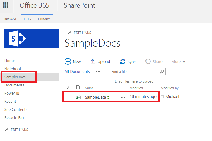
First you must start off with a SharePoint with a document library that includes an Excel file.
Sharepoint Location
The document library is titled SampleDocs, and the file we want to bring into PowerBI is called SampleData.
Clicking on the Home in the left navigation will take you to the home location of the SharePoint site. Copy down the HTML site address from your browser of this location it should look similar to the following:
https://partner.onmicrosoft.com/sites/[Your Site Name]/SitePages/Home.aspx
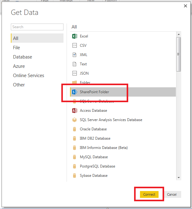
Open up PowerBI Desktop and on the home ribbon click Get Data. Highlight the SharePoint Folder and click Connect to continue.
SharePoint Folder Connection
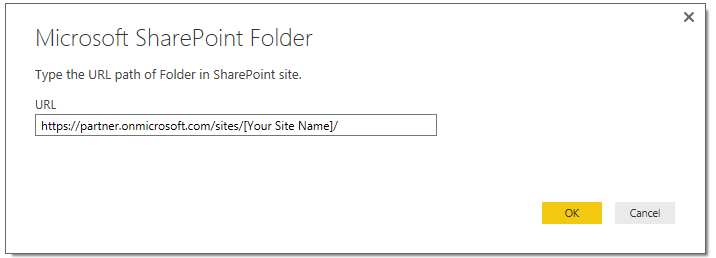
Upon clicking connect you will be presented with another screen asking for the SharePoint folder location. In the URL window you will add the SharePoint site that we identified above. However, it is important to note that you don’t need the entire web address. Rather PowerBI only needs the specific site name, thus all that needs to be inserted into the URL field is highlighted below in Red.
https://partner.onmicrosoft.com/sites/[Your Site Name]/SitePages/Home.aspx
The ending “Sitepages/Home.aspx” can be removed.
Enter Shortened Site URL
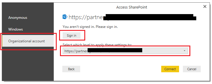
Clicking ok will present a authentication screen. Depending on your company or SharePoint authentication you will need to enter the credentials to log into the SharePoint Site. You may have to try a couple different connection methods until you are able to properly connect to the SharePoint site. In my example I had to select Organization Account then click the Sign in. I signed in with my credentials given me via my I.T. group. Also, I had to use the drop down to select the proper level to apply the settings. I used the same address as listed above: https://partner.onmicrosoft.com/sites/[Your Site Name]/
User Sign In Page
After signing in click Connect to proceed. PowerBI Desktop will then load all the files from the SharePoint site in a preview window. Click Edit to modify the query.
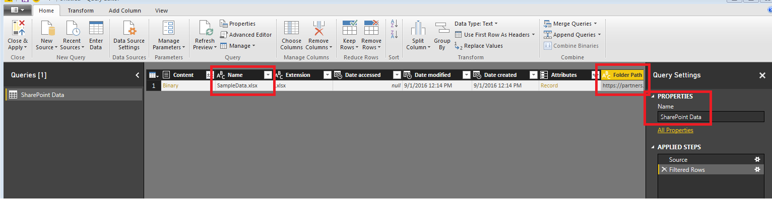
Query Editor View
We can now see our SampleData File and the folder path. Each document library will be a separate folder path, thus if you have multiple document libraries then you will have all the files in those different folder paths.
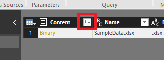
Next click the double down arrows to load the excel file.
Load File
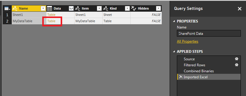
Power BI Desktop will then go to the SharePoint site and download the information inside your excel file. For my data I have all the information retained in a table within my excel document. The table name is call MyDataTable. Thus, clicking on the Table link in the MyDataTable row I will be able to open all the data within this table.
Load Table of Data from Excel File
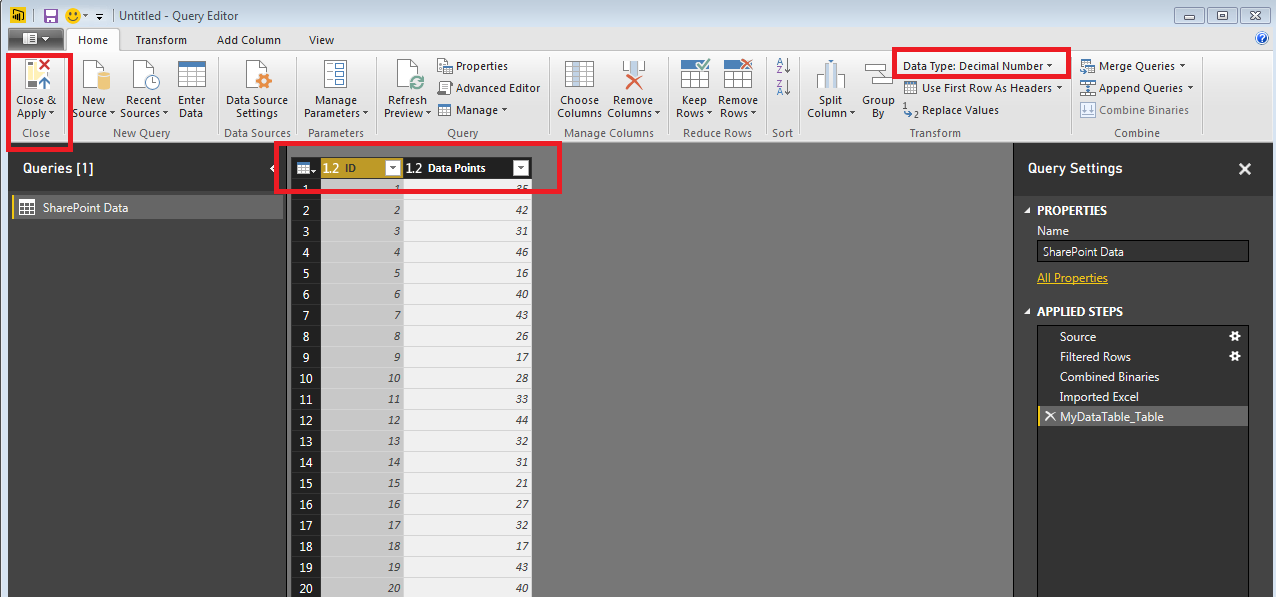
Finally the data is loaded from the excel table. Click Close & Apply on the Home ribbon to load the data into PowerBI.
Note: It is always important to check your columns and verify that your data types are correct. Highlight each column and make sure you select the proper Data Type for each column. Data Type can be found on the Home ribbon.
Final Load Data
Thanks for visiting. Make sure you stop by again for more great tutorials.
Recently at work I’ve been working with a number of large data warehouses with time series data. Often when working on such data you need to incorporate a data calendar to compute date ranges. So, for this tutorial we will build a custom date table directly inside PowerBI.
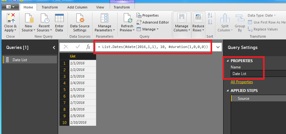
Start by opening up power BI and clicking Get Data on the home ribbon, then select Blank Query. Like always make sure you start by re-naming the query into something meaningful. Change the name of the Query to Date List. Next enter the following equation into the formula bar:
Note: For more information on the M language you can visit here. Also, here is the link to the List.Dates function found here.
Once we enter the formula into the formula bar the list of dates will appear below.
Date List
The quick explanation about the List.Dates function is below. I’ve simplified the variables below:
List.Dates( Start Date , Number of intervals , Type of interval )
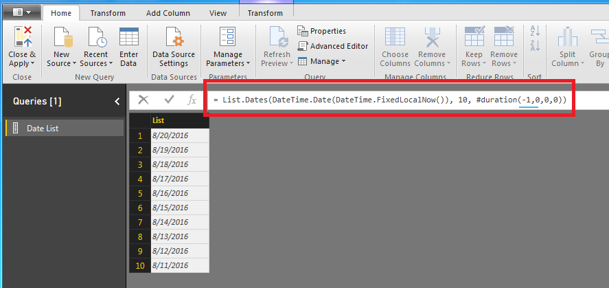
While this is interesting it does not help us make a report that updates the date range dynamically. The real world use case for this would be you have a report with data that is being generated daily, say for example a website. Maybe you want a custom date range that automatically changes every day you log into PowerBI. For example if today is 08-20-2016, I want the first date to be today and then list the dates that previous 10 days.
Note: In this equation we have changed the duration to -1. This is important to note because now our date table returns older dates. In our previous equation we used a positive 1 and we return future dates.
In this new equation we have defined the Start Date to the following statement : DateTime.Date( DateTime.FixedLocalNow() ) This is tricky because if you only use DateTime.FixedLocalNow() the statement will error out. The error occurs because the DateTime.FixedLoaclNow() is a date and time. The List.Dates function is expecting a Date only value. Hence why we use the DateTime.Date() function to remove the time stamp and only return today’s date.
Date List Using Date of Today
It is most likely your date ranges will be different than the ones in the example because the DateTime.FixedLocalNow() function will be pulling in your computer’s current date.
Next modify the equation to now pull the last 90 days (highlighted in red below)
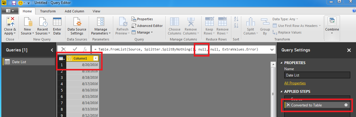
The list of dates is just that a list. We really can’t do to many other enhancements to our data with only a list of dates. Now transform the list into a table. Click on the Transform ribbon and select To Table. Notice now that we have a new column and a new applied step.
I colored the first null in the equation. This is actually a parameter that you can use to name the new column we just made. Tricky, Tricky, PowerBI. Modify the equation to the following:
Our table is updated and now has the name Date. Nice work!
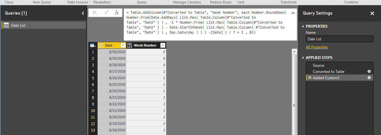
Now lets make our date list useful. Click on the ribbon labeled Add Column and then the button labeled Add Custom Column. Add the following equation to the new column and name it Week #, then click OK, to continue.
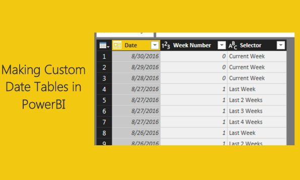
This equation defines the start of the week highlighted in RED. Since today is Tuesday 8/30/16, then the days 8/30 (Tues), 8/29 (Mon), 8/27 (Sunday) are considered week 0 or the current week. All dates prior will start with weekly increment.
Date List
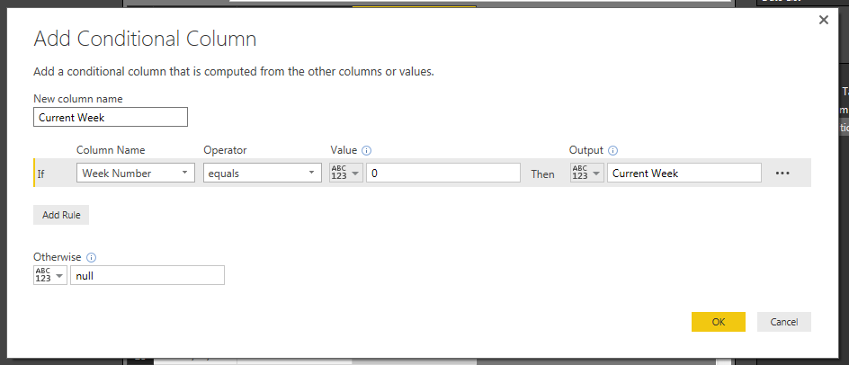
Now we can add some logic to define week variables. Click on the Add Column ribbon and select the Conditional Columnbutton. Using the drop downs in Column Name, Operator, Value and Output enter the following:
Current Week Logic
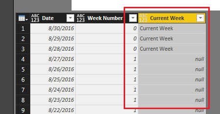
Click OK to proceed. We have now added an additional column with a text description of the week.
Current Week Column
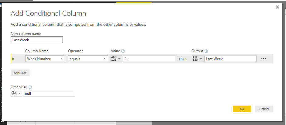
Following the add column steps mentioned above we will now add more week descriptions. Add the following conditional column for Last Week:
Last Week Logic
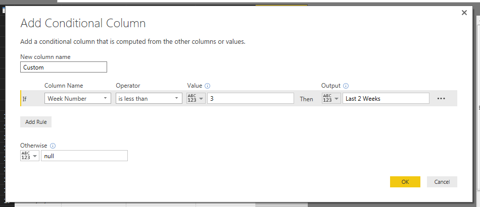
From here you can make custom columns for how you want to describe your data. In this example we will build last 2 weeks, 3 weeks and last 4 weeks. See the add conditional column logic for each of those respective weeks.
Conditional Column Logic for last 2 weeks:
Last 2 Weeks Logic
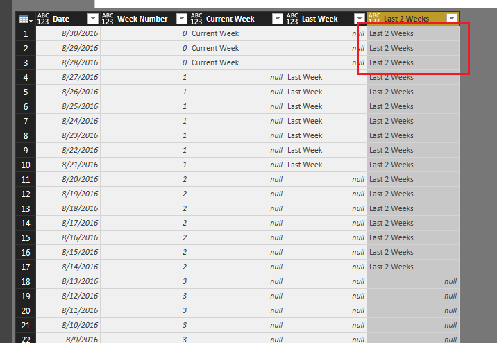
Note: When we added this conditional column we label week 0 as last 2 weeks. See image below as an example:
Last 2 Weeks Column
To fix this we modify the code that generated this column. The code initially states the following:
= Table.AddColumn(#"Added Conditional Column1", "Last 2 Weeks", each if [Week Number] < 3 then "Last 2 Weeks" else null )
We modify this code to the following: (changes highlighted in bold)
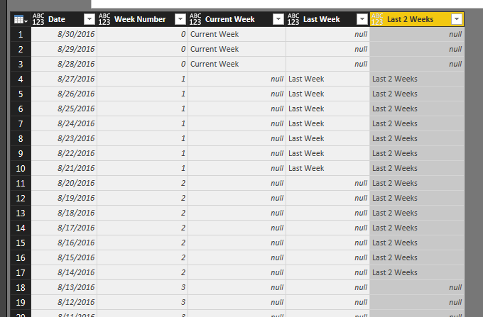
= Table.AddColumn(#"Added Conditional Column1", "Last 2 Weeks", each if [Week Number] < 3 and [Week Number] > 0 then "Last 2 Weeks" else null )
This now removes the first three days from our Last 2 Weeks column reflecting a more accurate picture of our time ranges.
Corrected Last 2 Weeks Column
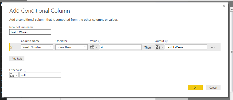
Next we will add the Last 3 Weeks column and the Last 4 weeks column. Each time we will modify the add column code to remove the first three dates of the current week.
Last 3 Weeks Logic
Last 3 Weeks auto generated code:
= Table.AddColumn(#"Added Conditional Column2", "Last 3 Weeks", each if [Week Number] < 4 then "Last 3 Weeks" else null )
We modify to the following to achieve the correct Last 3 Weeks data range: (changes highlighted in bold)
= Table.AddColumn(#"Added Conditional Column2", "Last 3 Weeks", each if [Week Number] < 4 and [Week Number] > 0 then "Last 3 Weeks" else null )
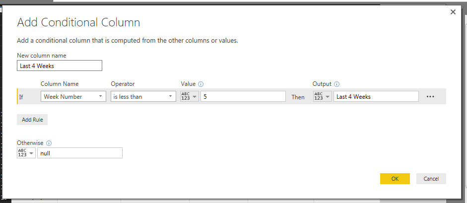
Add the Last 4 Weeks column:
Last 4 Weeks Logic
Last 4 Weeks auto generated code:
= Table.AddColumn(#"Added Conditional Column3", "Last 4 Weeks", each if [Week Number] < 5 then "Last 4 Weeks" else null )
Modify the code the following to correct the column: (changes highlighted in bold)
= Table.AddColumn(#"Added Conditional Column3", "Last 4 Weeks", each if [Week Number] < 5 and [Week Number] > 0 then "Last 4 Weeks" else null )
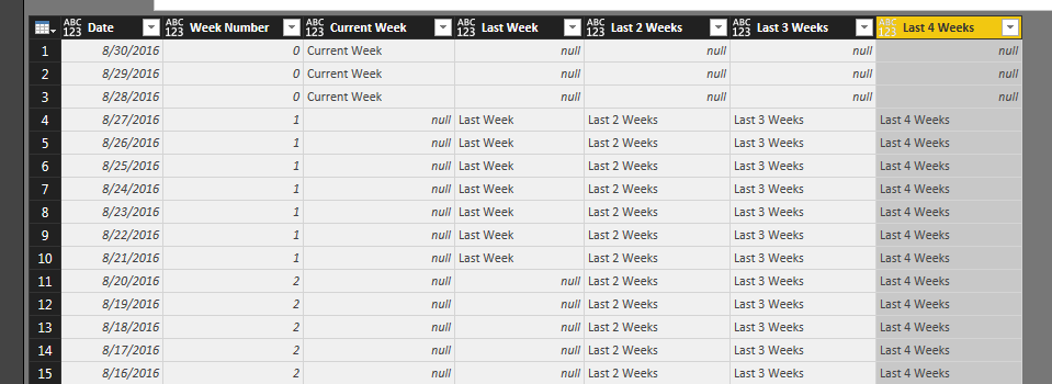
Nice job so far. We are almost to the end now. After all those additional columns you should have something that looks similar to the following:
Date Table
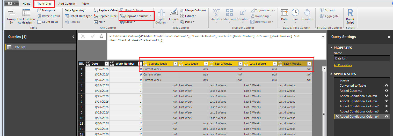
Next we will pivot all the data down to one column. This will enable us to select a time period and automatically have our date table update to the specific range.
First, shift select the following columns, Current Week, Last Week, Last 2 Weeks, Last 3 Weeks, and Last 4 Weeks. Then on the Transform ribbon click the Unpivot Columns button.
Unpivot Columns Command
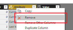
Next delete the Attribute column using a right click on the Attribute column and selecting Remove Columns.
Remove Attribute Column
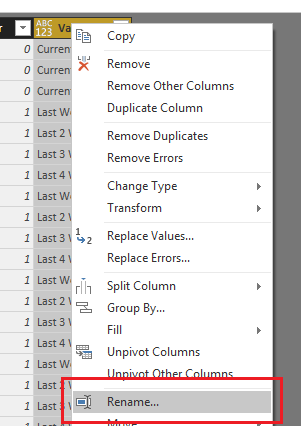
Rename the Value column to Selector by right clicking on the Value column.
Rename the Value Column
Modify each column to have the correct Data Type on the Home ribbon.
Date column data type should be Date
Week Number column data type should be Whole Number
Selector column data type should be Text
Note: It is important to always check your data types for each column before you leave the Query Editor. If you don’t you’ll find that the visuals that your trying to build later on on the page view will not work as expected.
Next, click the Home ribbon and select Close & Apply. You can now build the following visuals:
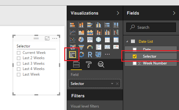
A slicer for the Selector column:
Selector Column as a Slicer
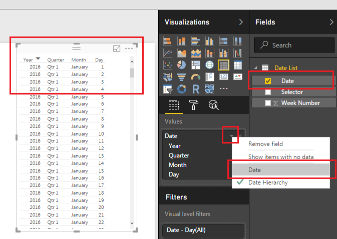
Table visual for the Date column:
Note: When you use the Date Column as the data source for the Table Visual the data will automatically be added as a Date Hierachy. This does not work well with our data so you will need to change the date from a Date Hierarchy to a standard Date. To do this click the little triangle next to the Date in the Values box. Then select Date.
Date Table
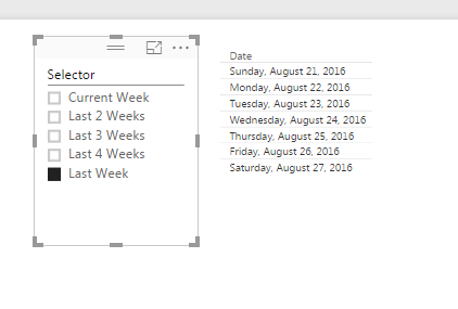
Now you can finally play around with your data and by selecting different items in the Selector slicer you can filter down to different date ranges. Below I selected the Last Week item, which filters down my dates to only the 7 days from last week.
Last Week Slicer Selected
Nice job making a custom date table in PowerBI. The nice part about this table is that it will always refresh with the latest dates whenever the queries are refreshed for this PowerBI file.
Bonus: For those of you who want to cheat and just have the M code to generate this custom date table it can be used from here:
let
 Source = List.Dates(DateTime.Date(DateTime.FixedLocalNow()), 90, #duration(-1,0,0,0)),
 #"Converted to Table" = Table.FromList(Source, Splitter.SplitByNothing(), {"Date"}, null, ExtraValues.Error),
 #"Added Custom1" = Table.AddColumn(#"Converted to Table", "Week Number", each Number.RoundDown( Number.From(Date.AddDays( List.Max( Table.Column(#"Converted to Table", "Date" ) ) , -1 * Number.From( List.Max( Table.Column(#"Converted to Table", "Date" ) ) - Date.StartOfWeek( List.Max( Table.Column( #"Converted to Table", "Date" ) ) , Day.Saturday ) ) ) -[Date] ) / 7 + 1 , 0)),
 #"Added Conditional Column" = Table.AddColumn(#"Added Custom1", "Current Week ", each if [Week Number] = 0 then "Current Week" else null ),
 #"Added Conditional Column1" = Table.AddColumn(#"Added Conditional Column", "Last Week", each if [Week Number] = 1 then "Last Week" else null ),
 #"Added Conditional Column2" = Table.AddColumn(#"Added Conditional Column1", "Last 2 Weeks", each if [Week Number] < 3 and [Week Number] > 0 then "Last 2 Weeks" else null ),
 #"Added Conditional Column3" = Table.AddColumn(#"Added Conditional Column2", "Last 3 Weeks", each if [Week Number] < 4 and [Week Number] >0 then "Last 3 Weeks" else null ),
 #"Added Conditional Column4" = Table.AddColumn(#"Added Conditional Column3", "Last 4 Weeks", each if [Week Number] < 5 and [Week Number] > 0 then "Last 4 Weeks" else null ),
 #"Unpivoted Columns" = Table.UnpivotOtherColumns(#"Added Conditional Column4", {"Date", "Week Number"}, "Attribute", "Value"),
 #"Removed Columns" = Table.RemoveColumns(#"Unpivoted Columns",{"Attribute"}),
 #"Renamed Columns" = Table.RenameColumns(#"Removed Columns",{{"Value", "Selector"}}),
 #"Changed Type" = Table.TransformColumnTypes(#"Renamed Columns",{{"Date", type date}, {"Week Number", Int64.Type}, {"Selector", type text}})
in
 #"Changed Type"
Often you will need to create some custom calendars within your PowerBI reports. Ruth Pozuelo from Curbal does a great video tutorial on using Calendar() and CalendarAuto(). I have use the Calendar() DAX function many times and find it very helpful. The following videos are built directly within DAX. This approach is one of many different methods that can be used to generate a list of dates. In a previous tutorial I talked about how to build a date table within the Query Editor (build date table in the Query Editor).
One method that Ruth talks about is the ability to use the CalendarAuto(). I have not used this expression in any previous reports, but seeing how simple it is to implement this will definitely have to be added to the toolbox.
Curbal has been generating a lot of great content. To learn about for more information you can visit the website found here, or visit the YouTube Channel.
For more great videos about Power BI click the image below:
Previously we’ve done a tutorial on loading multiple text files within one query. This is nice, however we will also need to import multiple Excel files. First, to understand the procedure of querying multiple excel files you have to understand the basics between the CSV (comma separated values) file and an excel (.xls or .xlsx) files. In a CSV file you have only one data set. The beginning of the file starts with values and separates each file with a “,” a carriage return starts a new row of data. This is an easy and efficient way to store millions of rows of data. By contrast the excel file is way more complicated. Excel files can have multiple sheets of tables of data. Think of this as a stack of CSV type files. For example if you have an excel workbook with three sheets of data, Sheet 1, Sheet 2, Sheet 3. You can think of those three sheets as grid of data, similar to the CSV file. The multiple sheet aspects of an excel file makes the data ingestion into PowerBI a little bit more complicated. To add to the complication, when you loading data from either multiple sheets, or selecting a specific out of many sheets of data. For illustration purposes imagine working with two excel files with three sheets each, 2 x 3 = 6, a total of 6 sheets of data, or what I will call “pages” of data. This is why it is more complex to load excel files than CSV files.
Note: If you want to learn how to load multiple CSV files visit this tutorial.
Not only do you have to figure out what data you want to ingest on the page you must all tell PowerBI which sheets do you want to look at, and from which excel file. If that was to many words think of loading the following data sample:
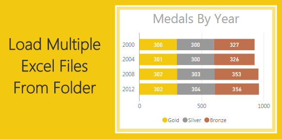
Workbook 1 – Year 2000 Olympic Medals
Sheet 1
Olympic Medals Table
Rank
Country
Gold
Silver
Bronze
Total
Sheet 2
Sheet 3
WorkBook 2 – Year 2004 Olympic Medals
Sheet 1
Olympic Medals Table
Rank
Country
Gold
Silver
Bronze
Total
Sheet 2
Sheet 3
The data structure for both workbook 1 and 2 are similar but the names of the files are different and there can be multiple pages.
To resolve this we will have to write a M language function that will load each file as a function. This will be done in later in the tutorial.
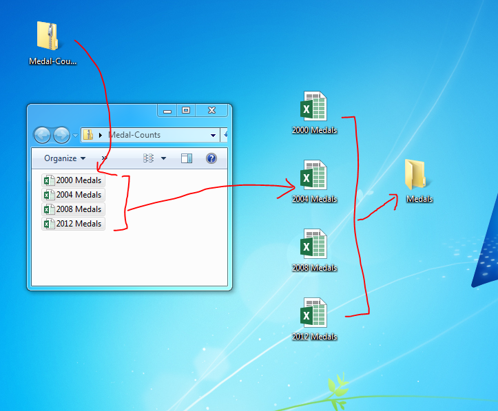
Here is the data source information for Olympic medals won by each country from 2000 to 2012, download here. Inside the Medal Count zip file are four xlsx files, extract them to your desktop. Move the files into a folder on your desktop labeled Medals.
Medals Folder
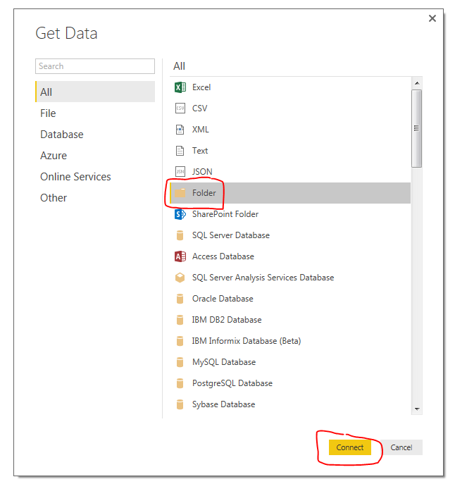
Now, open up PowerBI, We will begin shaping our data to load all the excel files. On the Home ribbon click on the Get Data button. Select Folder on the right side and click Connect.
Get Folder Data
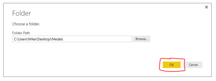
Next select the folder path that you want acquire the files from, Click OK to continue.
Load Folder Screen
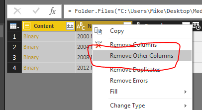
Next we are presented with the loaded files within our selected folder. Click Edit at the bottom of the screen to proceed. The Query Editor window will now open. Select the first two columns labeled Content, and Name. With those two columns selected right click on the header and select Remove Other Columns. This will remove all the useless data associated with the files.
Remove Other Columns
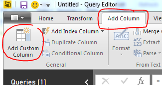
Click the Add Column ribbon and press the Add Custom Column on the left side of the ribbon.
Add Custom Column
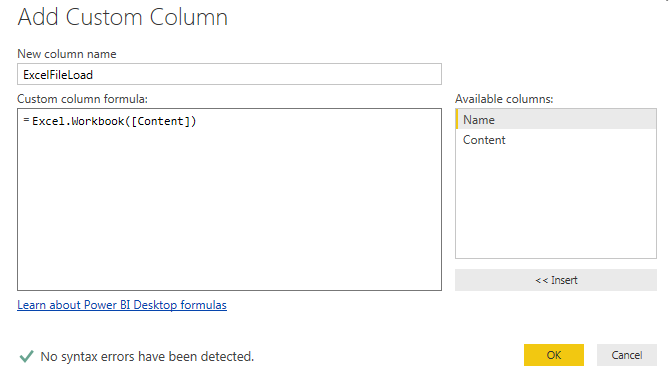
Name the new column ExcelFileLoad and enter the following equation.
Excel.Workbook Equation
Note: Once you type “Excel.Workbook(” you can click on the column labeled Content on the right side of the screen to have the name automatically added. This is useful when you have many many columns to choose from or if there naming of those columns becomes complex. This way you won’t type in the column name incorrectly.
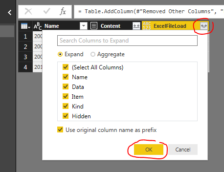
Click OK to proceed. Notice we now have a new column called ExcelFileLoad. Next click the Expand button (the one with the arrows) located at the right of our newly added column. Click OK to proceed.
Expand Column Button
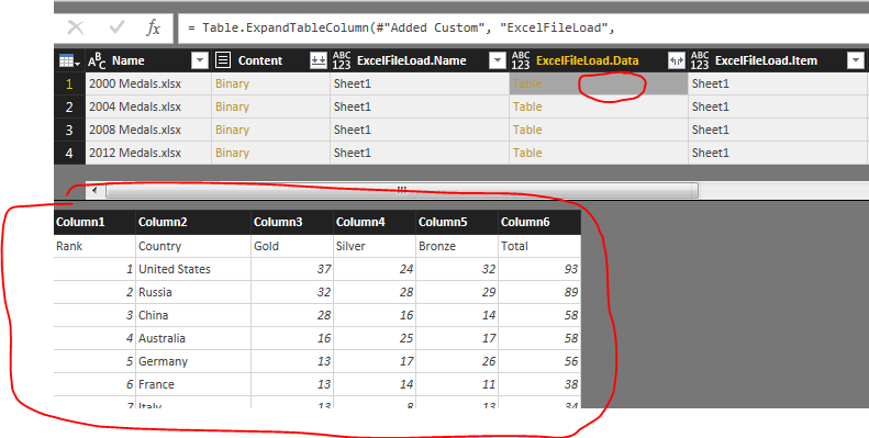
Now we have a new column labeled ExcelFileLoad.Data, which is the data contained in our excel files. Now click in the Grey Area next to the word labeled Table. This will open up the file and reveal the information present in the file. Notice that we can see the headers and the data in our file. Row 1 contains the headers of each column. Rows after row 1 contains the medal data.
View Data of File
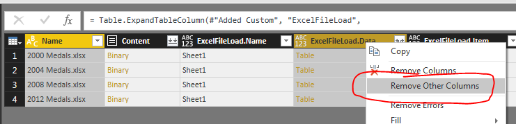
Next select the columns labeled Name and ExcelFileLoad.Data and right click on the column header, then select Remove Other Columns
Remove Other Columns Again
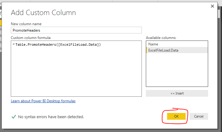
On the Add Column ribbon click Add CustomColumn again. Name the column PromoteHeaders and enter the following formula. Click OK to proceed.
Promote Headers Step
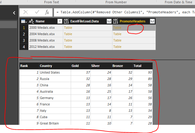
Clicking again on the grey area in our newly created column reveals our tables with promoted headers.
View of Data with Promoted Headers
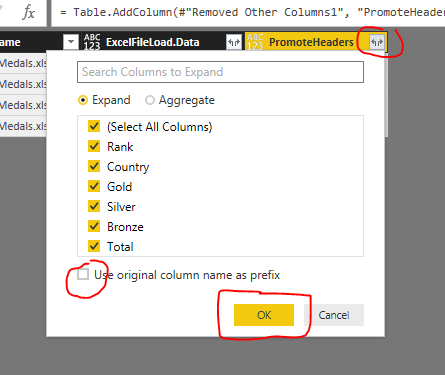
Next click the Expand Button, un-check the Use original column name as prefix and click the OK button to proceed.
Expand Data
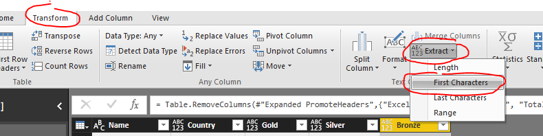
Remove the following columns, ExcelFileLoad.Data, Rank, and Total, bu right selecting the columns and right clicking on the header and selecting Remove Columns. Now we want to parse out the year name from the Name column. To do this click on Name Column. Then click the Transform ribbon and click the Extract button, then select First Characters from the drop down menu.
Extract First Characters
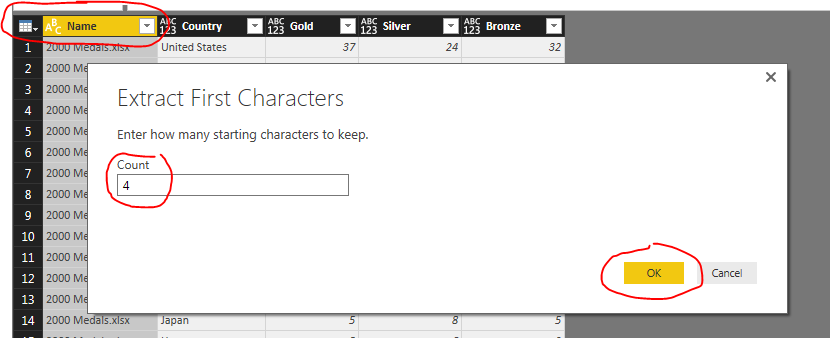
In the Extract First Characters menu enter the number 4 and click OK to proceed.
Extract First 4 Characters
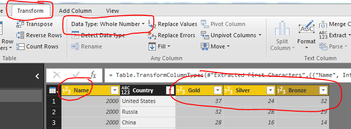
Change the following columns to whole numbers: Name, Gold, Silver, Bronze. Do this on the Transform ribbon in the Data Type drop down.
Change Data Types
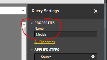
We are now ready to load all the data. Rename the Query to Medals, click the Home ribbon and select Close & Apply.
Name Query
And there you have it. We have successfully loaded four excel files into one query.
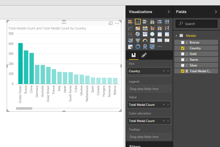
Bonus: for added flare add the following measure.
Total Medal Count = sum(Medals[Gold]) + sum(Medals[Silver]) + sum(Medals[Bronze])
This week I encountered an issue when working with multiple queries in my data model. Here is the source files in case you want to follow along.
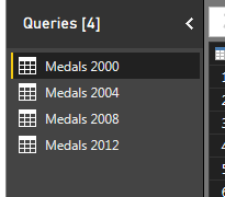
Here’s what happened. I had a PBIX file that had four queries in it, one file for the summer the Olympic metal count for the following years, 2000, 2004, 2008, and 2012.
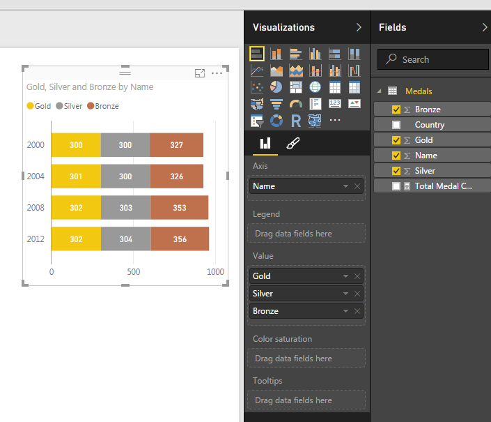
Olympic Metal Count
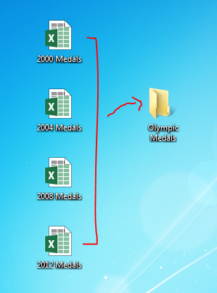
After a bit of working I figured that my desktop screen was going to get to cluttered if I continued to collect Olympic metal data. Thus, I moved my excel files which were my source data into a folder called Olympic Medals.
File Move
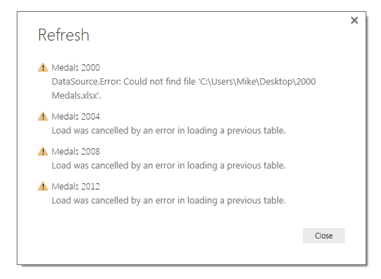
By doing this I broke all the links for all four files. This was discovered when I tried to refresh my queries and noticed that all the queries failed. Power BI gave me a nice little message notifying me that there was a data source error.
DataSource.Error: Could not fine the file:
Missing File Error
To fix this I had to open the query editor and change each file’s location to the new folder that I just made. Seeing that this is not an efficient use of my time, I decided to spend more time to figure out a way to make a variable that would be my file location for all my queries.
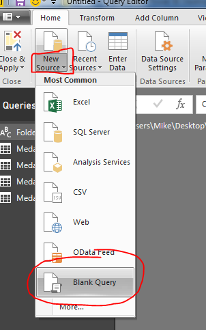
Lets begin by making a new blank query by clicking on the bottom half of the New Source button on the Home ribbon. Then click the item labeled Blank Query.
Start Blank Query
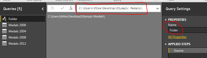
With the new query open type in the file location where you will obtain all your working files. For me my file location was on my desktop, thus the file location is listed below. Rename the new query to Folder.
Folder Query
Note: Since we are working on building a file structure for Power BI to load the excel files you will want to be extra careful to add a “\” back slash at the end of the file location.
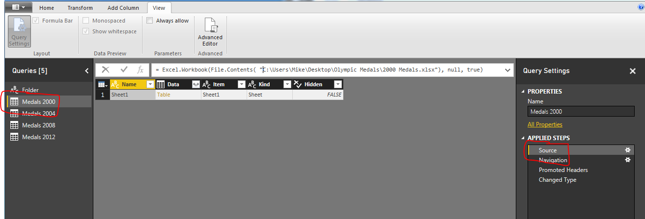
Next on the query for Medals 2000, we click the Source under the applied steps window on the right. This will expose the code in the formula bar at the top of the window.
Select the Source Applied Step
Note: If you don’t see the formula bar as I have illustrated in the image above, you can turn this feature on by click the View ribbon and checking the box next to the words Formula Bar. This will expose the formula bar so you can edit the source step.
This is where the magic happens. We can now insert our new blank query into this step. Our current file contents looks like the following:
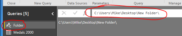
Not only does this shorten our equation, it now uses the folder location we identified earlier and then we can pick up the file name 2000 Medals.xlsx. This makes is very easy to add additional queries with the same steps. Also, if you move your files to a new folder location, you only have to change the Folder query to reflect the new file location. To test this make a new folder on your desktop called New Folder. Move all the Olympic medal files to the new folder. Now in Power BI Desktop press the Refresh on the Home ribbon. This should result in the Data.Source.Error that we saw earlier. To fix this click the Edit Queries on the Home ribbon, select the Folder query and change the file directory to the new folder that you made on your desktop. It should look similar to the following:
New Folder Image
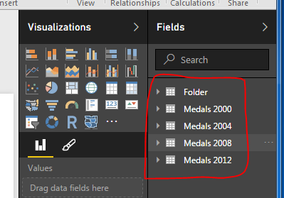
Once you’ve modified the Folder query, click Close & Apply on the Home ribbon and all your queries will now reload. Success!!
New Queries Loaded
Hope this tutorial helps and solves some of the problems when moving data files and storing information for Power BI desktop. Please Share if you like the tutorials. Thanks.
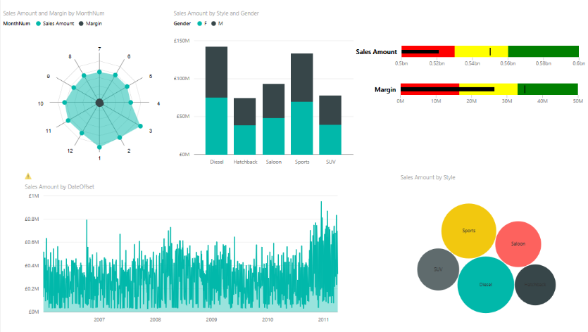
As I have been exploring PowerBI and building dashboards I have noticed that often the visuals can obscure your data. As you click on different visuals there is a need to highlight different pieces of data. Take for example the following dashboard:
Sample Visual Example
Notice the different car types in the bar chart. As you click on each vehicle type, Diesel, Hatchback, etc.. you expect the data to change accordingly. In some cases it is helpful to present a card visual to show the user what you selected and any relevant data points you want to highlight. For example if I select the Diesel vehicle type I may want to know the average sales amount, total sales in dollars, or number of units sold. This is where we can build specific measures that will intelligently highlight selected data within your PowerBI visual.
Here is a sample of what we will be building today:
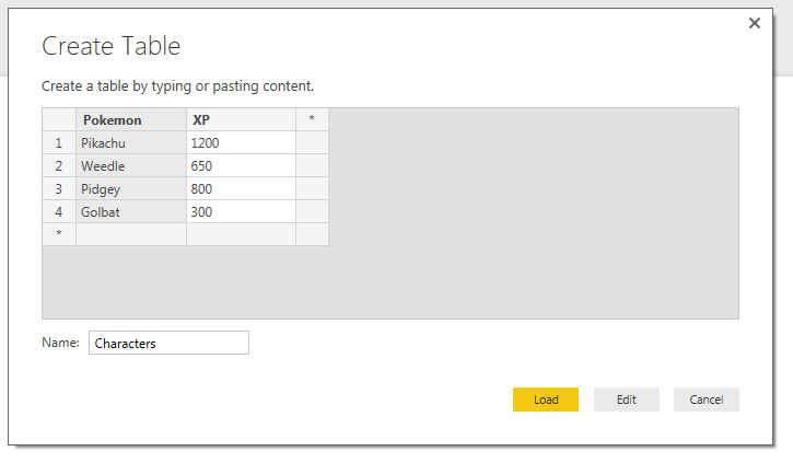
lets begin with starting with some data. In honor of your news feed being bombarded with Pokemon Go articles lets enter some data on Pokemon characters.
We will enter our data manually. For a full tutorial on manually entering in data visit here.
Click the Enter Data button on the Home ribbon and enter the following information into the displayed table.
Pokemon
XP
Pikachu
1200
Weedle
650
Pidgey
800
Golbat
300
Rename the table to Characters. Once you are finished entering in the data it should look like the following:
Create Table of Characters
Click Load to continue.
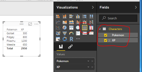
Start to examine your data by building a table visual.
Table Visual
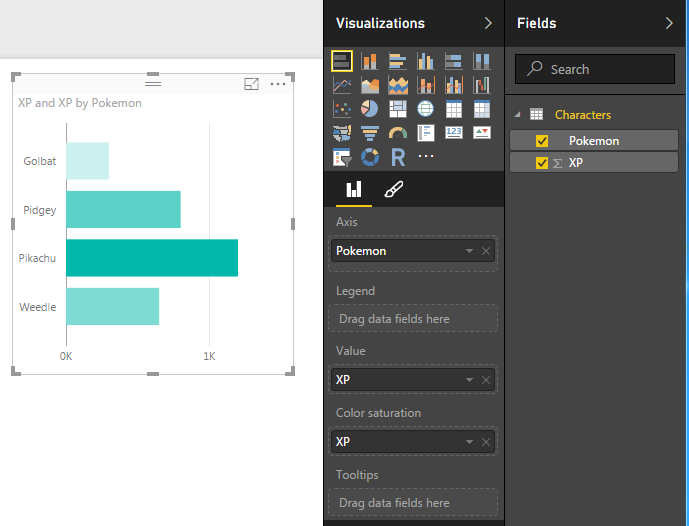
Next add a Bar chart.
Bar Chart
Note: I added the XP column twice. Once to the Value attribute and to the Color Saturation. This enhances the look of your visual by coloring the bars with a gradient. The largest bar will have the darkest color, and the smallest bar will have the lightest color.
Next, we will begin building some measures. The first measure will be a total of all the experience points (XP) for each character. Click the New Measure button on the Home ribbon and enter the following DAX expression:
Total XP = Sum(Characters[XP])
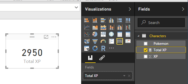
Now, add a Card visual and add the new measure we created Total XP.
Total XP Card Visual
This measure totals all the experience points for all the selected characters within the visual. Since all characters are now selected the total XP for all characters is 2,950.
The next, and final measure, will be the intelligent card. For this measure we want to display the characters name when we select them in the bar chart. Click the New Measure button on the Home ribbon and enter the following DAX expression:
Update: As of Mid 2017 Microsoft introduced a new DAX expression called SELECTEDVALUE which greatly simplifies this equation. Below is an example of how you would change the DAX equation to use SELECTEDVALUE.
This measure first checks to see how many distinct items are in the column Pokemon of our dataset. If there is only one selected character then we will display the FIRSTNONBLANKcharacter, which will be the name of our selected character. If there are more than one characters selected. The measure will count the number of characters selected and return a text string with the count and the word Selected. Thus, showing us how many items have been selected.
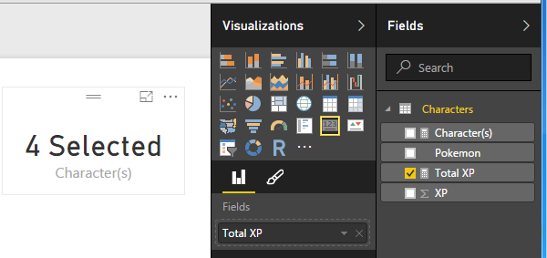
Add the measure titled Character(s) to a card visual.
Add Character Card Visual
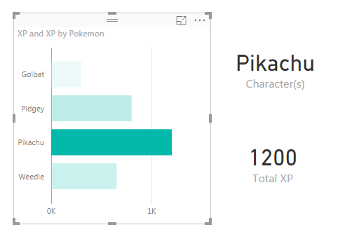
We can now see that there are 4 characters selected. Clicking on Pikachu in the bar chart resolves with the character’s name being displayed and the XP of Pikachu being displayed in the Total XP card visual.
Selecting Pikachu
You can select multiple items by holding down Ctrl and clicking multiple items in the bar chart.
Well, that is it. I hope you enjoyed this Pokemon themed tutorial. Thanks for visiting.
Want to learn more about PowerBI and Using DAX. Check out this great book from Rob Collie talking the power of DAX. The book covers topics applicable for both PowerBI and Power Pivot inside excel. I’ve personally read it and Rob has a great way of interjecting some fun humor while teaching you the essentials of DAX.
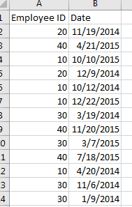
I had an interesting comment come up in conversation about how to calculate a percent change within a time series data set. For this instance we have data of employee badges that have been scanned into a building by date. Thus, there is a list of Badge IDs and date fields. See Example of data below:
Employee ID and Dates
Looking at this data I may want to understand an which employees and when do they scan into a building over time. Breaking this down further I may want to review Q1 of 2014 to Q1 of 2015 to see if the employee’s attendance increased or decreased.
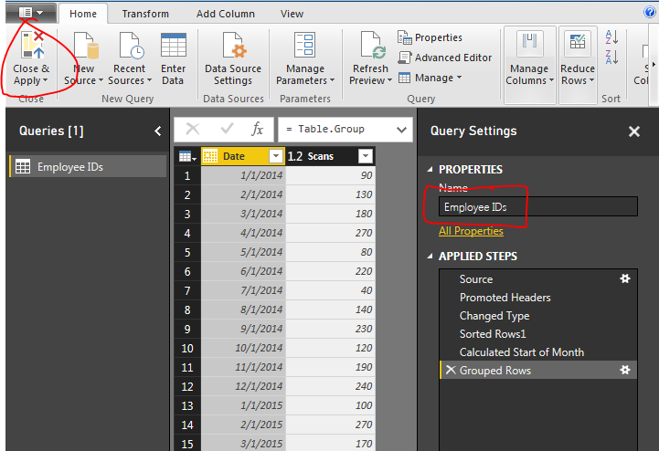
Here is the raw data we will be working with, Employee IDs Raw Data. Our first step is to Load this data into PowerBI. I have already generated the Advanced Editor query to load this file. You can use the following code to load the Employee ID data:
let
 Source = Csv.Document(File.Contents("C:\Users\Mike\Desktop\Employee IDs.csv"),[Delimiter=",", Columns=2, Encoding=1252, QuoteStyle=QuoteStyle.None]),
 #"Promoted Headers" = Table.PromoteHeaders(Source),
 #"Changed Type" = Table.TransformColumnTypes(#"Promoted Headers",{{"Employee ID", Int64.Type}, {"Date", type date}}),
 #"Sorted Rows1" = Table.Sort(#"Changed Type",{{"Date", Order.Ascending}}),
 #"Calculated Start of Month" = Table.TransformColumns(#"Sorted Rows1",{{"Date", Date.StartOfMonth, type date}}),
 #"Grouped Rows" = Table.Group(#"Calculated Start of Month", {"Date"}, {{"Scans", each List.Sum([Employee ID]), type number}})
in
 #"Grouped Rows"
Note: I have highlighted Mike in red because this is custom to my computer, thus, when you’re using this code you will want to change the file location for your computer. For this example I extracted the Employee ID.csv file to my desktop. For more help on using the advanced editor reference this tutorial on how to open the advance editor and change the code, located here.
Next name the query Employee IDs, then Close & Apply on the Home ribbon to load the data.
Close and Apply
Next we will build a series of measures that will calculate our time ranges which we will use to calculate our Percent Change (% Change) from month to month.
Now build the following measures:
Total Scans, sums up the total numbers of badge scans.
Total Scans = SUM('Employee IDs'[Scans])
Prior Month Scans, calculates the sum of all scans from the prior month. Note we use the PreviousMonth() DAX formula.
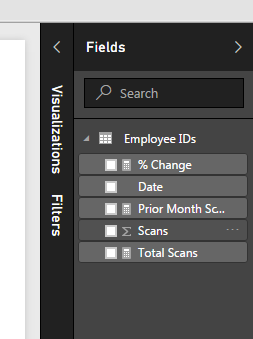
Completing the new measures your Fields list should look like the following:
New Measures Created
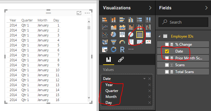
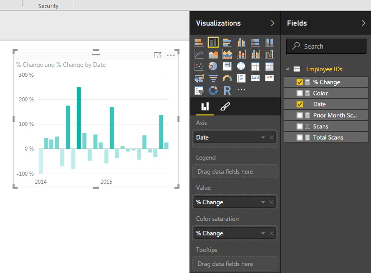
Now we are ready to build some visuals. First we will build a table like the following to show you how the data is being calculated in our measures.
Table of Dates
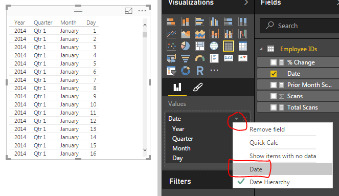
When we first add the Date field to the chart we have a list of dates by Year, Quarter, Month, and Day. This is not what we want. Rather we would like to just see the actual date values. To change this click the down arrow next to the field labeled Date and then select from the drop down the Date field. This will change the date field to be viewed as an actual date and not a date hierarchy.
Change from Date Hierarchy
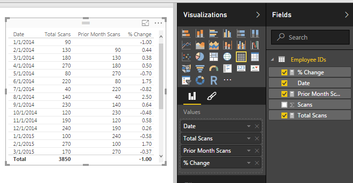
Now add the Total Scans, Prior Month Scans, and % Change measures. Your table should now look like the following:
Date Table
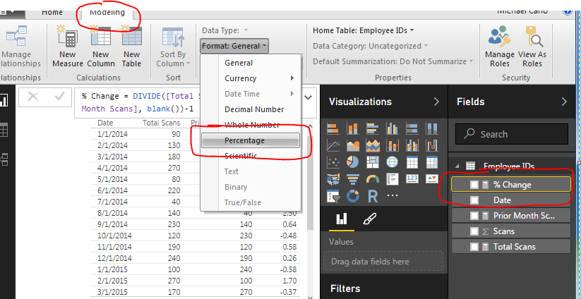
The column that has % Change does not look right, so highlight the measure called % Change and on the Modeling ribbon change the Format to Percentage.
Change Percentage Format
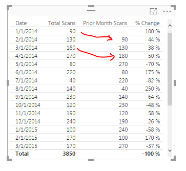
Finally now note what is happening in the table with the counts totaled next to each other.
Final Table
Now adding a Bar chart will yield the following. Add the proper fields to the visual. When your done your chart should look like the following:
Add Bar Chart
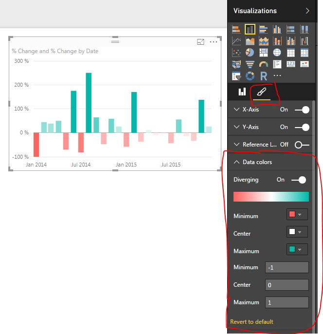
To add a bit of flair to the chart you can select the Properties button on the Visualizations pane. Open the Data Colors section change the minimum color to red, the maximum color to green and then type the numbers in the Min, Center and Max.
Changing Bar Chart Colors
Well, that is it, Thanks for stopping by. Make sure to share if you like what you see. Till next week.
Want to learn more about PowerBI and Using DAX. Check out this great book from Rob Collie talking the power of DAX. The book covers topics applicable for both PowerBI and Power Pivot inside excel. I’ve personally read it and Rob has a great way of interjecting some fun humor while teaching you the essentials of DAX.
Let me setup a scenario for you. You get a data file from an automated system, it has the same number of columns but the data changes for every new file. Being the data savvy person that you are you’ve spent some time working in excel to make a template where you can copy your new data into and then automatically all your equations and graphs magically work. You pat your self on the back and happily send out your fantastic report to everyone you know. Then tomorrow when the data comes to you again you repeat the same process over again. Still enamored by your awesome report, you send it out again knowing you have saved your self so much time not having to do the analysis or creation of your reports over and over again. Now, fast forward 3 months. That stupid report shows up again, and now you have to lug all that data from file to file and begrudgingly you sent out your report. Thus, is the store of the analyst. You love data, but you hate it as well. Well in this tutorial I’ll show you how to remove some of the pain of that continual data loading process by loading new data from a folder.
My previous post (found here) talks about loading data from a folder. In this tutorial we will add some logic to this method that will look at a folder but only load the most recently added item from that folder.
Data for this tutorial is located this link Monthly Data Zip File. This data in the ZIP file is a monthly data sample from Feb 2016 to April of 2016.
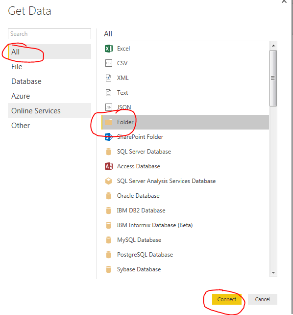
Download the zip file mentioned above and extract the Monthly Data folder down to your desktop. Open up PowerBI Desktop and click on the Get Data button and select All on the left side. Click on the item labeled Folder and click Connect to continue.
Get Data from Folder
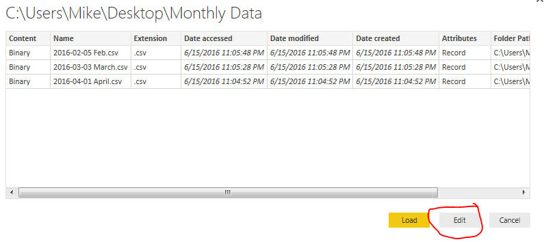
Select the newly unzipped Monthly Data folder that should be on your desktop. Click OK to continue. Upon opening that folder location you will be presented with the multiple files. Click Edit to edit the query.
Edit Query for Folder Load
Now you are in the Query Editor. This is where the fancy query editing will work to our advantage. We could load all the data into one large query. However, depending on the size of your data sets or how you want to report your data this may not always be desirable. Instead you may only want data from April, then May when the new data is sent next month.
Thus, our first step to start pairing down the data will be to first filter the files in sequential order. In this case because I have named the files with a Year-Month-Day format I can sort the files according to their names.
Note: When using PowerBI desktop it is a good practice to name the files beginning with a YYYY-MM-DD file name. This makes it really easy when sorting and ingesting information into PowerBI. I have used other columns of information such as Date Accessed or Date Created before but have gotten inconsistent results as these dates can change depending on when a file was moved or copied from one place to another.
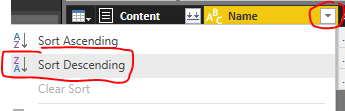
Click the drop down next to Name and sort the files in Sort Descending.
Name in Sort Descending
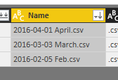
This places the files with the most recent file at the top of the list.
File List in Descending Order
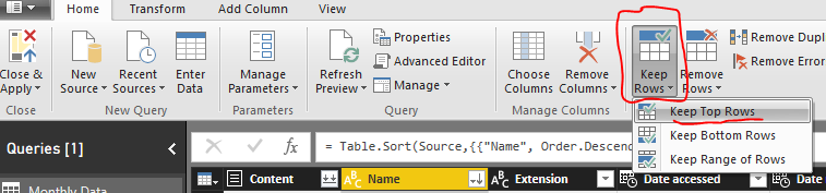
Next click on the Keep Rows button on the Home ribbon, select Keep Top Rows.
Keep Top Rows
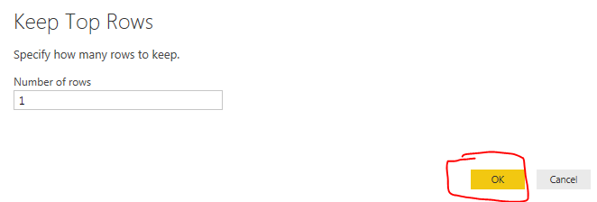
Enter the number 1 when the popup appears. Click OK to continue.
Keep Top Rows Menu
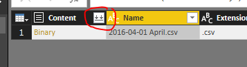
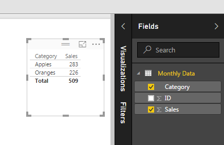
Now you’ll notice you have only one file selected which is our latest file from April. Click the Load File button found in the Content column.
Load File Button
We have completed the activities in the Query Editor and can now load the data. Click Close & Apply found on the Home ribbon. All our April data has loaded. by making a simple table we can now see all the data that was just loaded.
Loaded Data from April
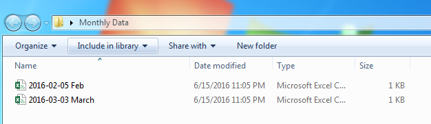
Now we will remove some data from our desktop folder labeled monthly data. Open the folder on the desktop labeled Monthly Data and delete the filed labeled 2016-04-01 April. You should now have a folder labeled Monthly Data with only two files in it, one for Feb and one for March.
Two Files Left
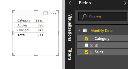
Return back to Power BI Desktop and click the Refresh button on the Home ribbon. Notice now how all our data has changed. We are now looking at the March data because it is the most recent file in our folder based on the file name.
March Data Load
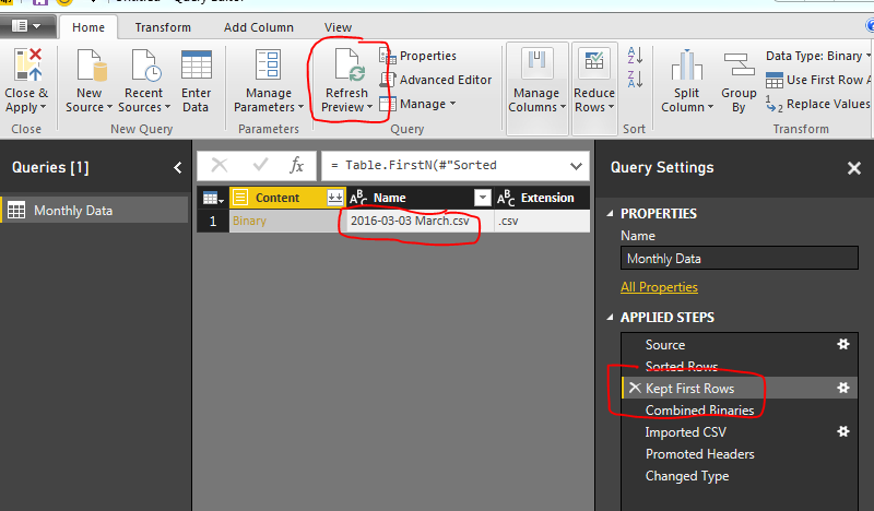
To verify this we open the query editor (Click the Edit Queries on the Home ribbon). Click Refresh Preview on the Home ribbon and finally select the Applied Step called Kept First Rows. This will reveal the month of March as our data source.
Month of March Loaded
Now, every time you add a new file to our folder and refresh PowerBI the latest file (based on the naming convention we talked about earlier) will always be loaded.
Note: This method works great when your data source is coming from an automated system. The file format must always be the same for this to work reliability. If the file naming convention changes, or the number of columns or location of those columns changes then the query will most likely fail.
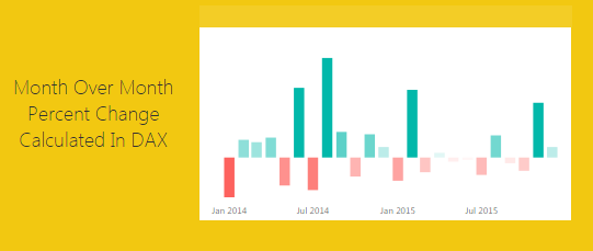
This tutorial will produce a measure that will dynamically calculate a percent change every time an item is selected in a visual. The previous tutorial can be found here. In the previous tutorial we calculated the percent change between two time periods, 2014 and 2013. In practice it is not always desirable to force your measure to only look at two time periods. Rather it would be nice that your measure calculations change with changes in your selections on visuals. Thus, for this tutorial we will add some dynamic intelligence to the measures. Below is an example of what we will be building:
First here is the data we will be using. This data is the same data source as used in the previous % change tutorial. To make things easy I’ll give you the M code used to generate this query. Name this query Auto Production.
Note: the code shown above should be added as a blank query into the query editor. Add the code using the Advanced Editor. Another tutorial showing you how to add advanced editor code is here.
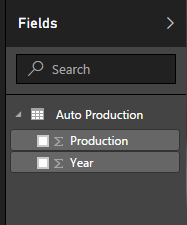
Once you’ve loaded the query called Auto Production. The Field list should look like the following:
Auto Production
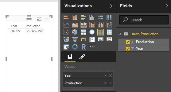
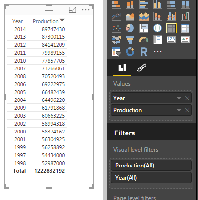
Next add a Table with Production and Year. this will allow us to see the data we are working with. When you initially make the table the Year and Production columns are automatically summed, thus why there is one number under year and production.
Table of Data
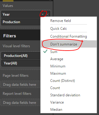
Rather we want to see every year and the production values for each of those years. To change this view click on the triangle in the Values section of the Visualizations pane. This will reveal a list, in this list it shows that our numbers are aggregated by Sum change this to Don’t Summarize.
Change to Don’t Summarize
Now we have a nice list of yearly production levels with a total production at the bottom of our table.
Table of Production Values by Year
Next we will build our measure using DAX to calculate the percent changes by year. Our Calculation for % change is the following:
% Change = ( New Value / Old Value ) - 1
Below is the DAX statement we use as our measure. Copy the below statement into a new measure.
I color coded the DAX expression between the two equations to show which parts correlated. Note we are using the DIVIDE function for division. This is important because if we run into a case where we have a denominator = 0 then an error is returned. Using DIVIDE allows us to return a zero instead of an error.
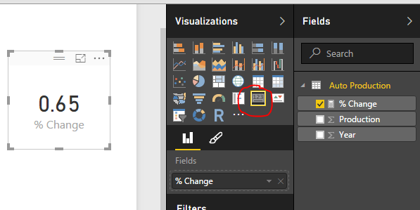
Next add our newly created measure as a Card.
Add Card
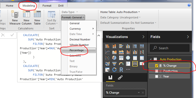
Change the % Change measure format from General to Percentage, do this on the Modeling ribbon under Formatting.
Change Measure Formatting
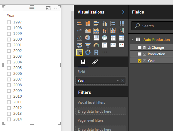
Next add a slicer for Year.
Slicer for Year
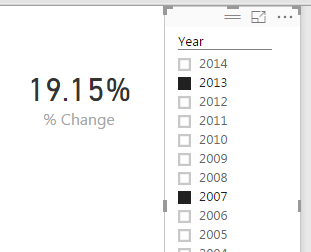
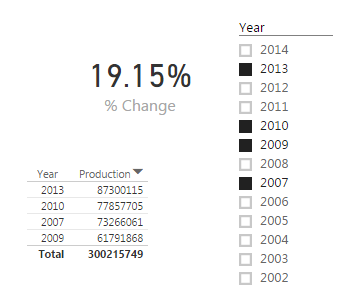
Now you can select different year and the % change will automatically change based on our selection. The % change will always select the smallest year’s production and the largest year’s production to calculate the % Change. By Selecting the Year 2013 and 2007, the percent change is 19.15%. The smallest year is 2007 and the largest is 2013.
Selecting Two Years
If we select a year between 2013 and 2007 the measure will not change.
Multiple Years Selected
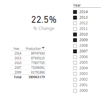
The measure will only change when the starting and ending years are changed. By selecting the year 2014, the measure finally changes.
Selecting Additional Year
Pretty cool wouldn’t you say? Thanks for taking the time to walk through another tutorial with me.
Want to learn more about PowerBI and Using DAX. Check out this great book from Rob Collie talking the power of DAX. The book covers topics applicable for both PowerBI and Power Pivot inside excel. I’ve personally read it and Rob has a great way of interjecting some fun humor while teaching you the essentials of DAX.
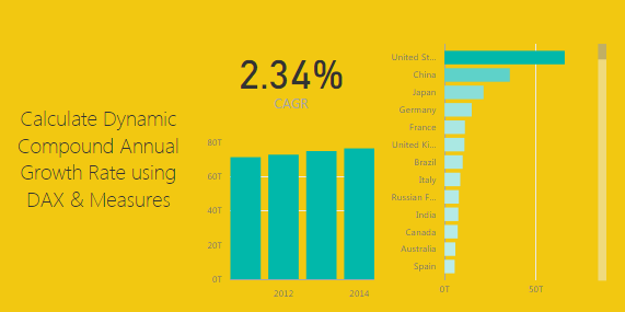
This tutorial walks through calculating a dynamic Compound Annual Growth Rate (CAGR). By dynamic we mean as you select different items on a bar chart for example the CAGR calculation will update to reveal the CAGR calculation only for the selected data. See the example below:
Lets start off by getting some data. For this tutorial we will gather data from World Bank found here. To make this process less about acquiring data and more about calculating the CAGR. Below is the Query Editor code you can copy and paste directly into the Advance Editor.
let
 Source = Excel.Workbook(Web.Contents("https://powerbitips03.blob.core.windows.net/blobpowerbitips03/wp-content/uploads/2017/11/Worldbank-DataSet.xlsx"), null, true),
 EconomicData_Table = Source{[Item="EconomicData",Kind="Table"]}[Data],
 #"Changed Type" = Table.TransformColumnTypes(EconomicData_Table,{{"Country Name", type text}, {"Country Code", type text}, {"Indicator Name", type text}, {"Indicator Code", type text}, {"1960", type number}, {"1961", type number}, {"1962", type number}, {"1963", type number}, {"1964", type number}, {"1965", type number}, {"1966", type number}, {"1967", type number}, {"1968", type number}, {"1969", type number}, {"1970", type number}, {"1971", type number}, {"1972", type number}, {"1973", type number}, {"1974", type number}, {"1975", type number}, {"1976", type number}, {"1977", type number}, {"1978", type number}, {"1979", type number}, {"1980", type number}, {"1981", type number}, {"1982", type number}, {"1983", type number}, {"1984", type number}, {"1985", type number}, {"1986", type number}, {"1987", type number}, {"1988", type number}, {"1989", type number}, {"1990", type number}, {"1991", type number}, {"1992", type number}, {"1993", type number}, {"1994", type number}, {"1995", type number}, {"1996", type number}, {"1997", type number}, {"1998", type number}, {"1999", type number}, {"2000", type number}, {"2001", type number}, {"2002", type number}, {"2003", type number}, {"2004", type number}, {"2005", type number}, {"2006", type number}, {"2007", type number}, {"2008", type number}, {"2009", type number}, {"2010", type number}, {"2011", type number}, {"2012", type number}, {"2013", type number}, {"2014", type number}, {"2015", type number}, {"2016", type number}, {"2017", type any}}),
 #"Removed Other Columns" = Table.SelectColumns(#"Changed Type",{"Country Name", "2011", "2012", "2013", "2014", "2015", "2016"}),
 #"Filtered Rows" = Table.SelectRows(#"Removed Other Columns", each [2011] <> null and [2012] <> null and [2013] <> null and [2014] <> null and [2015] <> null and [2016] <> null),
 #"Unpivoted Other Columns" = Table.UnpivotOtherColumns(#"Filtered Rows", {"Country Name"}, "Attribute", "Value"),
 #"Renamed Columns" = Table.RenameColumns(#"Unpivoted Other Columns",{{"Country Name", "Country"}, {"Attribute", "Year"}, {"Value", "GDP"}})
in
 #"Renamed Columns"
Note: The tutorial on how to copy and paste the code into the Query Editor is located here.
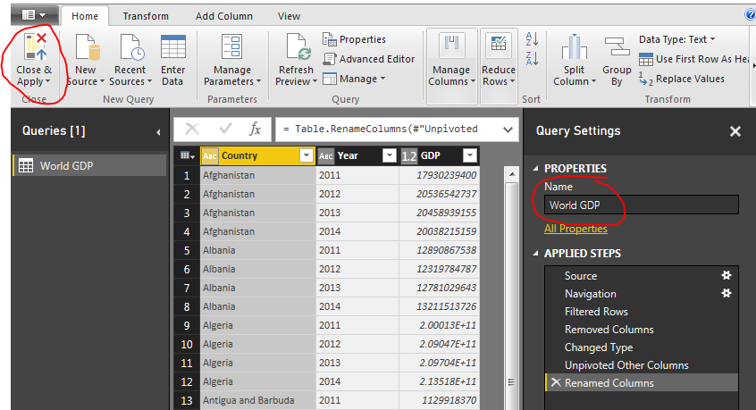
Paste the code above into the advance editor. Click Done to load the query into the the Query Editor. Rename the Query to World GDP and then on the home ribbon click Close & Apply.
World GDP Query
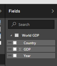
Loading the query loads the following columns into the fields bar on the right hand side of the screen.
Fields Load from World GDP
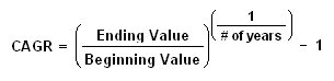
Next we will build a number of measure that will calculate the required variables to be used in our CAGR calculation. For reference the CAGR calculation is as follows: (found from investopia.com)
CAGR Calculation
For each variable on the right of the equation we will create one measure ; one for Ending Value, Beginning Value and # of Years. On the Home ribbon click the button labeled New Measure. Enter the following equation for the beginning value:
Beginning Value = CALCULATE(SUM('World GDP'[GDP]),FILTER('World GDP','World GDP'[Year]=MIN('World GDP'[Year])))
This equation totals all the items in the table called World GDP in the column labeled GDP. This calculation will change based on the selections in the page view.
Add two more measures for Ending Value and # of years
Ending Value = CALCULATE(SUM('World GDP'[GDP]),FILTER('World GDP','World GDP'[Year]=MAX('World GDP'[Year])))
# of Years = (MAX('World GDP'[Year])-MIN('World GDP'[Year]))
Your fields list should now look like the following:
Fields List with Measures
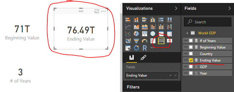
Next add a Card visual for each new measure we added. A measure is illustrated by the little calculator image next to the measure. I have highlighted the Ending Value measure as a card for an example.
Ending Value Measure as Card Visual
Combining all the previous measures we will now calculate the CAGR value. Add one final measure and add the following equation to calculate CAGR:
CAGR = ([Ending Value]/[Beginning Value])^(1/[# of Years])-1
This calculation uses the prior three measures we created. Add the CAGR as a card visual to the page.
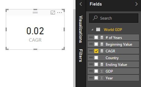
Card Visual for CAGR
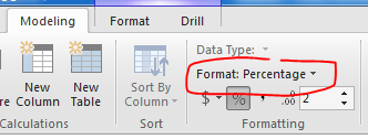
Notice how the value of this measure is listed as a decimal, which isn’t very useful. To change this to a percentage click on the measure CAGR item in the Fields list. Then on the Modeling ribbon change the format from General to Percentage.
Format Change to Percentage
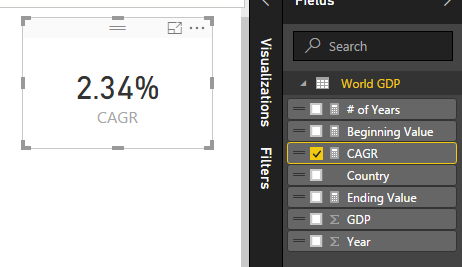
This changes the card visual to now be in a percentage format.
Percentage Format
Now you can add some fun visuals to the page and depending on what is selected the CAGR will change depending on the selected values.
ProTip: To calculate the CAGR you can alternatively compute the entire calculation into one large measure like so:
CAGR = ( [Ending Value] / [Beginning Value] )^(1/ [# of Years] )-1

is the same as below:

CAGR = (  CALCULATE(SUM('World GDP'[GDP]),FILTER('World GDP','World GDP'[Year]=MAX('World GDP'[Year])))  /  CALCULATE(SUM('World GDP'[GDP]),FILTER('World GDP','World GDP'[Year]=MIN('World GDP'[Year]))) ) ^ (1/  (MAX('World GDP'[Year])-MIN('World GDP'[Year]))  )-1
A final recommendation is to wrap the CAGR calculation in an IFERROR function to make sure if one year is selected the measure doesn’t fail. This returns a 0 if there is a calculation error of the equation. Documentation on IFERROR is found here.
CAGR = IFERROR( ([Ending Value]/[Beginning Value])^(1/[# of Years])-1 , 0)
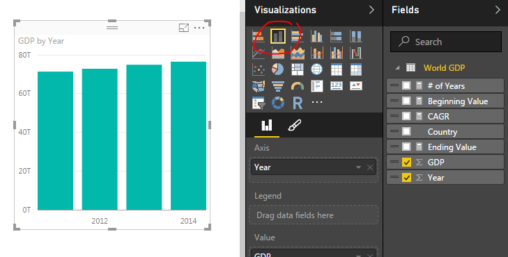
To finish out the tutorial you can add the following visuals:
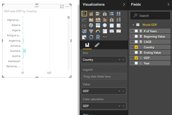
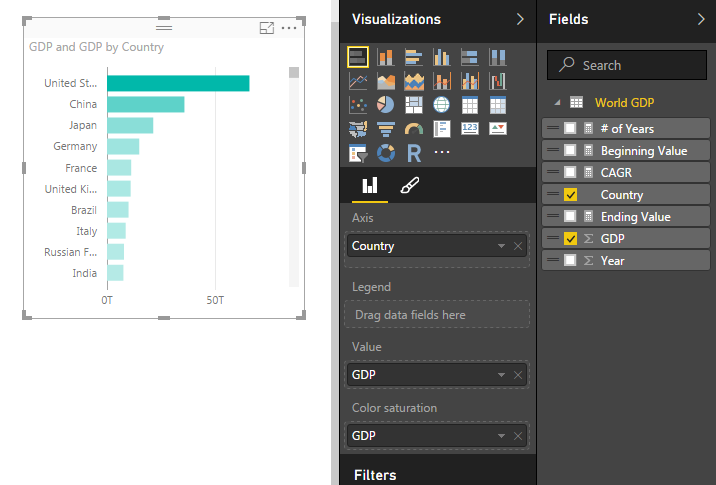
Stacked Bar Chart Visual – GDP by YearStacked Bar Chart Visual – GDP by Country
Note: you can sort the items in the stacked bar chart by selecting the ellipsis (the three dots in the upper right hand corner) and then selecting Sort By and clicking GDP.
Country Sorted by GDP
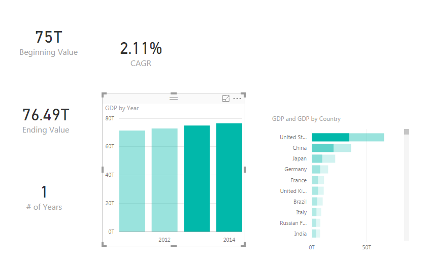
Finally select different items in the GDP by Year chart or the GDP by Country chart. To select more than one item in the bar charts you have hold shift and left mouse click the multiple items. Notice how all the measures change.
Years 2013 & 2014 CAGR
Thanks for following along.
This tutorial used the following materials:
Power BI Desktop (I’m using the April 2016 version, 2.34.4372.322) download the latest version from Microsoft Here.
Want to learn more about PowerBI and Using DAX. Check out this great book from Rob Collie talking the power of DAX. The book covers topics applicable for both PowerBI and Power Pivot inside excel. I’ve personally read it and Rob has a great way of interjecting some fun humor while teaching you the essentials of DAX.
Manage Consent
To provide the best experiences, we use technologies like cookies to store and/or access device information. Consenting to these technologies will allow us to process data such as browsing behavior or unique IDs on this site. Not consenting or withdrawing consent, may adversely affect certain features and functions.
Functional
Always active
The technical storage or access is strictly necessary for the legitimate purpose of enabling the use of a specific service explicitly requested by the subscriber or user, or for the sole purpose of carrying out the transmission of a communication over an electronic communications network.
Preferences
The technical storage or access is necessary for the legitimate purpose of storing preferences that are not requested by the subscriber or user.
Statistics
The technical storage or access that is used exclusively for statistical purposes.The technical storage or access that is used exclusively for anonymous statistical purposes. Without a subpoena, voluntary compliance on the part of your Internet Service Provider, or additional records from a third party, information stored or retrieved for this purpose alone cannot usually be used to identify you.
Marketing
The technical storage or access is required to create user profiles to send advertising, or to track the user on a website or across several websites for similar marketing purposes.