The Monkey Tools add-in for excel is really amazing. As a developer for Power BI for many years I’ve learn a ton of tips and tricks while working with Power Query. Watching Ken demo the high level of automation that Monkey Tools really blew my mind. How did I not know about this tool earlier?! My development patterns have now forever changed.
This presentation for Monkey Tools is presented by it’s developer MVP Ken Puls. Ken is a staple and expert in the Excel community. Not to mention, he is an incredible presenter. You will enjoy this session from Ken.
What are Monkey Tools?
Monkey tools in short is a simple way to automate data modeling within Excel. There are some incredibly helpful portions such as making date calendars, changing how data is handled during Power Query loading process and many more.
Ken gives us a great overview and starts digging into the amazing features of this tool in this two part series about this tool.
If you like the content from PowerBI.Tips please follow us on all the social outlets. Stay up to date on all the latest features and free tutorials. Subscribe to our YouTube Channel. Or follow us on the social channels, Twitter and LinkedIn where we will post all the announcements for new tutorials and content.
Introducing our PowerBI.tips SWAG store. Check out all the fun PowerBI.tips clothing and products:
A common ask from users is the ability to view data related to visuals in excel. While there is an option to export data, the format is often unfriendly and has limitations. What’s more, this data becomes disconnected and is not updated if a user looks at after the data is refreshed.
This post will explore a way to add a pre-built excel report that can be designed in advance with company branding and advanced features or VBA. Additionally, it will be linked to the report’s data model via live connect. This means it will continue updating if reopened, as well as maintaining Row Level Security.
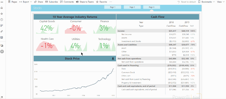
End Result
The end result will be a download button that can open a well designed excel report.
Video
This content was demonstrated at the Milwaukee Brew City User Group in February 2020. You can watch the video recording and see the steps detailed below.
Step 1 – Connect to Excel
There are two ways to connect:
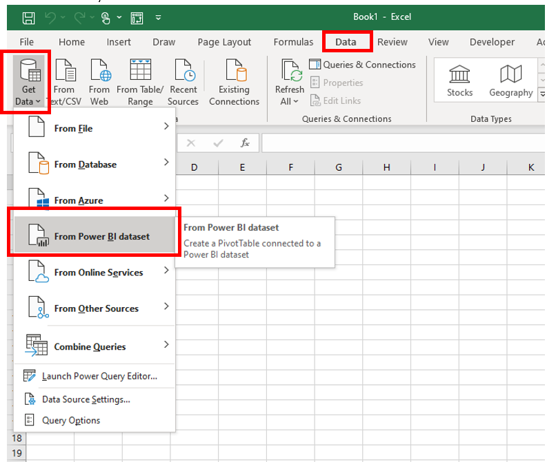
Option 1: This option may not be available to you depending on your office license.
Open Excel and navigate to the data tab. Click Get Data the select “From Power BI dataset”. From the list, select the report that contains the model.
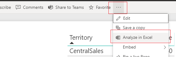
Option 2:
The other way is to navigate to the service (app.powerbi.com) and open the report that contains the model. Click the ellipsis and select Analyze in Excel.
This will download a file which has the extension “ODC”, which stands for Office Data Connection. This file contains information that will tell excel how to connect to the dataset on the service.
Click on the file to open in excel. Once opened, Excel will present you with an empty PivotTable. If you check the PivotTable fields you will notice that you can now see the fields and measures. The same ones which were created in your Power BI model.
We have now live connected to the model we have published in Power BI service. This works the same as using a live connection in Power BI. Your Excel file has access to all the logic and data is updated as soon as the model is updated. Refreshing the data source in Excel pulls the latest data directly from the Power BI model.
Step 2 – Develop a report
The PivotTable in the report is an OLAP (Online Analytical Processing) PivotTable and has a few differences from standard PivotTable made from flat data.
Just like Power BI, dimensions from multiple tables can be used in the same PivotTable. The relationships set up in the model will be observed.
Only explicit measures may be used in the VALUES section of the PivotTable. This means that unlike Power BI, you cannot drag a numeric column into VALUES and select a summarization (also known as an implicit measure). All values must have a specific measure written in the model file (or use an extension OLAP pivot table tools).
The PivotTable sends a new query each time some element in Excel is changed. For example, if you apply a filter, Excel will send a new query to the model. This works similar to the Direct Query mode in Power BI.
Now we have a connection set up, you can make a pre-defined
report that you can give directly to your end users.
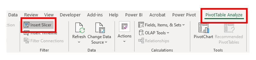
You can add a slicer by clicking on the PivotTable, click on the PivotTable Analyze tab and select Insert Slicer (or use Timeline for dates).
There are many advantages of using a live connection.
The Excel file can be branded with company logos
Pre set filters can be added.
More advanced features such as Data Solver, VBA and macros can be added.
In addition, the data can be updated inside the workbook, or set to be refreshed on open. Users will also be prompted to sign in and authenticated through their Office account. Features such as Row Level Security will continue to work.
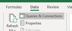
Keep it FRESH
You can set the report to refresh every time it is opened. Navigate to the Data tab and click “Queries and Connections”.
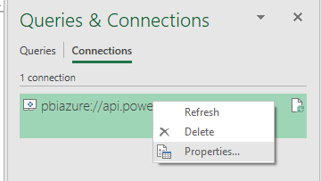
There will be one query, usually starting with pbiazue://. Right click this query and select properties.
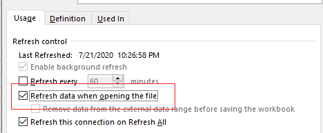
From here you can enable “Refresh data when opening the file”.
Step 3 – Upload the excel
Now, that the excel is created, you can distribute it to end users. A helpful way is to create a download link directly in the report.
A good place to host this would be SharePoint – you can link
a SharePoint site directly to the Power BI workspace. It is secured through
Active Directory, plus if users are already logged into Power BI they do not
need to sign in again.
First, navigate to the online SharePoint location where you wish to host and upload your excel file.
Next, right click the file, and select download. This will download the file back to your local machine.
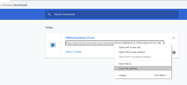
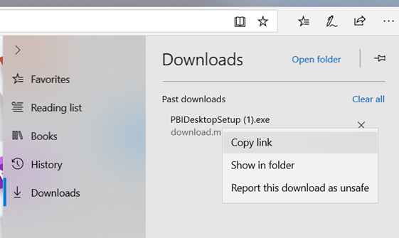
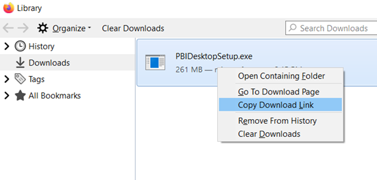
Now, navigate to your browser’s Downloads page. You can access through the settings of the browser, or if you are on a Windows machine, most browsers you can use the shortcut Ctrl-J. From here you will see the file you just downloaded. Right click the link and select what resembles “Copy link”. This may vary depending on the browser:
Chrome:
Edge:
Firefox:
Save the link you have copied to be used later.
Step 4 – Adding to the Report
For my download button, I am just using a down arrow image which I downloaded from an open license image site
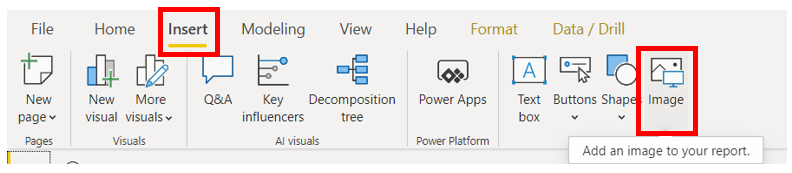
In Power BI Desktop, open the Insert tab and select Image. Select the image you wish to insert.
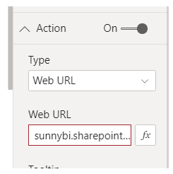
After it has been added, select the image and open the visualizations pane. Turn on Action and change type to web URL. Then paste in the URL (the direct download from SharePoint) you saved earlier.
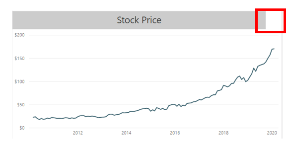
To tidy it up, I will add it next to the related visual. My visual has a text box above it. I have left some white space for a download button.
Step 5 – Using the button
Now, users can navigate to the report and click the download button. This will download the pre-built excel file. Users will be required to sign in and Row Level Security will still apply. In addition, users can use the “Refresh” button in the data tab to refresh data directly from the connected report.
Due to this being a Live Connection users will be required to enable content. In addition, they will need to sign into excel so that they can authenticate to the data model.
Tips and Tricks
Large tables will still need to send DAX queries
for each value, so make sure the DAX is efficient.
If using CUBE formulas, these are sent as
individual queries to the model. Try to use a single pivot table rather than
multiple formulas where possible.
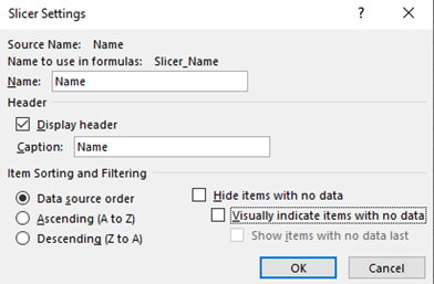
Slicers are useful, but can slow down reports, especially if you have many. One way you could speed it up is by right clicking on the slicer and going to slicer settings. Then untick “Visually indicate items with no data”. This will now always show all items in the slicer – even if there is no data associated with it. While this is less helpful, it can often dramatically speed up reports.’
Download OLAP PivotTable Extensions (https://olappivottableextensions.github.io). This is an amazing extension that can help see information about OLAP PivotTables. The functions are detailed on the website, but two features which are worth calling out:
Ability to see MDX query – this shows the query that is sent to the cube for the PivotTable
Ability to add calculations – you can add measures (written in MDX) to the specific PivotTable without having to add it to the cube
If you like the content from PowerBI.Tips please follow us on all the social outlets. Stay up to date on all the latest features and free tutorials. Subscribe to our YouTube Channel. Or follow us on the social channels, Twitter and LinkedIn where we will post all the announcements for new tutorials and content.
Introducing our PowerBI.tips SWAG store. Check out all the fun PowerBI.tips clothing and products:
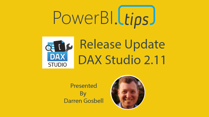
If you haven’t heard about DAX Studio, well now you have. DAX studio is an essential tool for Power BI developers. It enables you to explore and tune your tabular model with ease. This month we are pleased to have the creator of this tool Darren Gosbell present to us the latest updates for DAX Studio.
DAX Studio has just released it’s latest version 2.11.1. With this release comes a number of great improvements.
If you like the content from PowerBI.Tips please follow us on all the social outlets. Stay up to date on all the latest features and free tutorials. Subscribe to our YouTube Channel. Or follow us on the social channels, Twitter and LinkedIn where we will post all the announcements for new tutorials and content.
Introducing our PowerBI.tips SWAG store. Check out all the fun PowerBI.tips clothing and products:
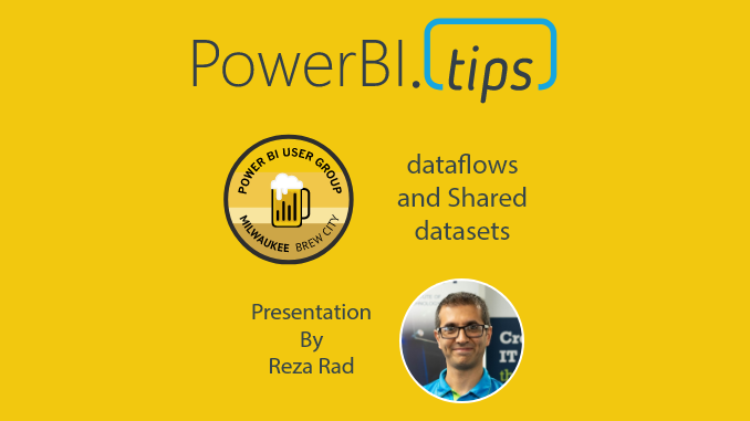
This month’s Milwaukee Power BI User group we have Reza Rad from Radacad.com. Reza has a long history within the Power BI MVP community. His presentation this month is about how to use dataflows and shared datasets.
Check out the recorded session below.
Discounts on Training
Like Reza’s training, visit the additional learning materials from Reza. Use the discount code “PowerBITips” to receive a $30 discount on your first month of training. Get the training: https://learn.radacad.com/product/academy-membership/
If you like the content from PowerBI.Tips please follow us on all the social outlets. Stay up to date on all the latest features and free tutorials. Subscribe to our YouTube Channel. Or follow us on the social channels, Twitter and LinkedIn where we will post all the announcements for new tutorials and content.
Introducing our PowerBI.tips SWAG store. Check out all the fun PowerBI.tips clothing and products:
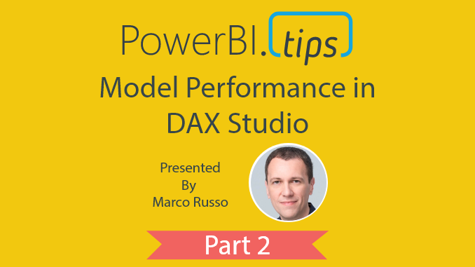
Understand more about your model then you thought possible! This is part two in our series on DAX Studio. If you missed part one be sure to check out the Introduction to DAX Studio. In this session Marco Russo shares the fundamentals for model performance in DAX Studio and dives into key areas that you absolutely need to understand. Marco is an accomplished trainer and you won’t find a better resource to guide you on this journey.
Using DAX Studio in conjunction with Vertipaq Analyzer Marco shows us how we can discover and explore the key statistics about our models. Use Vertipaq Analyzer against your open Power BI model or any tabular model. This tool only exports the tabular metadata, not the data! So we can do offline analysis on a model we don’t have access to by having people with permissions export these metrics. Better yet, we can download this into Excel and everything gets broken down for you all the way to your relationships and measures… AMAZING!
If you like the content from PowerBI.Tips, please follow us on all the social outlets to stay up to date on all the latest features and free tutorials. Subscribe to our YouTube Channel, and follow us on Twitter where we will post all the announcements for new tutorials and content. Alternatively, you can catch us on LinkedIn (Seth) LinkedIn (Mike) where we will post all the announcements for new tutorials and content.
As always, you’ll find the coolest PowerBI.tips SWAG in our store. Check out all the fun PowerBI.tips clothing and products:
If you’ve played around with MapBox in Power BI – you’ll know that it has loads of great features to create really rich and beautiful maps, including some great ‘out of the box’ map styles (i.e. base maps). However, you might not be aware that it also gives you the ability to design custom Mapbox styles with your own spatial layers. I discovered this feature on a recent project where my client wanted to include Victoria’s Catchment Management Authority (or CMA) boundaries on their base-map to provide greater context to help interpret their data. Up until this point, the only option I knew of was to purchase an expensive ArcGIS Online licence to create custom map styles. So, you can imagine just how excited I was when I discovered that I could also do this in MapBox – for FREE!!!
Reasons to Design Your Own Style
There
are plenty of reasons to design your own map styles, including:
Provide Context: I touched on this above, but the ability to add your own layers to the backgrounds on your maps goes a long way to providing additional context to help your report users understand and interpret their data.
Simplify: Sometimes you need to peel back the complexity to help your data stand out. Customizing base maps allows you to remove unnecessary elements which may distract your users from the data, and dynamically add back complexity at different zoom intervals (watch Step 4 of the Video to see how this works!)
Consistency, Branding, and Themes: Customizing the style allows you to design your maps with a similar ‘look and feel’ to other visuals in your report, as well as corporate branding and color themes. For the passionate Power BI designers out there – you’ll LOVE this feature (we’re always on the hunt for new formatting options in Power BI!)
I’m
not going to lie, there are a couple of steps involved in designing your own
custom styles for MapBox in Power BI, but believe me – it’s totally worth it! I
walk through the key steps in this short video, which include:
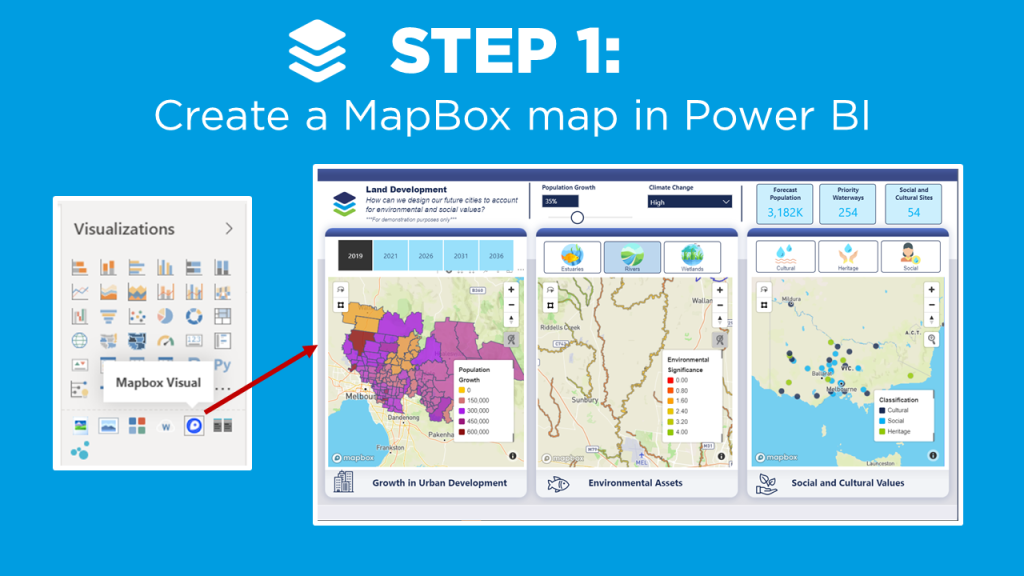
Create a MapBox map in
Power BI (check out the video on MapBox 101 if you’re new to MapBox, or need a
refresher).
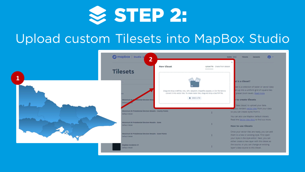
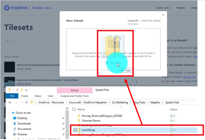
Upload your custom tilesets
into MapBox Studio
Duplicate an existing
MapBox style from gallery
Customise your own map
style
Add your custom style into
your MapBox visual in Power BI!
First, you can leverage the base choropleth map you created in the Mapbox 101 tutorial to get a starting point. The following steps describe how to enhance the style of the map to make it pop even more!
In this tutorial we want to add a boundry onto the base map. This will help us outline the specific areas around the rivers that we added as a layer in our Drill Down tutorial. A shape file was created and the zip loaded into Mapbox as a new tileset.
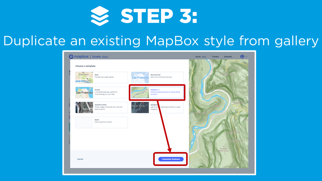
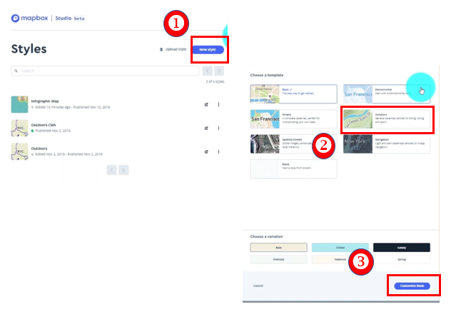
The next step is to duplicate an existing map style. 1) Select New style 2) Choose a template 3) Click Customize Basic
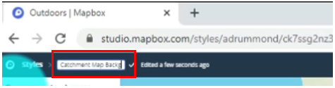
Rename your Mapbox style (upper left side of page)
Create your own custom layers and features to the map. Here are the changes made to this example.
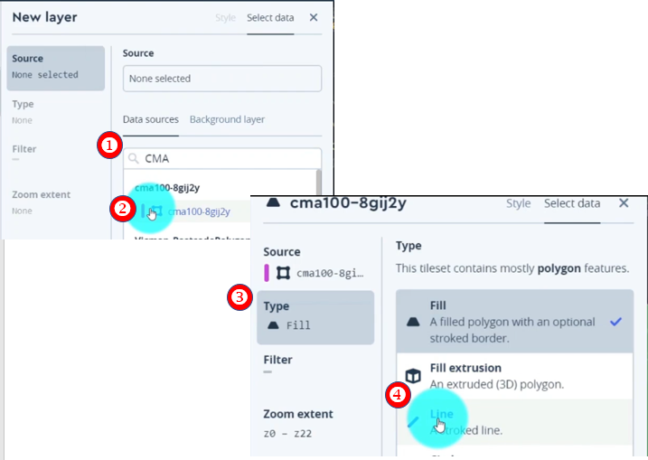
Click Add new layer
Search for tileset. (Our example uses the new boundry layer we created.) 1) Search for the tileset (ex. “CMA”) 2) Select tileset This will add the tileset to the base style we selected. 3) Click Type 4) Select Line to change the setting
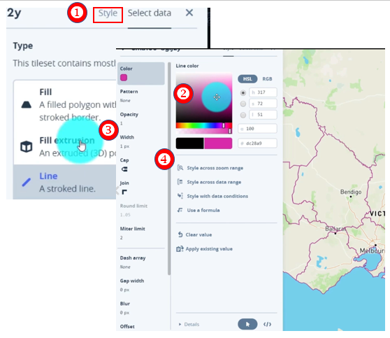
Select Style
Choose Color
Adjust width by clicking on the Width field
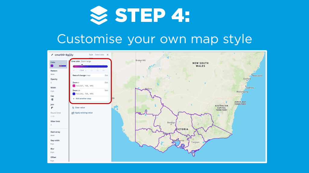
Style the color based on a zoom range. Select Style across zoom range to adjust the slider.
Add new Zoom Range by Clicking on the Zoom Range bar
Select second zoom range field (Zoom 22)
Adjust zoom range to different value (10)
Change the color (Blue)
Scroll down and Click Done
Great! Now as you zoom in and out of the map you can see the boundaries change color from pink to a blue. You can imagine how powerful this visual change can be in directing the attention in different map visuals.
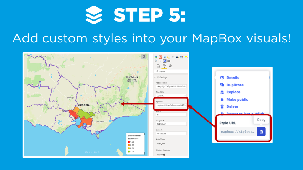
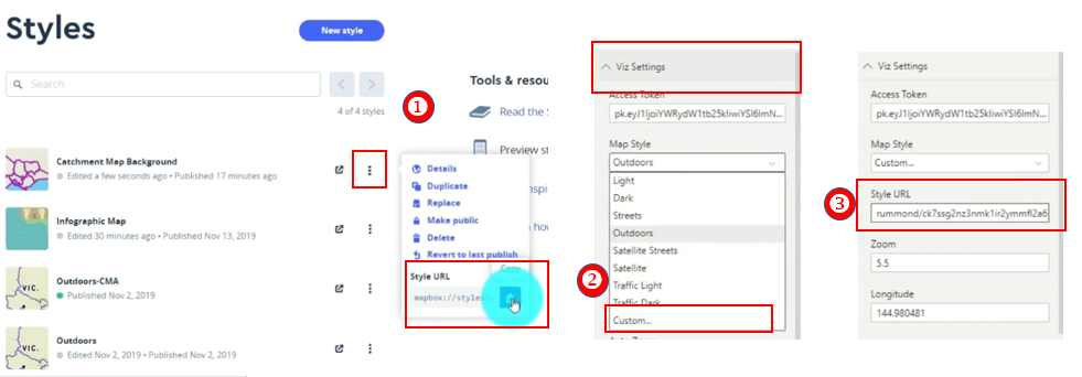
The final step is to take our new style and apply it to the Mapbox visual!
Select the ellipses of our style
Copy the Style URL
Jump back into the Power BI Desktop. Under Viz Setting and the Map Style Property, Select Custom.
Paste the copied URL from step 2 into the Style URL
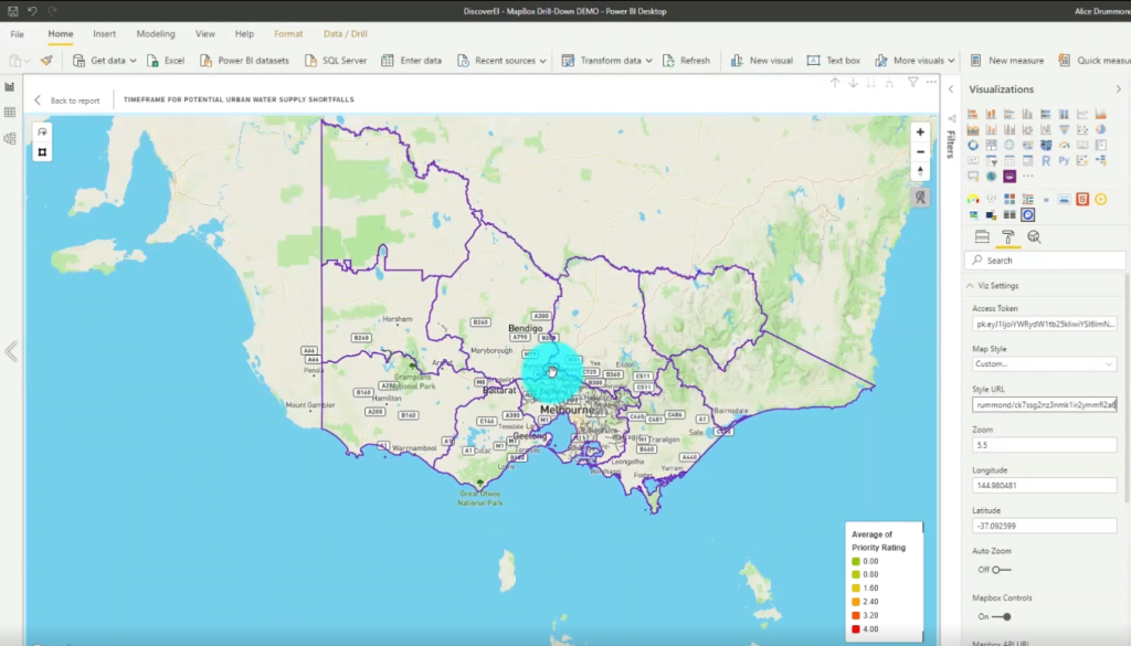
Final Custom Mapbox Style
The case study I present is a Power BI report with three maps to help design our future cities to account for population growth, while also considering our environmental and social values (created using ‘synthetic’ datasets for demonstration purposes only). I modify the default ‘Outdoor’ MapBox style to include my own custom tileset, and show how to create dynamic color gradients based on different zoom intervals.
If you’re keen to learn how to create really cool customized maps for your Power BI reports, then make sure to check out the other blogs in this 4-part MapBox series, where we provide an introductory MapBox 101, explore how to create 3D maps, and how to design drill down maps!
And
if you want to learn how you can create really beautiful and engaging Power BI
reports, get in touch with one of the DiscoverEI team to register for our
brand-new online training courses:
If you like the content from PowerBI.Tips please follow us on all the social outlets. Stay up to date on all the latest features and free tutorials. Subscribe to our YouTube Channel. Or follow us on the social channels, Twitter and LinkedIn where we will post all the announcements for new tutorials and content.
Introducing our PowerBI.tips SWAG store. Check out all the fun PowerBI.tips clothing and products:
If you’ve played around with MapBox in Power BI – you’ll know that it has loads of great features to create really rich and beautiful maps! One feature I love is the ability to ‘drill down’ to dynamically uncover different layers of your spatial data hierarchy, just in the same way that you can drill down on a standard column chart or matrix in Power BI.
Why Drill Down on a Map?
See the big picture: Using drill down, we can visualize the data set at the ‘big picture’ scale, and then explore finer details for areas of interest (just think of the classic spatial hierarchy of Country -> State -> City -> Suburb)
Save on real estate: We can also display multiple datasets at different levels in the same map – which goes a long way to conserving your precious report page real estate by reducing the number of visuals in your report!
Performance: Following on from above, less visuals almost always equates to better report performance! And this is especially true when using MapBox, which is at the slower end of the Power BI performance scale at the best of times – so using drill down to reduce the number of maps combined with filtering your datasets goes a long way to speeding up your reports!
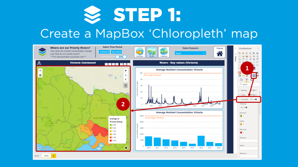
Create a Drill Down Map in MapBox
Setting up a drill down map in MapBox is pretty simple once you get the hang of configuring Choropleth maps, and in this video blog I walk through the key steps:
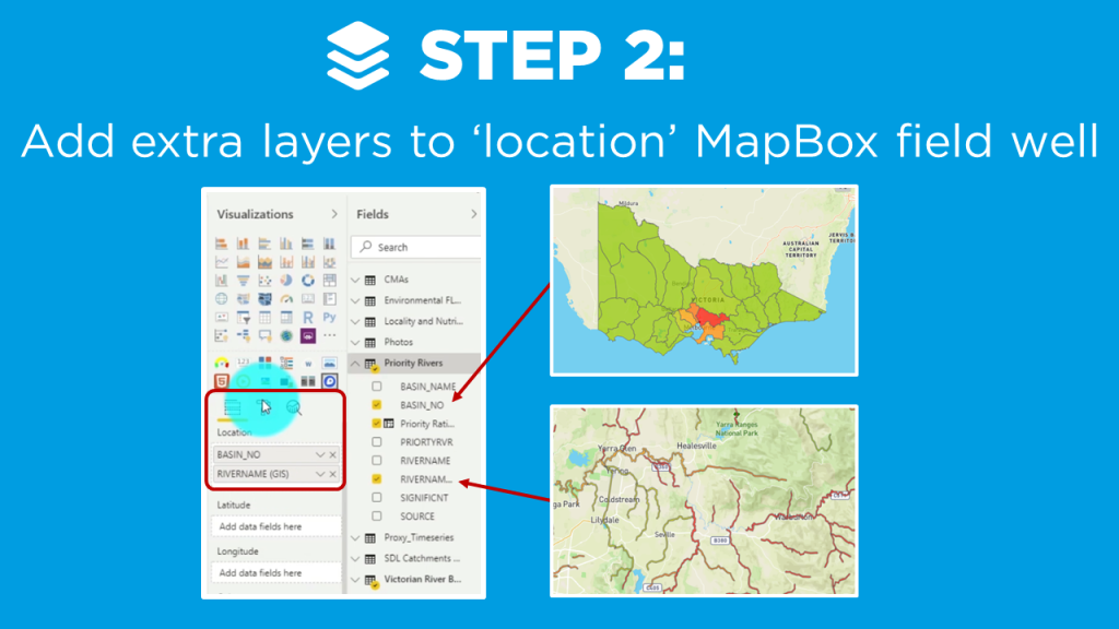
Add hierarchy layers to the ‘location’ MapBox field well
Enter the vector layer properties from the MapBox Studio for the additional map levels
In my example, I create a drill down map of priority Catchments and Rivers across Victoria using ‘synthetic’ data, which I created to visualize the nutrient concentration over time (for demonstration purposes only!).
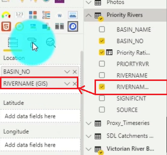
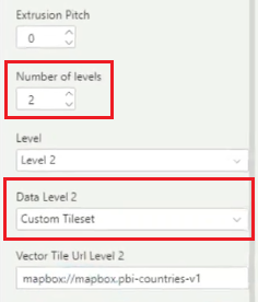
Locate the RIVERNAME field and Drag & Drop it into the second position in the Location field well under BASIN_NO.
Now navigate to the Format area and select the Choropleth section again. Increase the Number of levels to 2, and Select the Custom Tileset in the Data Level 2 section.
After you set the above you need to jump out of the Power BI Desktop and head over to the mapbox studio. Here you would take the second layer of the map that you created by choosing another tileset. (For details on how to do that watch the Mapbox 101 tutorial.)
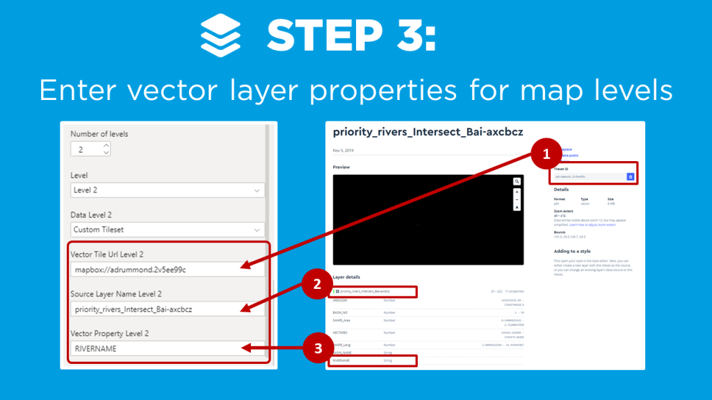
Copy the Tileset ID from Mapbox and insert that value into the PBI Desktop Vector Tile Url Level 2 property still under the Choropleth section.
Copy thelayer name from Mapbox and Paste into the Source Layer Name Level 2 property.
Copy the field you want from the attribute list in Mapbox and Paste into the Vector Property Level 2.
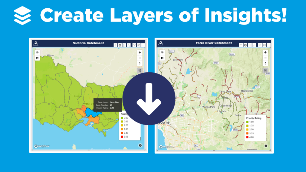
Mapbox Drill Down Results
We now have the ability to select our map area and drill down into the second layer. In our example, the rivers are now shown under each catchment.
If you’re keen to learn how to create really cool customized maps for your Power BI reports, then make sure to check out the other blogs in this 4-part MapBox series, where we provide an introductory MapBox 101, explore how to create 3D maps, and how to design your own styles!
And
if you want to learn how you can create really beautiful and engaging Power BI
reports, get in touch with one of the DiscoverEI team to register for our
brand-new online training courses:
If you like the content from PowerBI.Tips please follow us on all the social outlets. Stay up to date on all the latest features and free tutorials. Subscribe to our YouTube Channel. Or follow us on the social channels, Twitter and LinkedIn where we will post all the announcements for new tutorials and content.
Introducing our PowerBI.tips SWAG store. Check out all the fun PowerBI.tips clothing and products:
Darren Gosbell & Marco Russo join PowerBI.Tips in a 4 part series on how and why to use DAX Studio! They show us why DAX Studio is the ultimate tool for working with DAX queries!
In this first session we are joined by Darren who gives us a little history on DAX Studio and how we can get started with downloading the tool and getting it up and running. He covers many different areas of the tool including connecting to our various models, the basic functions of the tool, how you can output the results, and everything you need to know to get started. Be sure to check out this video and all the rest in the series.
If you like the content from PowerBI.Tips please follow us on all the social outlets. Stay up to date on all the latest features and free tutorials. Subscribe to our YouTube Channel. Or follow us on the social channels, Twitter and LinkedIn where we will post all the announcements for new tutorials and content.
Introducing our PowerBI.tips SWAG store. Check out all the fun PowerBI.tips clothing and products:
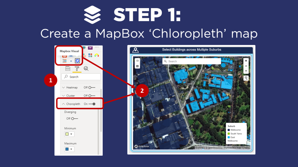
If you’ve played around with MapBox in Power BI – you’ll know that it has loads of great features to create really rich and beautiful maps! And one of my favorite ways to get a new client excited about Power BI is to create an awesome 3D map of their city. Now, I know that 3D features get a bit of a bad wrap in traditional data viz circles (don’t even think about creating a 3D pie chart!!!), so why then are 3D maps different?
Why use 3D maps?
Greater context: We see our world in 3D, so when we transform a flat 2D map of our cities or mountains into a 3D map, it immediately creates greater connection and a sense of perspective.
Another dimension: 3D maps don’t just have to be based on ‘relative’ heights, you can use the 3D effect to add a new dimension to your visualisation, such as population per town, to communicate key insights at a glance.
They just look really fancy: Sometimes half our battle as data analysts revolves around getting people within our (or our clients) organisations engaged and connected to their data. Creating 3D maps can go a long way to get that ‘wow’ factor which gets people excited and interested in the data!
Get started with MapBox
There
are a couple of tricks to getting the 3D features working in MapBox, so in this
video blog I walk through the key steps to help you create your own 3D maps
using MapBox:
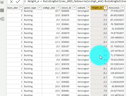
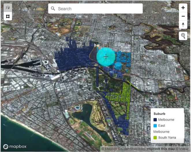
In my example, I create a 3D map of buildings across Melbourne as part of a ‘Green Roof’ assessment tool to help optimize the benefits of blue-green infrastructure across Melbourne. Note that I have anonymized this data and the calculations so that I can share it with the Power BI community (for demonstration purposes only!).
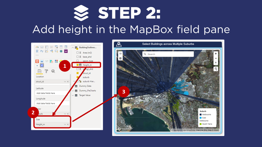
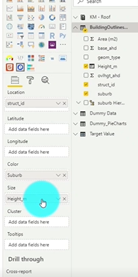
Create a data set that includes the height of the objects, in this case the height of buildings.
Drag the Height column from your data set into the Size field well.
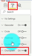
Click on the Format section of the visual and select the Choropleth toggle.
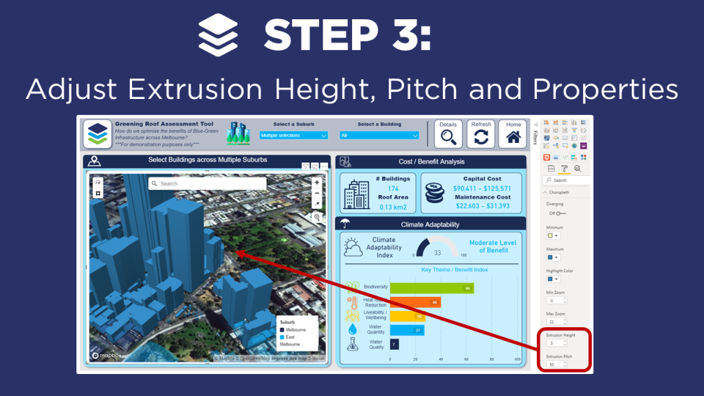
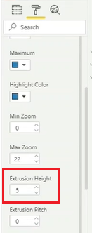
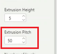
Scroll till you find the Extrusion Height. You will likely need to Adjust the value to a lower value. In our case, we take it from 500 to 5. The Extrusion Height is a multiplier of the Height value from our data set.
Now, we can look one option below and we see Extrusion Pitch. We are going to Adjust this from 0 to 30. This will provide an angled view of the map which provides a clearer picture of the dimensions.
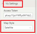
Adjust MapBox Properties
Under the Viz Settings we want to Select the Map Style and change it to Satellite
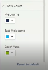
Add Color to the different suburbs. Select the Data Colors header and Click to open up the options. Now you can Set the colors of the different areas to visually separate them.
If you’re keen to learn how to create really cool customized maps for your Power BI reports, then make sure to check out the other blogs in this 4-part MapBox series, where we provide an introductory MapBox 101, explore how to create multi-layer drill down maps, and how to design your own styles!
And
if you want to learn how you can create really beautiful and engaging Power BI
reports, get in touch with one of the DiscoverEI team to register for our
brand-new online training courses:
If you like the content from PowerBI.Tips please follow us on all the social outlets. Stay up to date on all the latest features and free tutorials. Subscribe to our YouTube Channel. Or follow us on the social channels, Twitter and LinkedIn where we will post all the announcements for new tutorials and content.
Introducing our PowerBI.tips SWAG store. Check out all the fun PowerBI.tips clothing and products:
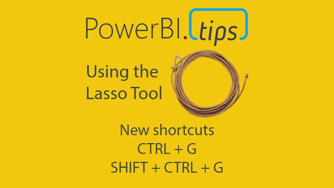
The April 2020 Power BI desktop release is an amazing release. This month the Power BI team has released a new lasso feature to enable users to select multiple visuals at a time. For me working in reports with lots of strategically placed visuals, this is HUGE!! How many times have I struggled to select a visual. Or, better yet needed to open up the visualization pane to select visuals from a list. The Lasso feature is a very welcome addition to the Power BI toolkit.
New Shortcuts
Another interesting feature that I found this month is the ability for Grouping visuals using key commands.
You can Group Visuals using CTRL + G
Then you can Un-Group them using SHIFT + CTRL + G
Like all visual editing programs and even in power point these commands are very common. Thus, seeing these commands in Desktop is amazing. Power BI Team, thanks so much for your wonderful work!!!
Video Tutorial
Download PowerBI Desktop
Want to use these features. Head on over to the PowerBI.com site and download the latest release. Download Here
If you like the content from PowerBI.Tips please follow us on all the social outlets. Stay up to date on all the latest features and free tutorials. Subscribe to our YouTube Channel. Or follow us on the social channels, Twitter and LinkedIn where we will post all the announcements for new tutorials and content.
Introducing our PowerBI.tips SWAG store. Check out all the fun PowerBI.tips clothing and products:
Check out the new Merch!
Hasta La Vista Data
Go Ahead Make My Data
PBIX Hat
Manage Consent
To provide the best experiences, we use technologies like cookies to store and/or access device information. Consenting to these technologies will allow us to process data such as browsing behavior or unique IDs on this site. Not consenting or withdrawing consent, may adversely affect certain features and functions.
Functional
Always active
The technical storage or access is strictly necessary for the legitimate purpose of enabling the use of a specific service explicitly requested by the subscriber or user, or for the sole purpose of carrying out the transmission of a communication over an electronic communications network.
Preferences
The technical storage or access is necessary for the legitimate purpose of storing preferences that are not requested by the subscriber or user.
Statistics
The technical storage or access that is used exclusively for statistical purposes.The technical storage or access that is used exclusively for anonymous statistical purposes. Without a subpoena, voluntary compliance on the part of your Internet Service Provider, or additional records from a third party, information stored or retrieved for this purpose alone cannot usually be used to identify you.
Marketing
The technical storage or access is required to create user profiles to send advertising, or to track the user on a website or across several websites for similar marketing purposes.