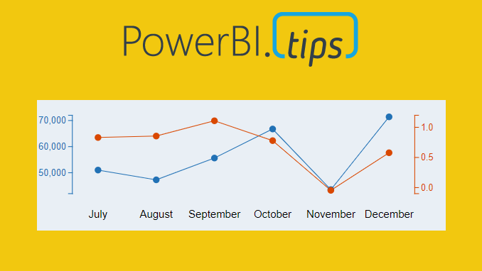
Ever need two different scales on the Y-Axis of a line chart? If so, then this tutorial is for you. While creating a dual y-axis line chart is pretty common in excel, it is not as easy in power BI. The only standard chart that comes with Power BI Desktop that enables dual y-axis is the Column and line combo chart types.
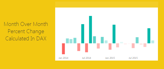
For this particular visual I needed to show correlation between two time series with different Y-axis scales. The Y-axis on the left of the chart had data elements in the thousands, but the right side needed percentages. The tutorial below illustrates how to accomplish by building a custom visual using the Charts.PowerBI.Tips tool.
Video Tutorial
note: there are a bunch of really good custom visuals that can be downloaded from the Microsoft App Source store. However, this article will not review all third party visuals that are able to produce a dual Y-axis line chart.
Source files
All files used to create this visual are located here on GitHub.
Layout file
The file used in this tutorial was a derivation of the Sunset layout from PowerBI.Tips. If you like this file, you can download it here:
If you like the content from PowerBI.Tips please follow us on all the social outlets. Stay up to date on all the latest features and free tutorials. Subscribe to our YouTube Channel. Or follow us on the social channels, Twitter and LinkedIn where we will post all the announcements for new tutorials and content.
Introducing our PowerBI.tips SWAG store. Check out all the fun PowerBI.tips clothing and products:
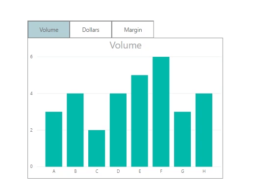
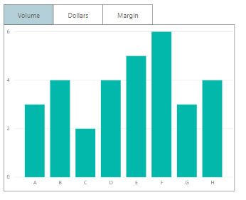
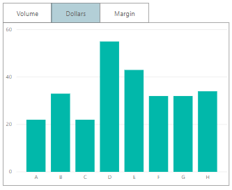
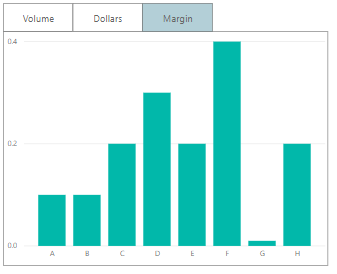
Sometimes, we want the users to see different metrics, but
do not want to take up too much space on our page. The scenario we are going to
walk through is how to build just one visual (in this case a bar graph). It
will include a toggle that allows the user to select their desired calculation,
either the sum of Volume, Dollars or Margin.
Final Solution
With buttons, we can change specific visuals on a page. Recently,
with the release of conditional formatting on titles and backgrounds, we have
some new methods to make this easier for the report author and cleaner for the
report consumer.
The Build
Before we start, turn on the selection pane and bookmark
pane. They can be turned on by clicking on the View ribbon and checking the
correct boxes.
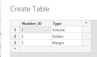
First, we’re going to create our control table. This
will be a disassociated table. This table should not have any relationships to
any of the other tables in our model. We just need to enter a numeric ID and a
description of what we want. Click on
the Enter Data button found on the Home ribbon. Enter the
following data as shown. Click the OK button to close the Create
Table dialog box.
Now that’s set up, we can write our measure. This measure will see what is selected in the Number_ID column of our control table, then return the appropriate calculation. Use a switch statement to select the correct calculation. Create the following measure:
Note: See there is a default value listed in the switch
statement. The default calculation means that if nothing is selected, SUM(
Sales[Volume] ) will be returned. The default value is represented by the last
property in the switch statement.
Time to set up our visual. Add a bar graph with Category on the
axis and the new measure, Selected Calculation, in the values
fields. Then add a slicer for the Number_ID column. The Number_ID
column comes from the control table we added earlier.
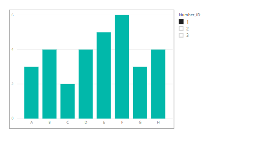
Switching the slicer can now change the graph to show the
different calculations.
The next stage is to add three buttons to the top of the
graph. In the Home tab of the ribbon, click Buttons and select Blank. Make sure
the outline colors and outline width match on all objects, Buttons and chart
outline.
Tip: Make sure you label your buttons in the Selection Pane. The selection pane can be turned on by clicking on the View ribbon and checking the box labeled Selection Pane. To Change the name of the button, double click the name listed in the Selection Pane. Giving a title (such as Button_Volume) will make it easily to see what visual items are on the page.
After this, it’s time to add the bookmarks.
The bookmark pane can be turned on by clicking on the
View ribbon and checking the box labeled Bookmark Pane.
Step 1:
Select a value of 1
in the Number_ID slicer.
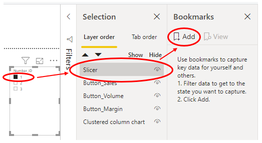
Select the slicer (and only the slicer) in the
Selection pane.
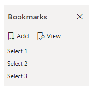
Click “Add Bookmark” in the Bookmarks pane.
Step 2:
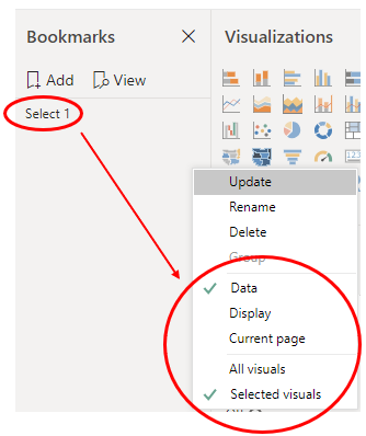
In the Bookmarks pane, right click the bookmark and rename it to Select 1.
Right click again, and untick “Display” and “Current Page”. Select “Selected Visuals”.
Now repeat step 1 and step 2, but do so with the values of 2 and 3 from Number_ID
slicer. Name these bookmarks Select 2 and Select 3. You should finish with
three bookmarks, each that filters Number_ID to a different value. You
can test the bookmarks by clicking on them once in the bookmark pane.
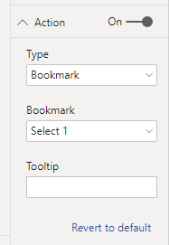
On Button_Volume, assign the Select 1 bookmark (as Number_ID
1 refers to volume). To do this, click on Button_Volume in the selection pane.
In the visualizations pane for this button, go to the property named “Action”.
Turn it on, change the type to bookmark, and choose Select 1 in the dropdown.
Repeat for Button_Dollars and assign Select 2. Then
for Button_Margin and assign Select 3. Now the buttons can change the
graph, but it’s a bit hard to see what is selected.
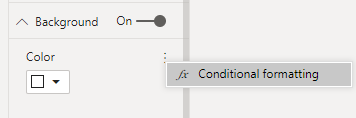
Add Conditional Formatting
This is where conditional formatting can help us! Select Button_Volume
in the selection pane. Then in the visualizations pane, turn on the background
property, select the ellipsis and click conditional formatting
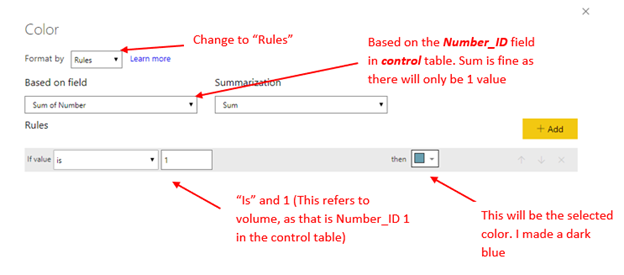
Here’s the settings we want:
This is going to apply a rule if the Number_ID selected is 1, to give the button a blue background. As there are no other rules, any other number selected will default to the white.
Now, apply the same steps to the other two buttons, but make
the rule “If value is 2” for Dollars, and “If
value is 3” for Margin.
To tidy up, hide the slicer and turn the visual headers of all buttons off. You can click on the eye next to the slicer in the selection pane to hide it.
Turn the visual headers off by clicking the button, then in
the visualizations pane.
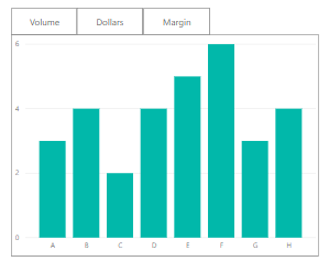
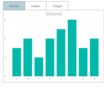
Great! Now the tab shows the selected button and correct
measure:
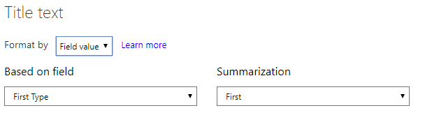
To make it even clearer, apply conditional formatting to the
title of the graph. On the graph, open conditional formatting. Set it to field
value and use the type field in the control panel.
Using this control table allows for greater flexibility. We can add more calculations, easily edit them or even sync across pages, all without having to re-record any bookmarks.
If you like the content from PowerBI.Tips please follow us on all the social outlets to stay up to date on all the latest features and free tutorials. Subscribe to our YouTube Channel. Or follow us on the social channels, Twitter and LinkedIn where we will post all the announcements for new tutorials and content.
Introducing our PowerBI.tips SWAG store. Check out all the fun PowerBI.tips clothing and products:
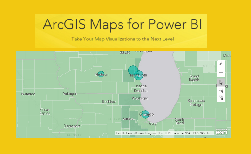
In the September 2016 release of PowerBI, Microsoft introduced a new visual called the ArcGIS Maps preview. For more information on the maps integration you can read the following post from Microsoft. This tutorial will review how to load data using Latitude and Longitude data and map those points on the ArcGIS map.
First, we need to open PowerBI Desktop and then we will load some data. The version of PowerBI Desktop for this tutorial is 2.39.4526.362 64-bit (September, 2016). You can download the latest version of the software here.
On the Home ribbon click on the Get Data button and from the Get Data window select Blank Query. Click Connect to proceed.
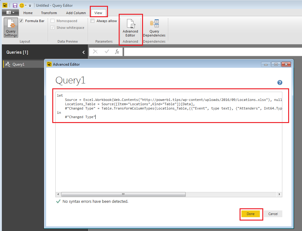
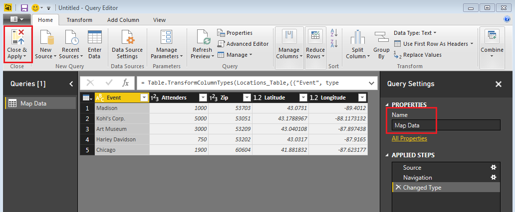
Now you will be in the Query Editor, click on the View ribbon and select the Advanced Editor button. The Advanced Editor will now open.
Enter the following code into the Advanced Editor: (you can copy and paste the code directly from this site) Click Done to load the data.
let
 Source = Excel.Workbook(Web.Contents("http://powerbi.tips/wp-content/uploads/2016/09/Locations.xlsx"), null, true),
 Locations_Table = Source{[Item="Locations",Kind="Table"]}[Data],
 #"Changed Type" = Table.TransformColumnTypes(Locations_Table,{{"Event", type text}, {"Attenders", Int64.Type}, {"Zip", Int64.Type}, {"Latitude", type number}, {"Longitude", type number}})
in
 #"Changed Type"
Note: this will load an excel file that is hosted on PowerBI.Tips, so make sure you have an internet connection.
Load Query
Re-name your query to Map Data and then on the Home ribbon click Close & Apply.
Load Map Data In PBI
Before working on this tutorial, you will want to make sure you have enabled the ArcGIS map which is in preview.
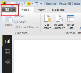
Click the Menu button to open up the menu options.
PBI Menu Button
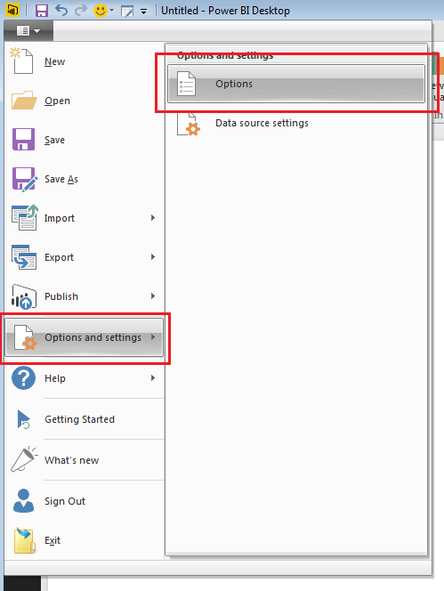
This will expose the menu. With the menu open click on Options and Settings and then click on Options.
Selecting Options
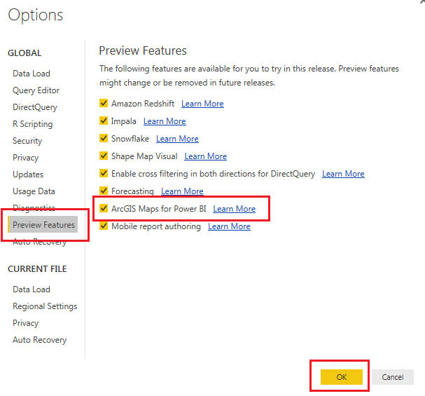
Once the Options menu is open, click on Preview Features and then make sure the ArcGIS Maps for PowerBI preview feature is check. Then click OK to close the options menu.
Options Menu
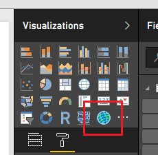
You should now see a new bright blue icon listed in the Visualizations window.
ArcGIS Maps Icon
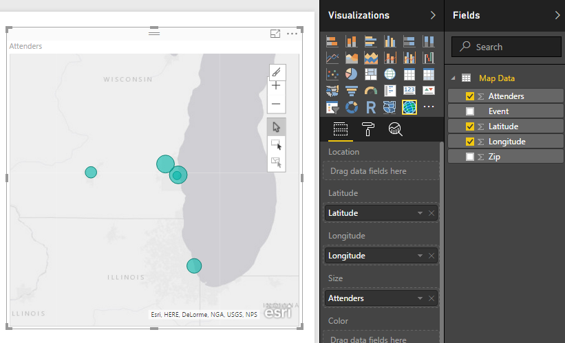
Click on the ArcGIS visualization and then add the following following columns of data from the Fields window into the visual.
Fields for ArcGIS Map
OK, Wow, seems like a normal map. So, why all the hype? Well, unlike other mapping visualizations, this map enhances the selection methods for points on a map.
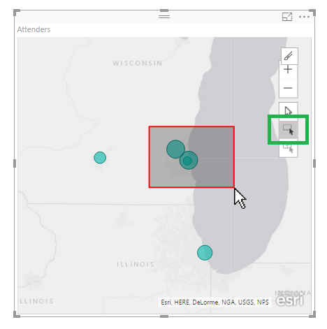
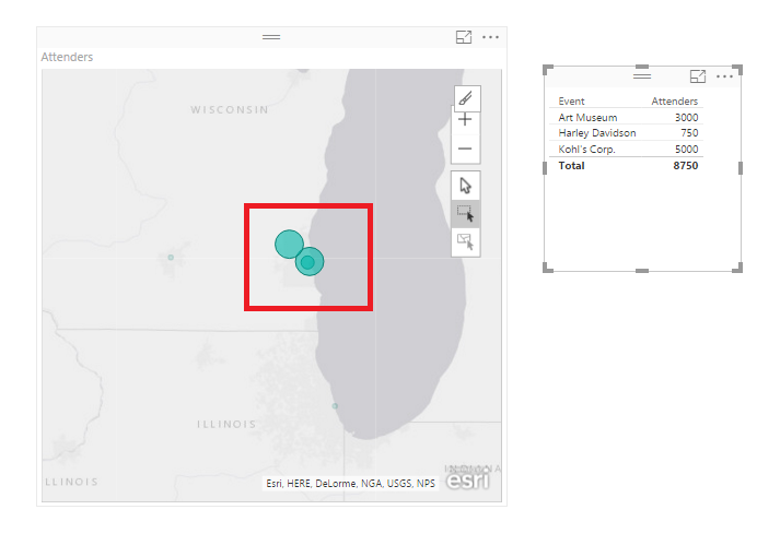
By clicking on the square with the black mouse arrow (highlighted with a green box here because the selection tool for the visual uses a red box) You can then click drag a red box across the map to select multiple geographical points on the map.
Highlighting Points on Map
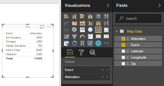
Selecting points on the map will filter other visuals on the page.
Add a Table visual with the following fields:
Table Visual Fields
Now click the Multi-Select button and highlight some points on the map.
Multi-Select Button
Notice how only the selected points are highlighted on the map and the table filters to only those points.
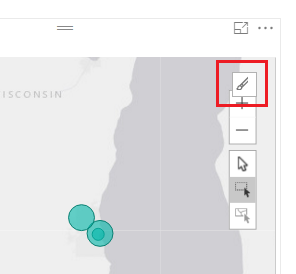
To enhance the map further click the In-Focus Edit Mode button.
In-Focus Edit Mode
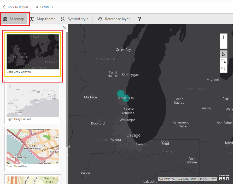
Now, the map editor opens. This allows you to change the basemap view, the theme of the map, symbols on the map and adds other data to enhance the coloring of the map.
Click on the Basemap button and then select the Dark Gray Canvas. We have turned the map in to a sort of night mode.
Basemap Change
Have fun here and explore a couple of the other map types.
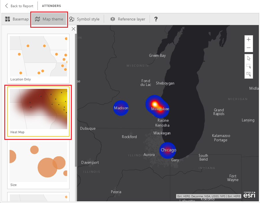
Next Click on the Map Theme then click on the Heat Map. Alright, this is getting pretty cool.
Heat Map Selection
In the next section Symbol Style you can change the properties of the points on the map. For the heat map you can change the Transparency and the Area of Influence of the points. Each map theme, Location, Heat Map, Size, and Clustering have different Symbol Style properties. So you might want to select a couple different Map Themes and try adjusting the Symbol Styles to see how they change.
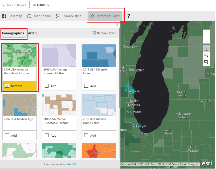
Now finally, the best part of the ArcGIS mapping, the Reference Layer. This will blow your mind!
Click the Reference layer button then select a layer to add from the Demographics tab. For this example, I chose the USA Average Household Income.
Household Income Layer
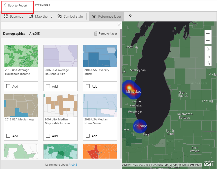
To return to the Report click the Back to Report button in the upper left hand corner of the page view.
Back to Report
The layer feature is by far the most helpful part of this tool. Imagine the time required to collect all that regional demographics data, model it and then to apply it to the mapping visual. The ArcGIS mapping tool is quite impressive.
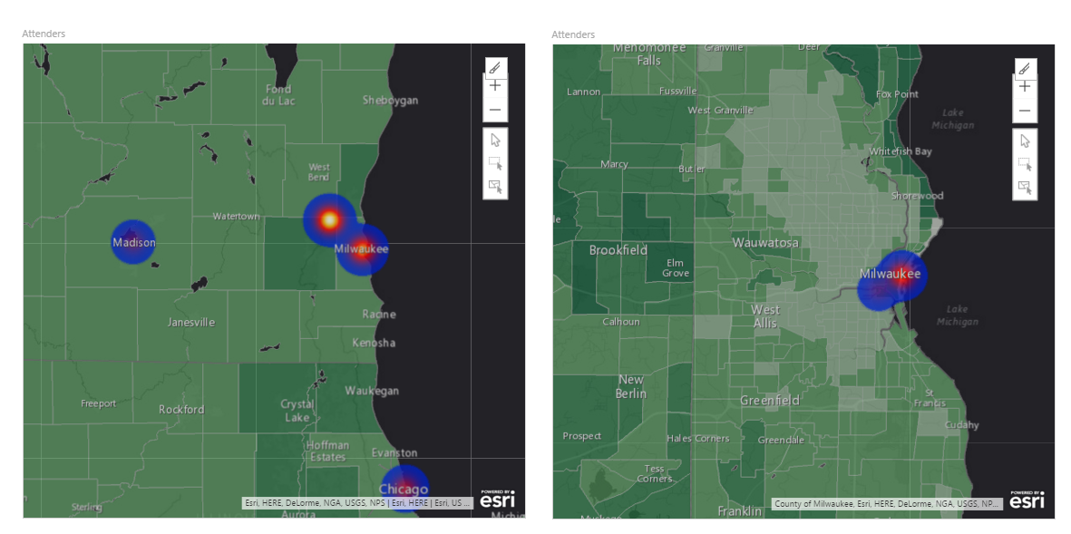
One other note before we leave. Now that you are back on the report level view. Use your mouse scrolling wheel and zoom in and out on the map visual. Notice the closer you zoom into the data points the more detailed the regional views become. See comparison below:
Zoomed Views
Thanks for following along. Remember to share if you liked this tutorial. See you next week.
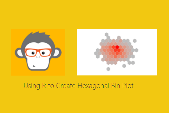
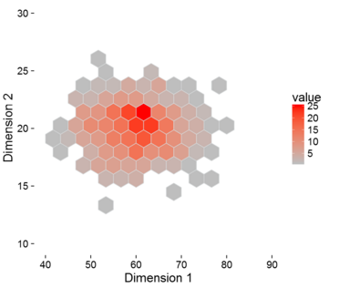
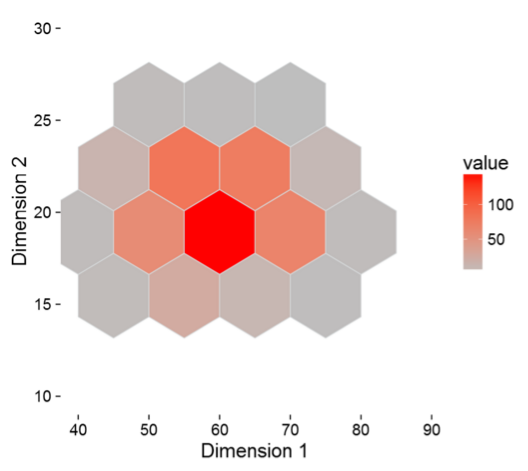
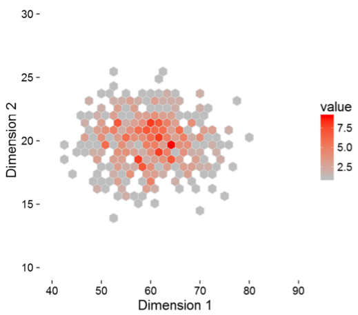
Continuing on the theme with R this month, this week tutorial will be to design a hexagonal bin plot. At first you may say what in the world is a hexagonal bin plot. I’m glad you asked, behold a sweet honey comb of data:
Hexagonal Bin Plot
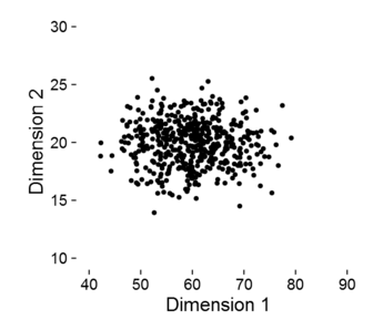
The hexagonal bin plot looks just like a honey comb with different shading. In this plot we have a number of data points with are graphed in two dimensions (Dimension 1, x-axis and Dimension 2, y-axis). Each hexagon square represents a collection of points. Now, if we plot only the points on the same graph we have the following.
Scatter Plot
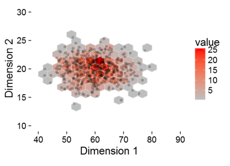
In the scatter plot, it’s difficult to see the concentration of points and if there is any correlation between the first dimension and the second dimension. By comparison, the hex bin plot counts all the points and plots a heat map. And, if you ask me the hexagonal bin plot just looks better visually. To bring this all together, if we overlay the scatter plot on top of the hexagonal bin plot you can see that the higher concentration of dots are in the shaded areas with darker red.
Plot Overlay
Cool, now lets build some visuals. Lets begin. Tutorial <- Hexagonal Bin Plot (sorry had to interject a bit of R humor here, ignore if you don’t like code humor)
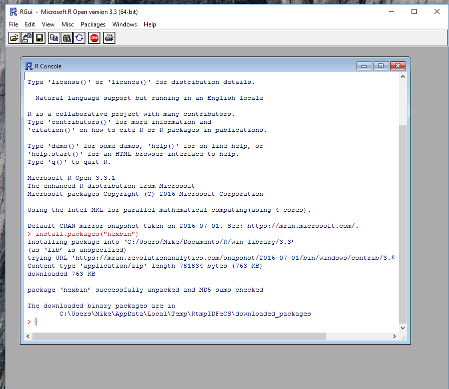
The very first step will be to open the R console and to install a new library called HexBin. Run the following code in the Mircosoft RGui.
install.packages("hexbin")
This will load the correct library for use within PowerBI.
Install hexbin
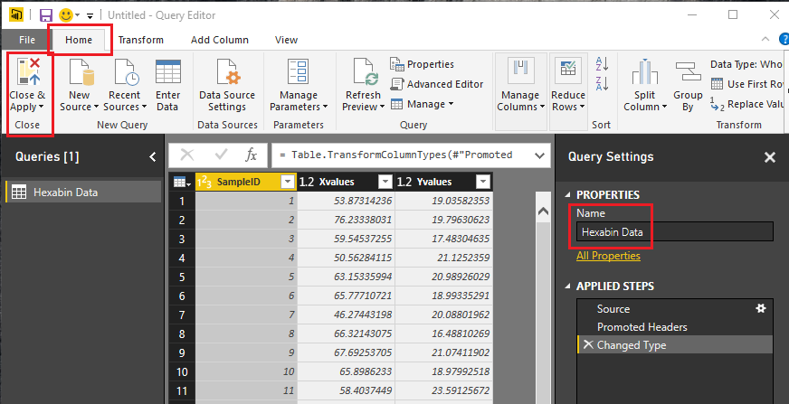
Start by opening up PowerBI. Click on the Get Data button on the home ribbon, then select Blank Query. In the Query editor click on the View ribbon and click on the Advanced Editor. Enter the following query into the Advanced Editor:
let
 Source = Csv.Document(Web.Contents("https://powerbitips03.blob.core.windows.net/blobpowerbitips03/wp-content/uploads/2016/09/Hexabin-Data.csv"),[Delimiter=",", Columns=3, Encoding=1252, QuoteStyle=QuoteStyle.None]),
 #"Promoted Headers" = Table.PromoteHeaders(Source),
 #"Changed Type" = Table.TransformColumnTypes(#"Promoted Headers",{{"SampleID", Int64.Type}, {"Xvalues", type number}, {"Yvalues", type number}})
in
 #"Changed Type"
This query loads a csv file of data into PowerBI.
Note: For more information on how to open and copy and paste M language into the Advanced Editor you can follow this tutorial, which will walk you though the steps.
After the clicking Done in the Advanced Editor the data will load. Next rename the query to Hexabin Data and then on the Home ribbon click Close & Apply.
Save Query
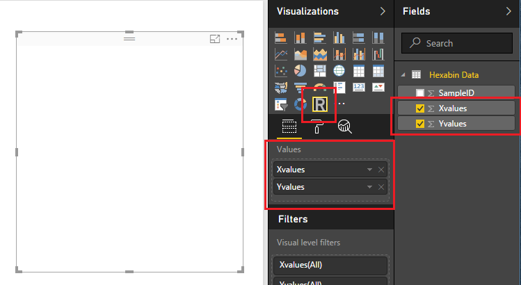
Next click on the R visual in the Visualizations bar on the right side of the screen. There will likely be a pop up warning you about enabling R Scripts. Click Enable to activate the R script editor. With the R script visual selected on the page add the following columns to the Values field selector.
R Visual Fields
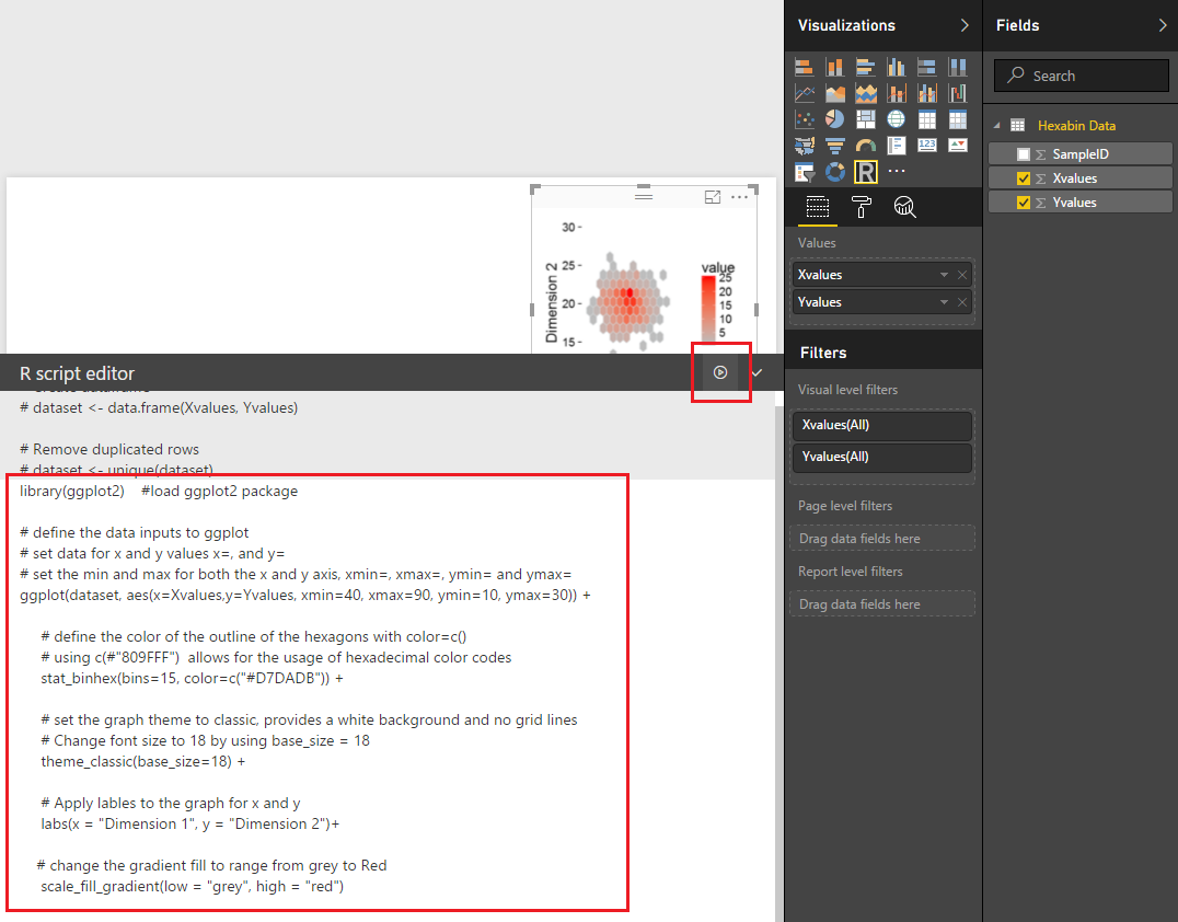
Notice that the R visual is blank at this time. Next add the following R code in the R script editor window. This will tell PowerBI Desktop to load the ggplot2 library and define all the parameters for the plot. I’ve added comments to the code using # symbols.
library(ggplot2) #load ggplot2 package

# define the data inputs to ggplot
 # set data for x and y values x=, and y=
 # set the min and max for both the x and y axis, xmin=, xmax=, ymin= and ymax=
 ggplot(dataset, aes(x=Xvalues,y=Yvalues, xmin=40, xmax=90, ymin=10, ymax=30)) +

# define the color of the outline of the hexagons with color=c()
 # using c(#"809FFF") allows for the usage of hexadecimal color codes
 stat_binhex(bins=15, color=c("#D7DADB")) +

# set the graph theme to classic, provides a white background and no grid lines
 # Change font size to 18 by using base_size = 18
 theme_classic(base_size=18) +

# Apply lables to the graph for x and y
 labs(x = "Dimension 1", y = "Dimension 2")+

# change the gradient fill to range from grey to Red
 scale_fill_gradient(low = "grey", high = "red")
Click the run button and the code will execute revealing our new plot.
R Script Code
One area of the code that is interesting to change is the section talking about the number of bins. In the code pasted above the code states there are 15 bins.
stat_binhex(bins=15, color=c("#D7DADB")) +
Try increasing this number and decreasing this number to see what happens with the plot.
Five Bins
stat_binhex(bins=5, color=c("#D7DADB")) +
Thirty Bins
stat_binhex(bins=30, color=c("#D7DADB")) +
Well that is it. Thanks for reading through another tutorial. I hope you had fun.
Want to see more R checkout the Microsoft R Script Showcase. If you want to download the PBIX file used to create this visual you can download the file here.
If you want to learn more about R and the different visuals you can build within R check out this great book which helped me learn plotting with R.
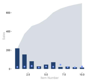
Back by popular demand, we have another great tutorial on using R visuals. There are a number of amazing visuals that have been supplied with the PowerBI desktop tool. However, there are some limitations. For example you can’t merge a scatter plot with a bar chart or with a area chart. In some cases it may be applicable to display one graph with multiple plot types. Now, to be fair Power BI desktop does supply you with a bar chart and line chart, Kudos Microsoft, #Winning…. but, I want more.
This brings me to the need to learn R Visuals in PowerBI. I’ve been interested in learning R and working on understanding how to leverage the drawing capabilities of R inside PowerBI. Microsoft recently deployed the R Script Showcase, which has excellent examples of R scripts. I took it upon myself to start learning. Here is what I came up with.
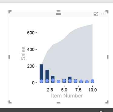
R Plot in PowerBI Desktop
This is an area plot in the background, a bar chart as a middle layer and dots for each bar. The use case for this type of plot would be to plot sales by item number, sales are in the dark blue bars, and the price is shown as the light blue dots. The area behind the bars represent a running total of all sales for all items. Thus, when you reach item number 10, the area represents 100% of all sales for all items listed.
If you want to download my R visual script included in the sample pbix file you can do so here.
Great, lets start the tutorial.
First you will need to make sure you have installed R on your computer. To see how to do this you can follow my earlier post about installing R from Microsoft Open R project. Once you’ve installed R open up the R console and enter the following code to install the ggplot2 package.
install.packages("ggplot2")
Install ggplot2 Code
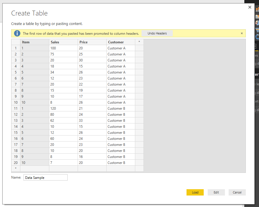
Once complete you can close the R console and enter PowerBI Desktop. First, we will acquire some data to work with. Click on the Home ribbon and then select Enter Data. You will be presented with the Create Table dialog box. Copy and paste the following table of information into the dialog box.
Item
Sales
Price
Customer
1
100
20
Customer A
2
75
25
Customer A
3
20
30
Customer A
4
18
15
Customer A
5
34
26
Customer A
6
12
23
Customer A
7
20
22
Customer A
8
15
19
Customer A
9
10
17
Customer A
10
8
26
Customer A
1
120
21
Customer B
2
80
24
Customer B
3
62
33
Customer B
4
10
15
Customer B
5
12
26
Customer B
6
60
24
Customer B
7
20
23
Customer B
8
10
20
Customer B
9
8
16
Customer B
10
7
20
Customer B
Rename your table to be titled Data Sample.
Data Sample Table
Click Load to bring in the data into PowerBI.
Next, we will need to create a cumulative calculated column measure using DAX. On the home ribbon click the New Measure button and enter the following DAX expression.
This creates column value that adds all the sales of the items below the selected row. For example if I’m calculating the cumulative total for item three, the sum() will add every item that is three and lower.
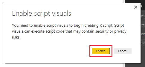
Now, add the R visual by clicking on the R icon in the Visualizations window.
Note: There will be an approval window that will require you to enable the R script visuals. Click Enable to proceed.
Enable R Visuals
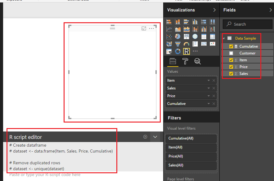
While selecting the R visual add the following columns to the Values field in the Visualization window.
Add Column Data
Note: After you add the columns to the Values the R visual renders a blank image. Additionally, there is automatic comments entered into the R Script Editor (the # sign is a designation that denotes a text phrase).
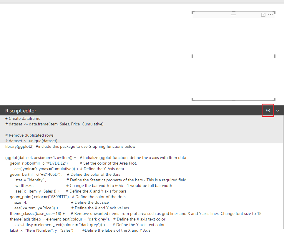
Next, enter the following R code into the script editor.
library(ggplot2)   # include this package to use Graphing functions below

ggplot(dataset, aes(xmin=1, x=Item)) +    # Initialize ggplot function, define the x axis with Item data
 geom_ribbon(fill=c("#D7DDE2"),           # Set the color of the Area Plot,
 aes( ymin=0, ymax=Cumulative )) +        # Define the Y-Axis data
 geom_bar(fill=c("#21406D") ,             # Define the color of the Bars
 stat = "identity" ,      # Define the Statatics property of the bars - This is a required field
 width=.6 ,               # Change the bar width to 60% - 1 would be full bar width
 aes( x=Item, y=Sales )) +          # Define the X and Y axis for bars
 geom_point( color=c("#809FFF"),    # Define the color of the dots
 size=4,                  # Define the dot size
 aes( x=Item, y=Price )) +          # Define the X and Y axis values
 theme_classic(base_size=18) +      # Remove unwanted items from plot area such as grid lines and X and Y axis lines, Change font size to 18
 theme( axis.title.x = element_text(colour = "dark grey"),     # Define the X axis text color
 axis.title.y = element_text(colour = "dark grey")) +          # Define the Y axis text color
 labs( x="Item Number", y="Sales")                             # Define the labels of the X and Y Axis
Press the execute R Script button which is located on the right side of the R Script Editor bar.
Execute R Script Editor Button
The R Script will execute and the plot will be generated.
R Plot Generation
Great, we have completed a R visual. So what, why is this such a big deal. Well, it is because the R Script will execute every time a filter is applied or changed. Lets see it in action.
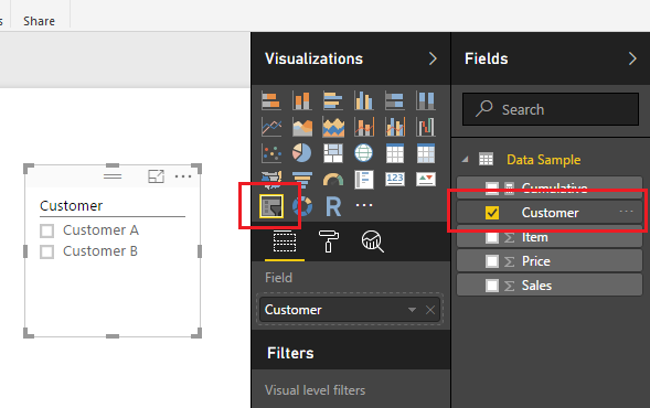
Add a slicer with the Customer column.
Add Customer Slicer
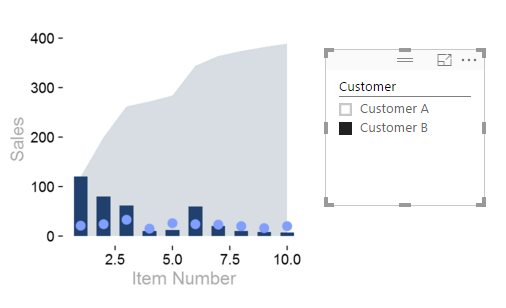
Notice when you select the different customers, either A or B the R script Visual will change to reflect the selected customer.
Customer B Selected
Now you can write the R script code once and use the filtering that is native in PowerBI to quickly change the data frame supporting the R Visuals.
As always, thanks for following along. Don’t forget to share if you liked this tutorial.
Want to learn more about PowerBI and Using DAX. Check out this great book from Rob Collie talking the power of DAX. The book covers topics applicable for both PowerBI and Power Pivot inside excel. I’ve personally read it and Rob has a great way of interjecting some fun humor while teaching you the essentials of DAX.
For those of you who have been hanging around PowerBI for a while you have likely heard about integration with R visuals. No, this isn’t a twisted dream where Power BI now ships with Pirates… Rather, this has been a highly untapped feature.
In a brief summary R or as it is known on its site R Project for Statistical Computing, is a statistical open source software package that enables mathematicians, statisticians, or data scientists to quickly calculate complex analysis. It is the tool of us super nerds. Now R by it’s self isn’t super powerful, it’s the numerous packages that have been developed by people way smarter than me that can do very amazing functions. Packages include functions for forecasting, math functions, statistic functions and best of all charting functions. Well, this may be fine and dandy so what? Well here is the best part. Microsoft has chosen to integrate and support various releases of R into it’s tools. For example R can now be leveraged within SQL server 2016, and now visuals built in R can be leveraged in Power BI Desktop and PowerBI.com. R can also be used to transform and prepare data during a date set load.
The important note here is that Microsoft has released it’s own open version of R. This distribution is called MRAN, and can be found at this site. The MRAN has been slightly tweaked from the R Project. In the Microsoft version of R, (which I will refer to as MRAN) there has been stability fixes and the improved performance (added Multi threaded Performance).
So enough back ground lets fire this thing up.
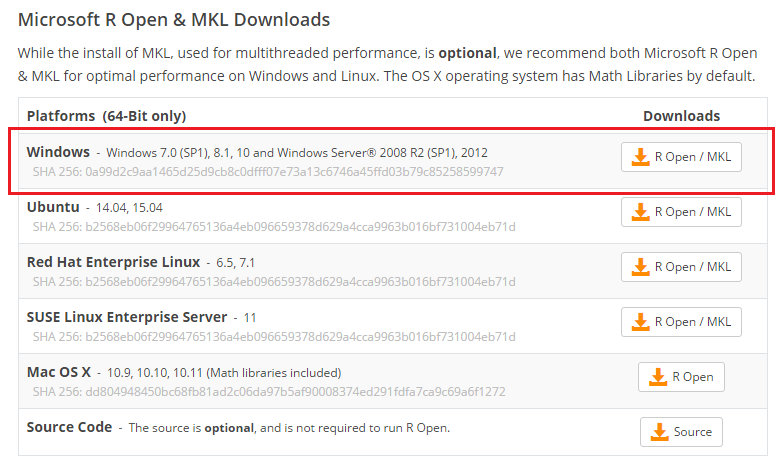
First you will need to install the latest version of MRAN.
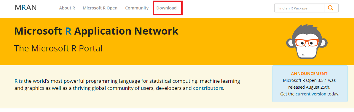
Navigate to the following address https://mran.microsoft.com/ Click the Download button found at the top middle of the page.
mran download page
Note: At the time of this Tutorial the current version of MRAN is 3.3.1, it is likely that this will change since Microsoft is constantly updating this site and releasing new stabilized & enhanced performance versions of R.
Select the platform that you will be using to install MRAN on. I’m using windows, thus I’ll be downloading and installing the top installation version.
Windows Platform of MRAN
Note: If you need additional installation help you can follow / read the documentation provided by Microsoft. It can be found here.
In order to keep this tutorial brief I will assume you know how to install software and have made it through the MRAN installation successfully. Once installed you should have the following program installed in your start menu.
Installation of R
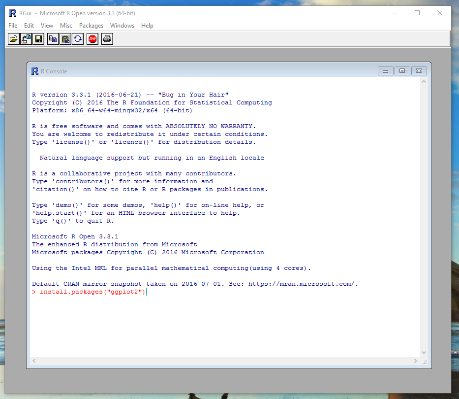
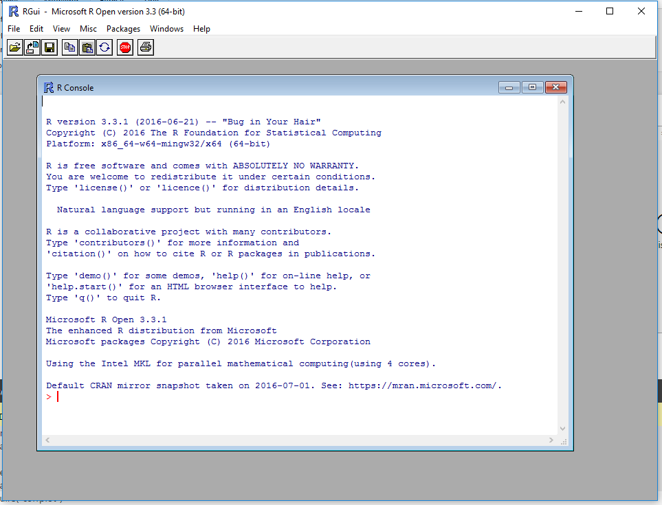
Run the new installation of R. The R installation will open up a console window.
R Console
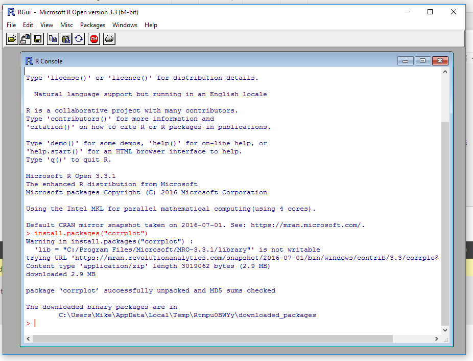
At the bottom of the console window is a red line where you enter commands. Enter the following code and press enter.
install.packages(“corrplot”)
This will install the proper R package that we will use later in PowerBI. After running this line of code the console will download the correct package and install it on your computer.
Install corrplot Function
At this time you can close the R console program.
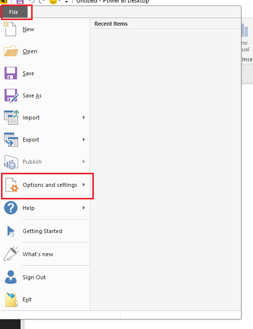
Now, open up PowerBI Desktop. Once in PowerBI desktop click on the File Button at the top left hand part of the screen. Next, Click Options and Settings.
PowerBI Options and Settings
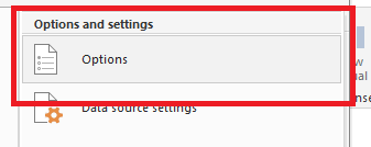
Then click on the Options button.
Options Button
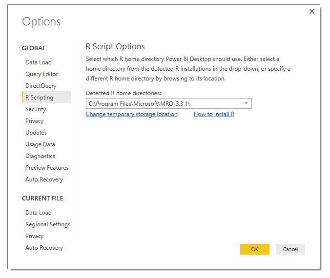
Under the Global options menu on the left verify that your new installation of MRAN is listed. PowerBI should automatically detect the installation and show the installation with the current version number in the home directory:
R Home Directory
Seeing the listed installation in the Home Directory verifies that R has been properly installed on your computer. Clicking OK will close the window.
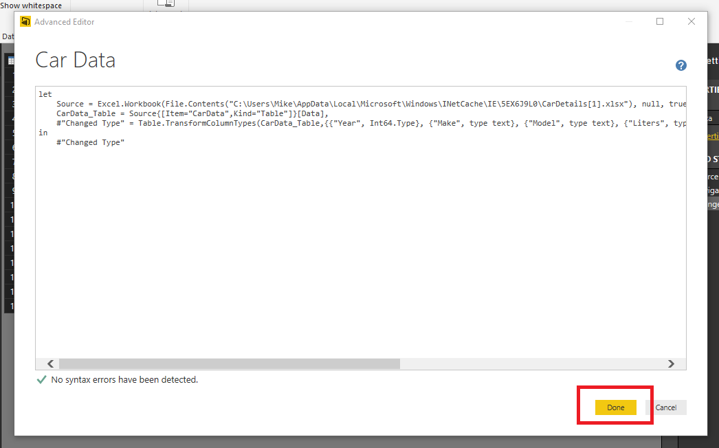
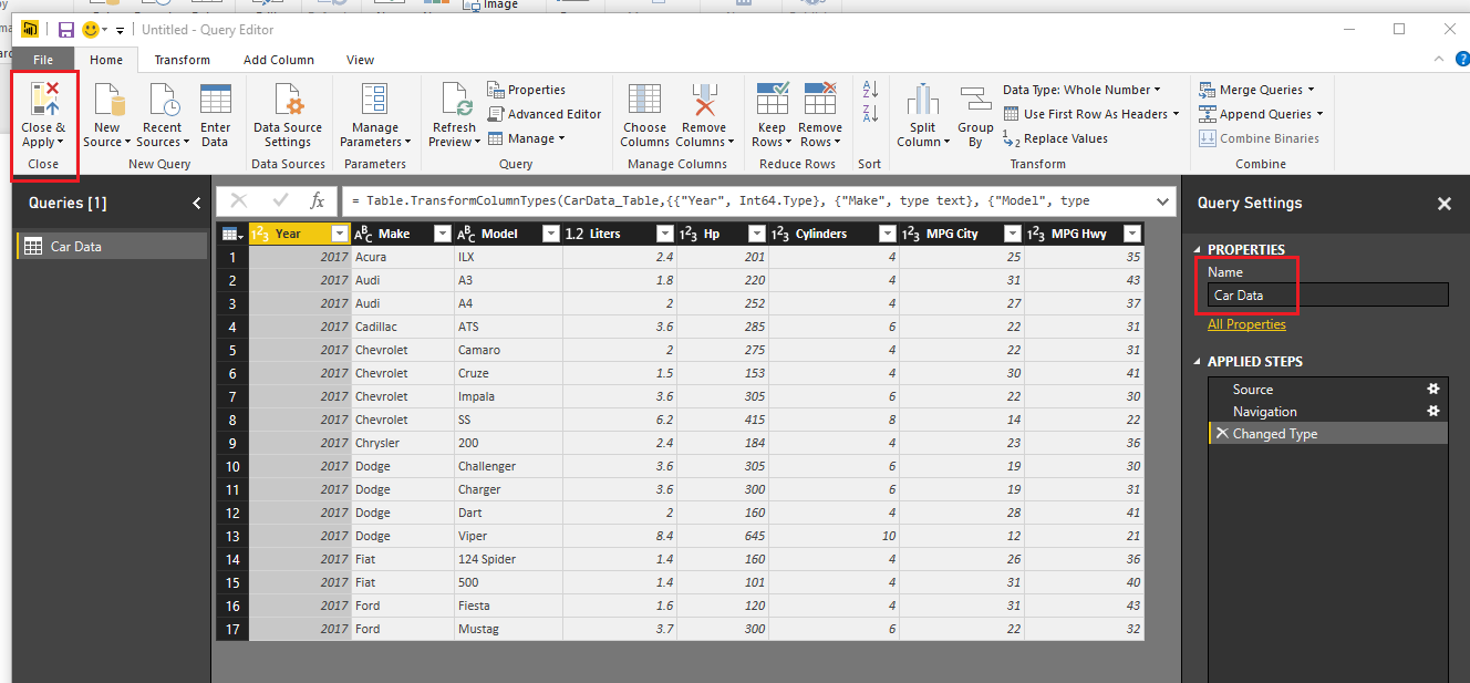
Data Time!! Below is the M Language that can be used in your Query Editor. Copy the code below and enter it into the Advanced Editor found in the Query Editor.
let
 Source = Excel.Workbook(Web.Contents("https://powerbitips03.blob.core.windows.net/blobpowerbitips03/wp-content/uploads/2016/09/CarDetails.xlsx"), null, true),
 CarData_Table = Source{[Item="CarData",Kind="Table"]}[Data],
 #"Changed Type" = Table.TransformColumnTypes(CarData_Table,{{"Year", Int64.Type}, {"Make", type text}, {"Model", type text}, {"Liters", type number}, {"Hp", Int64.Type}, {"Cylinders", Int64.Type}, {"MPG City", Int64.Type}, {"MPG Hwy", Int64.Type}})
in
 #"Changed Type"
Note: If you want to learn how to enter M language code into the Query Editor follow this Tutorial.
Once you have pasted the code above into the Query Editor it should look like the following:
Advanced Editor
Clicking Done will close the Advanced Editor and you will have data loaded into the Query Editor. You must have an internet connection to connect to this data. Rename your query to Car Data. Then on the Home ribbon click Close & Apply to load the data into the data model.
Car Data in Query Editor
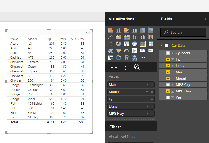
Generate a simple table visual to see our data in table form:
Table Visual
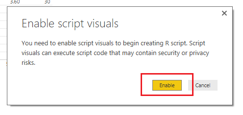
Add an R visual by clicking the R inside the Visualizations bar. When you click on the R visual you will see a pop-up, click Enable to proceed.
Enable R Visuals
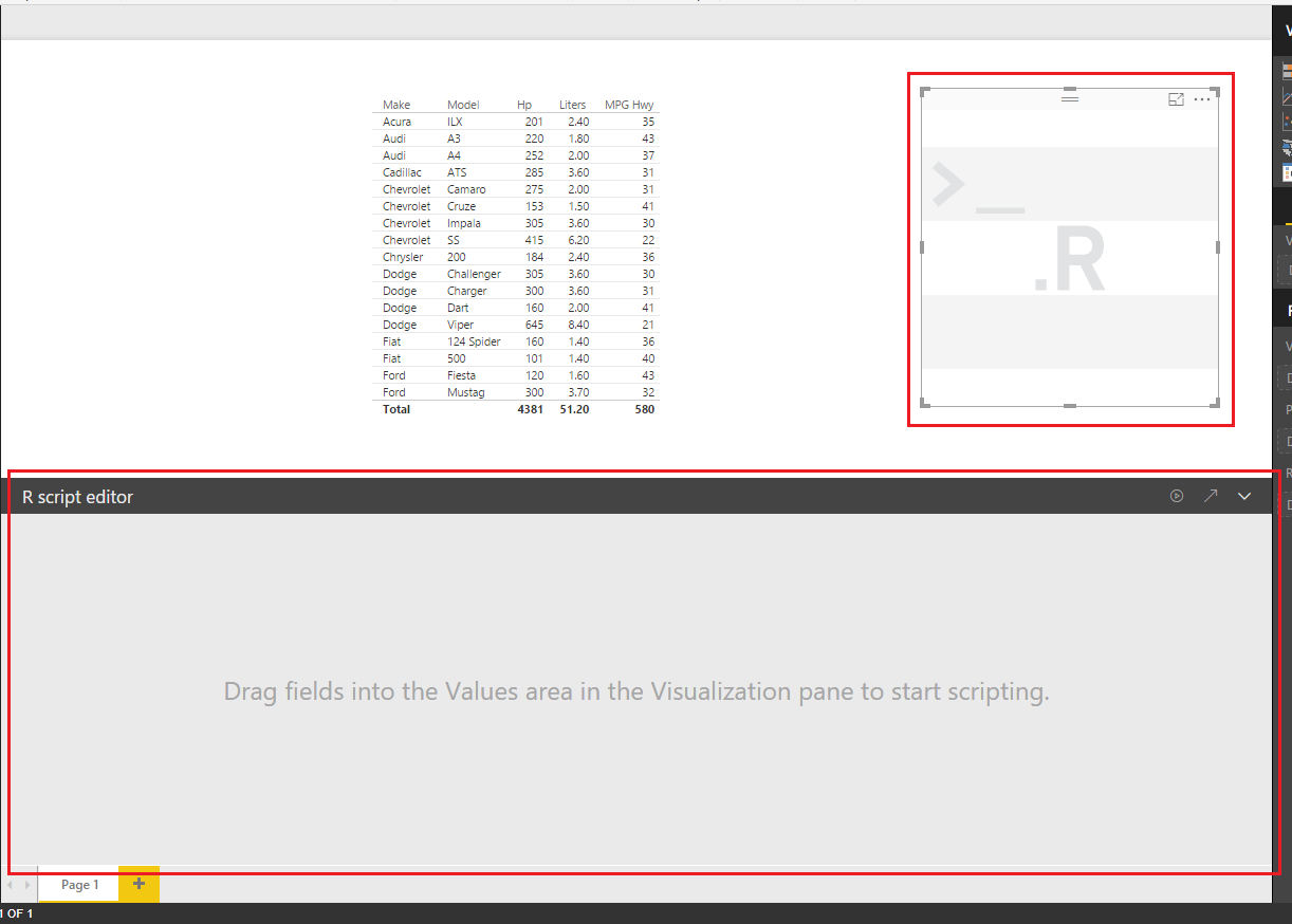
Doing this will open up a visual pane on the page and reveal an R script editor at the bottom of the page window.
R Script Editor
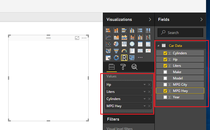
While keeping the R visual selected add the following fields to the visual under the Values field:
Add Columns to R Visual
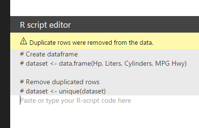
After adding these fields the R Script Editor will update and reveal code which informs you that your data from the selected columns will be added to a dataset.
R Code Script Editor
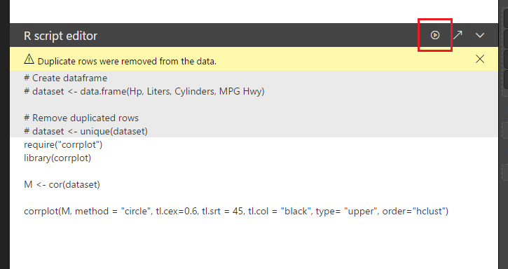
Next add the following code into the white area below the #dataset <- unique(dataset) statement.
This loads a package called corrplot which allows you to apply a graph that has a correlation plot between metrics. The M <- cor(dataset), takes your data runs a function called cor and then saves the results into a new variable called M.
Next click the Play button icon found on the right of the grey bar on the R Script Editor.
Running the R Script
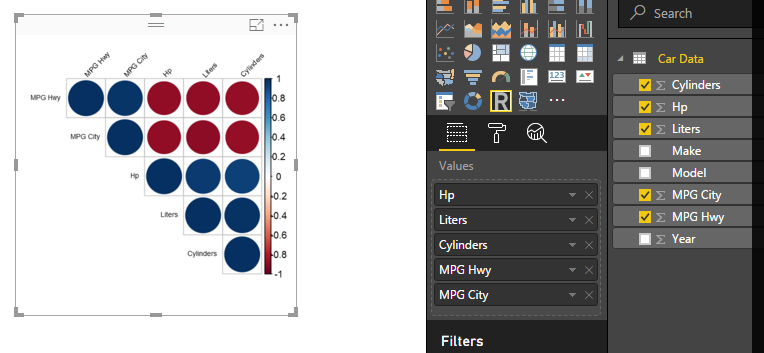
Success! You have completed a correlation plot using R within PowerBI. Nice job.
Final Plot
Bonus:
If you want to get fancy with this correlation plot you can change the circles to the actual correlation values. Change the last line of the R Script Editor code to the following and press the run script button:
This removes the circles and then populates the correlation plot with numerical values representing the correlation between the various data features.
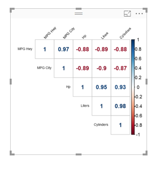
Correlation Numbers
The blue numbers represent values that have a positive correlation, while the red numbers represent a negative correlation. In practical terms the higher the Horsepower (HP) of the vehicle the lower the Miles per Gallon (MPG) that are realized.
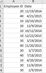
I had an interesting comment come up in conversation about how to calculate a percent change within a time series data set. For this instance we have data of employee badges that have been scanned into a building by date. Thus, there is a list of Badge IDs and date fields. See Example of data below:
Employee ID and Dates
Looking at this data I may want to understand an which employees and when do they scan into a building over time. Breaking this down further I may want to review Q1 of 2014 to Q1 of 2015 to see if the employee’s attendance increased or decreased.
Here is the raw data we will be working with, Employee IDs Raw Data. Our first step is to Load this data into PowerBI. I have already generated the Advanced Editor query to load this file. You can use the following code to load the Employee ID data:
let
 Source = Csv.Document(File.Contents("C:\Users\Mike\Desktop\Employee IDs.csv"),[Delimiter=",", Columns=2, Encoding=1252, QuoteStyle=QuoteStyle.None]),
 #"Promoted Headers" = Table.PromoteHeaders(Source),
 #"Changed Type" = Table.TransformColumnTypes(#"Promoted Headers",{{"Employee ID", Int64.Type}, {"Date", type date}}),
 #"Sorted Rows1" = Table.Sort(#"Changed Type",{{"Date", Order.Ascending}}),
 #"Calculated Start of Month" = Table.TransformColumns(#"Sorted Rows1",{{"Date", Date.StartOfMonth, type date}}),
 #"Grouped Rows" = Table.Group(#"Calculated Start of Month", {"Date"}, {{"Scans", each List.Sum([Employee ID]), type number}})
in
 #"Grouped Rows"
Note: I have highlighted Mike in red because this is custom to my computer, thus, when you’re using this code you will want to change the file location for your computer. For this example I extracted the Employee ID.csv file to my desktop. For more help on using the advanced editor reference this tutorial on how to open the advance editor and change the code, located here.
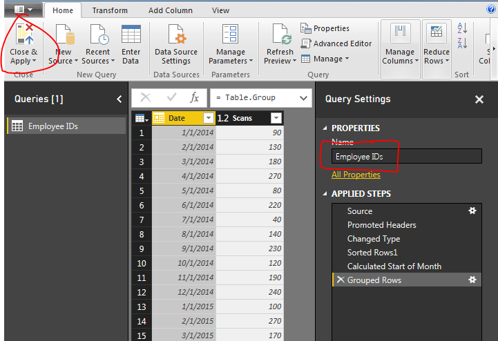
Next name the query Employee IDs, then Close & Apply on the Home ribbon to load the data.
Close and Apply
Next we will build a series of measures that will calculate our time ranges which we will use to calculate our Percent Change (% Change) from month to month.
Now build the following measures:
Total Scans, sums up the total numbers of badge scans.
Total Scans = SUM('Employee IDs'[Scans])
Prior Month Scans, calculates the sum of all scans from the prior month. Note we use the PreviousMonth() DAX formula.
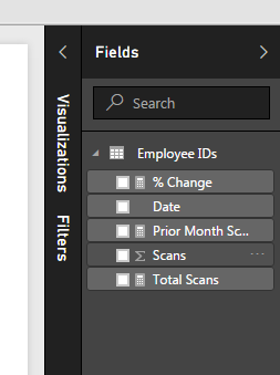
Completing the new measures your Fields list should look like the following:
New Measures Created
Now we are ready to build some visuals. First we will build a table like the following to show you how the data is being calculated in our measures.
Table of Dates
When we first add the Date field to the chart we have a list of dates by Year, Quarter, Month, and Day. This is not what we want. Rather we would like to just see the actual date values. To change this click the down arrow next to the field labeled Date and then select from the drop down the Date field. This will change the date field to be viewed as an actual date and not a date hierarchy.
Change from Date Hierarchy
Now add the Total Scans, Prior Month Scans, and % Change measures. Your table should now look like the following:
Date Table
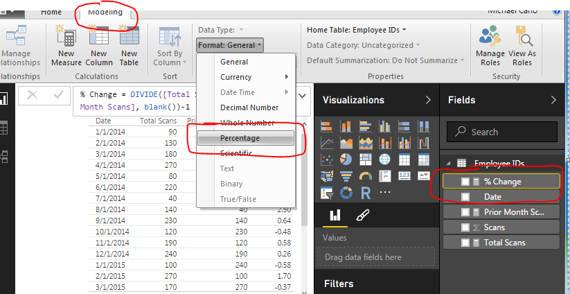
The column that has % Change does not look right, so highlight the measure called % Change and on the Modeling ribbon change the Format to Percentage.
Change Percentage Format
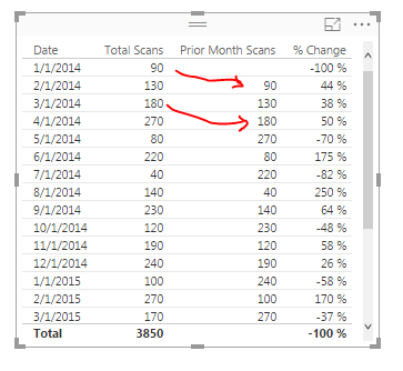
Finally now note what is happening in the table with the counts totaled next to each other.
Final Table
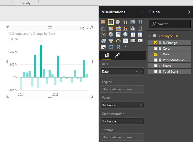
Now adding a Bar chart will yield the following. Add the proper fields to the visual. When your done your chart should look like the following:
Add Bar Chart
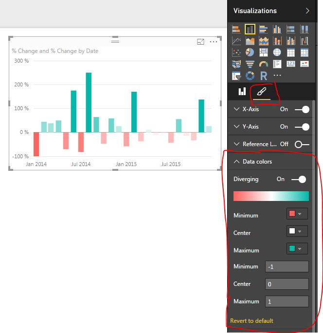
To add a bit of flair to the chart you can select the Properties button on the Visualizations pane. Open the Data Colors section change the minimum color to red, the maximum color to green and then type the numbers in the Min, Center and Max.
Changing Bar Chart Colors
Well, that is it, Thanks for stopping by. Make sure to share if you like what you see. Till next week.
Want to learn more about PowerBI and Using DAX. Check out this great book from Rob Collie talking the power of DAX. The book covers topics applicable for both PowerBI and Power Pivot inside excel. I’ve personally read it and Rob has a great way of interjecting some fun humor while teaching you the essentials of DAX.
In our last post we built our first measure to make calculated buckets for our data, found here. For this tutorial we will explore the power making measures using Data Analysis Expressions (DAX).
When starting out in Power BI one area where I really struggled was how to created % change calculations. This seems like a simple ask and it is if you know DAX.
Alright lets go find some data. We are going to go grab data from Wikipedia again. I know, the data isn’t to reliable but it is fun to play with something that resembles real data. Below is the source of data:
https://en.wikipedia.org/wiki/Automotive_industry
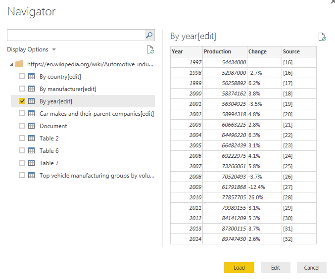
To acquire the data from Wikipedia refer to this tutorial on the process. Use the Get Data button, click on Other on the left, select the first item, Web. Enter the webpage provided above in the URL box. Click OK to load the data from the webpage. For our analysis we will be completing a year over year percent change. Thus, select the table labeled By Year[edit]. Data should look like the following:
Global Auto Production Wikipedia
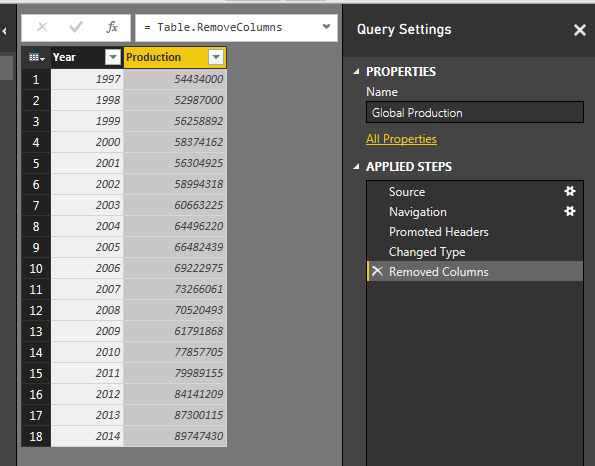
This is the total number of automotive vehicles made each year globally from 1997 to 2014. Click Edit to edit the data before it loads into the data model. While in the Query Editor remove the two columns labeled % Change and Source. Change the Name to be Global Production. Your data will look like the following:
Global Production Data
Click Close & Apply on the Home ribbon to load the data into the Data Model.
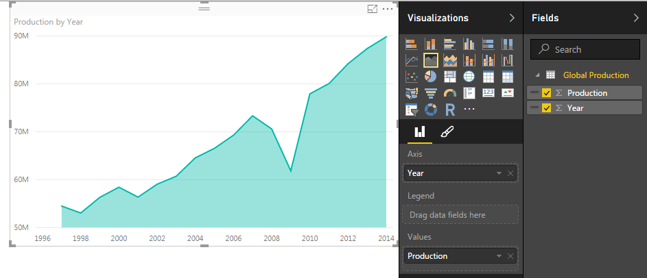
Add a quick visual to see the global production. Click the Area Chart icon, and add the following fields to the visual, Axis = Year, Values = Production. Your visual should look something like this:
Area Chart of Global Production
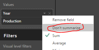
Next we will add a table to see all the individual values for each year. Click the Table visual to add a blank table to the page. Add Both Year and Production to the Values field of the visual. Notice how we have a total for both the year and production volumes. Click the triangle next to Year and change the drop down to Don’t summarize.
Change to Don’t Summarize
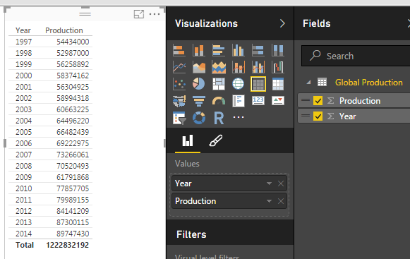
This will remove the totaled amount in the year column and will now show each year with the total of Global Production for each year. Your table visual should now look like the following:
Table of Global Production
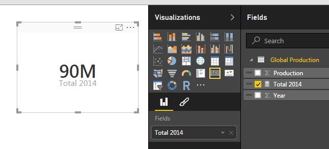
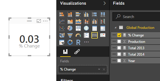
Now that we have the set up lets calculate some measures with DAX. Click on the button called New Measure on the Home ribbon. The formula bar will appear. We will first calculate the total production for 2014. We will build on this equation to create the percent change. Use the following equation to calculate the sum of all the items in the production column that have a year value of 2014.
Total 2014 = CALCULATE(sum('Global Production'[Production]),FILTER('Global Production','Global Production'[Year] = 2014))
Note: I know there is only one data point in our data but go alone with me according to the principle. In larger data sets you’ll most likely have multiple numbers for each year, thus you’ll have to make a total for a period time, a year, the month, the week, etc..
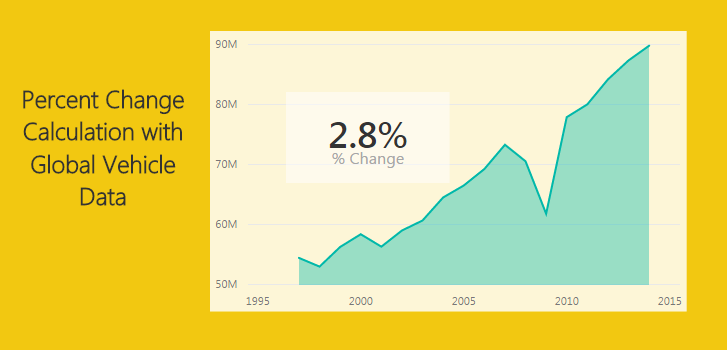
This yields a measure that is calculating only the total global production in 2014. Add a Card visual and add our new measure “Total 2014” to the Fields. This shows the visual as follows, we have 90 million vehicles produced in 2014.
2014 Production
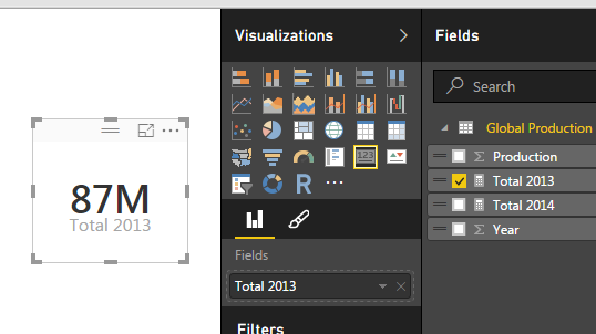
Repeat the process above instead use 2013 in the Measure as follows:
Total 2013 = CALCULATE(sum('Global Production'[Production]),FILTER('Global Production','Global Production'[Year] = 2013))
This creates another measure for all the production in 2013. Below is the Card for the 2013 Production total.
2013 Production
And for my final trick of the evening I’ll calculate the percent change between 2014 and 2013. To to this we will copy the portions of the two previously created measure to create the percent change calculation which follows the formula [(New Value) / (Old Value)]- 1.
This makes for a long equation but now we have calculated % change between 2013 and 2014.
Percent Change
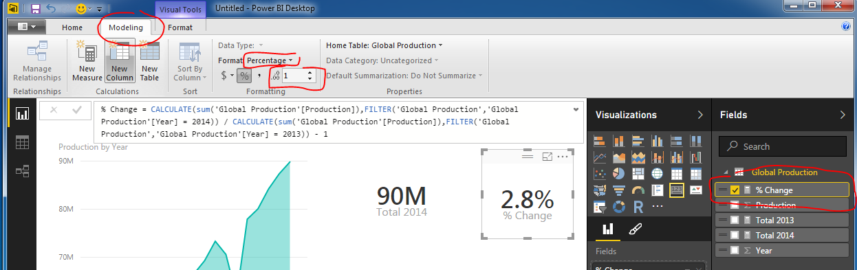
Wait you say. That seems really small, 0.03 % change is next to nothing. Well, I applaud you for catching that. This number is formatted as a decimal number and not a percentage, even though we labeled it as % change. Click the measure labeled % Change and then Click on the Modeling ribbon. Change the formatting from General to Percentage with one decimal. Notice we now have a percentage.
Change Format to Percentage
Thanks for working along with me. Stay tuned for more on percent change. Next we will work on calculating the percent change dynamically instead of hard coding the year values into the measures.
Want to learn more about PowerBI and Using DAX. Check out this great book from Rob Collie talking the power of DAX. The book covers topics applicable for both PowerBI and Power Pivot inside excel. I’ve personally read it and Rob has a great way of interjecting some fun humor while teaching you the essentials of DAX.
This tutorial is a real simple mapping exercise. I was talking with a colleague today about Power BI and I was challenged to map something using latitude and longitude. I had played with mapping before but not using latitude or longitude.
I’d have to say if you want to impress someone with your PowerBI skills adding a map is a good way to do so. Typically this a functionality that you can’t add into excel, well at least not with out some serious effort.
Alright, here we go..
Resources for this project are:
Power BI Desktop (I’m using the March 2016 version, 2.33.4337.281) download the latest version from Microsoft Here.
Excel file with a table in it with our location information that can be downloaded here: Locations Data Set
After downloading the Locations Data Set, Open up PowerBI and load the Excel file into Power BI. If you need to learn how to load Excel files you can follow the loading excel tutorial.
Click the Get Data on the Home ribbon. Select the first option Excel and click Connect at the bottom of the Get Data window.
Navigate to the downloaded file called Locations.xlsx and open the file by clicking Open in the bottom right hand corner.
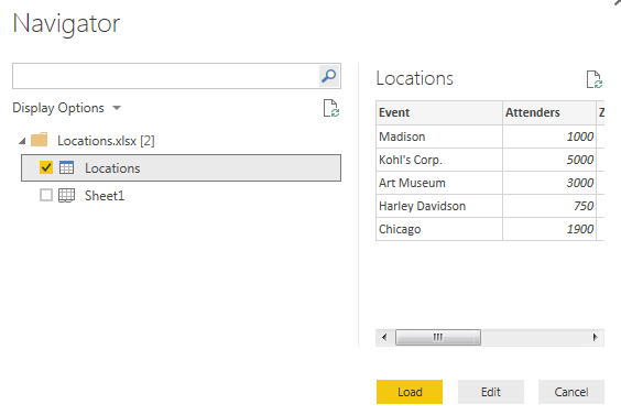
Next, the navigator window will open. Select the table (denoted with the grid with a blue top header) called Locations. Then Click Load to load the data into the data model.
Navigator Window Selection
Note: there are two different icons in the Navigator window. One is called Locations which is a Table within the Excel document. While the other is called Sheet1, which is simply the first sheet in the excel workbook. For Future references it is much easier to make tables in excel and use them to load data in to PowerBI than using just a worksheet. So whenever possible try to form your data in Excel into Tables. When loading a table the headers of the table automatically load into the column names in the PowerBI data models.
We now have loaded the data into a new Table in PowerBI called Locations.
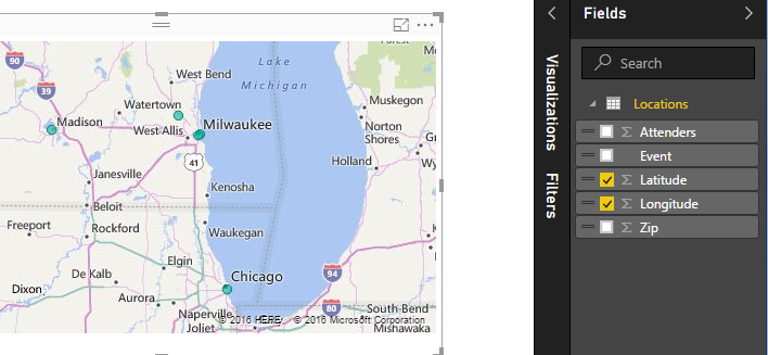
To make the map check the boxes for Latitude and Longitude. Power BI intelligently understands that latitude and Longitude are mapping functions and we are now presented with a map with tiny blue dots.
Map from our Data
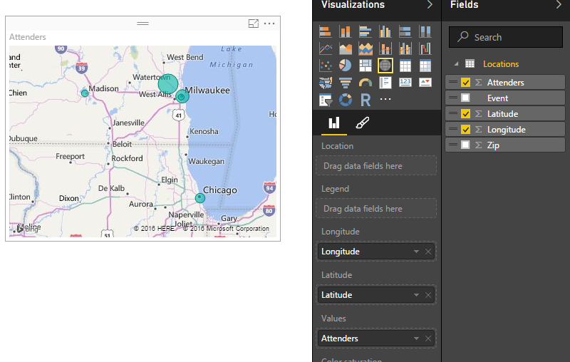
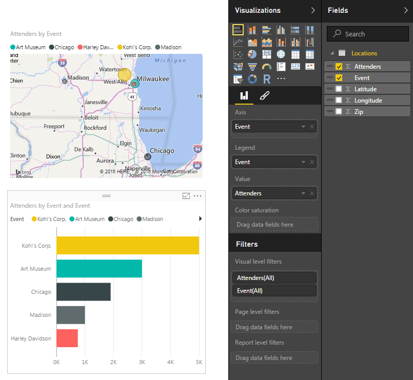
Lets add some more data to enhance the map. We can change the size of the circles at each location by dragging the column called Attenders over to the Values field for this visual.
Change Bubble Size
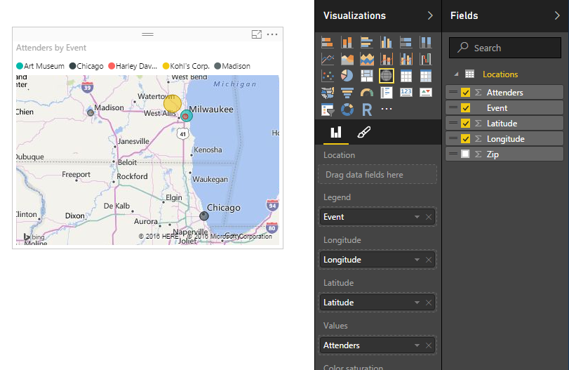
We have now changed the size of the circles relative to each other to show the number of people that we saw at each location. To add color to the map drag the column called Event to the Legend option of the visual. This yields a map that now has each circle with a different color according to the event name.
Colored Bubbles on a Map
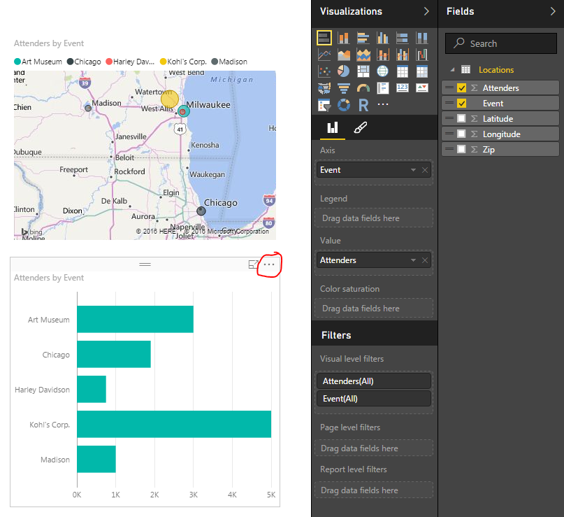
To enhance our visual further we will add a bar chart with the total count of attenders per event. To do this click any where on the visual page (this will de-select the map visual on the page). Now click the Event column and then the Attenders column. This will present you with a table list of events and the corresponding attendees. Leaving the table visual highlighted click the Stacked Bar Chart which is in the upper left hand corner of the Visualizations window.
Adding a Bar Chart
I circled the triple dots on the bar chart. Click the triple dots and a menu will appear. First click Sort By, then click Attenders. This will sort the attenders in descending order from the largest amount at Kohl’s Corp. down to Harley Davidson. Drag the column labeled Event to the visualization option called Legend. This colors the bar chart.
Colored Bar Chart
Note: The colors in the bar chart match the colors in the map we made earlier. This build uniformity in your reports and when your filtering items colors across visuals make sense.
Take some time to click on each of the bars on the bar chart. Notice how the map re-draws with only the data for that selected item. To select multiple bars on the bar chart hold the CTRL button and click on the multiple bars.
Nice job. We have finished the mapping tutorial. Share if you liked it below.
There are often times when you need a small data set in order to make a visual behave exactly how you want it to. This may mean you need a small table to represent a range of numbers or text values.
Here are the Resources for this tutorial:
Power BI Desktop (I’m using the March 2016 version, 2.33.4337.281) download the latest version from Microsoft Here.
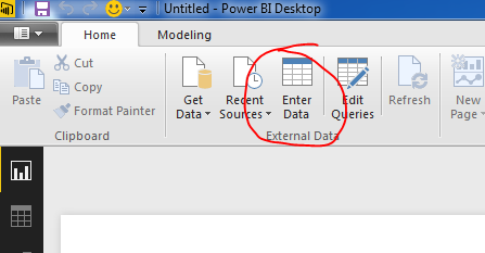
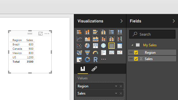
To enter your own data Click the Enter Data button on the Home ribbon.
Enter Data Button
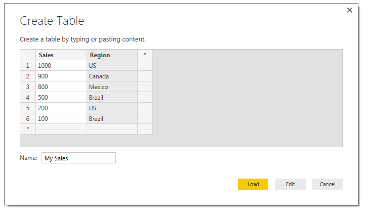
Next you are prompted with the Create Table window. In this window you are given the layout of a unfilled table. To begin entering data you can click in the first cell in Column one and start entering data. By pressing enter a new cell will populate below. You can Rename the column by double clicking the column name. To add a second column you Click on the * symbol next to your existing column. Finally to edit the table name you can type in the desired table name in the Name input box in the bottom left hand portion of the window.
Create Table Window
Finally, you can either to choose to Load the data as is or Edit the data to make additional changes (this can be useful to edit the data types of each column or to populate equations in subsequent columns). For the sake of this tutorial we will simply load the data. Click Load to load the data into the data model.
Now drag over the columns into the page view to begin generating visuals. By default PowerBI makes a table of data to show you the values you just entered.
Visual of Sales Table
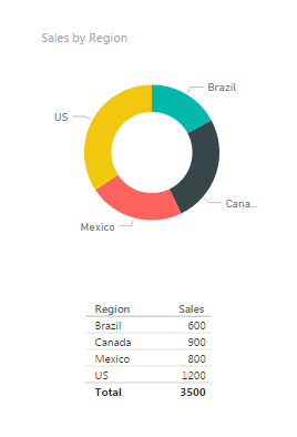
Select the table visual (you know it is highlighted when it has the trim boarder as shown above) and Click the Doughnut Visual. This transforms the data into a doughnut, and who doesn’t like a nice data doughnut? Click anywhere in the page to de-select the new doughnut visual. Add a second table by dragging over he Region and Sales columns. We can now see the pretty graphic and the numbers supporting that visual.
Visuals Made with our Custom Data
I bet you didn’t notice that something changed here. Look closely at the data we see now vs. what we entered earlier. Go ahead, scroll up, I’ll wait… Did you catch it?
We now have 5 rows of data but we entered 6 before. That is because the Sales column is a number column and can be aggregated. Look in the fields column and you see there is a little sum symbol in front of the Sales column. This means that this column has a default summarization associated. To see what is the default summarization highlight Sales by clicking on the column name in the grey area. Then Click the ribbon titled Modeling, and there it is in the properties section the Default Summarization is Sum. Every time you use the Sales column it will be summarized in the tables and visuals views. Our visual table shows Brazil with a total sales of 600, because we had two Regions labeled as Brazil 500 and 100.
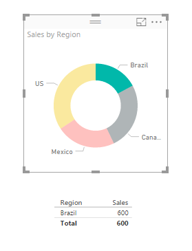
Now you can click on any of the data points in the doughnut. Notice the table automatically filters down to only show the areas you selected.
Data Filtered to only Brazil
ProTip: you can select multiple selections by holding down CTRL and selecting multiple items in the visual. You can only do this inside of one visual. As soon as you click another visual all filtering will disappear.
Again, I hope you enjoyed this quick tutorial. If you liked it make sure you share it below.
Manage Consent
To provide the best experiences, we use technologies like cookies to store and/or access device information. Consenting to these technologies will allow us to process data such as browsing behavior or unique IDs on this site. Not consenting or withdrawing consent, may adversely affect certain features and functions.
Functional
Always active
The technical storage or access is strictly necessary for the legitimate purpose of enabling the use of a specific service explicitly requested by the subscriber or user, or for the sole purpose of carrying out the transmission of a communication over an electronic communications network.
Preferences
The technical storage or access is necessary for the legitimate purpose of storing preferences that are not requested by the subscriber or user.
Statistics
The technical storage or access that is used exclusively for statistical purposes.The technical storage or access that is used exclusively for anonymous statistical purposes. Without a subpoena, voluntary compliance on the part of your Internet Service Provider, or additional records from a third party, information stored or retrieved for this purpose alone cannot usually be used to identify you.
Marketing
The technical storage or access is required to create user profiles to send advertising, or to track the user on a website or across several websites for similar marketing purposes.